1stwebdesigner |

| Client Tactics: Freelance Contract Basics Part 2 Posted: 29 Apr 2010 02:09 PM PDT
What is a Schedule?A schedule is just a fancy legal way of saying “this is my work process and this is how you (dear client) will pay me.”. Schedules like contracts benefit the client and the freelancer in the fact that it lays everything out on the table. No hidden surprises, everything is accounted for. Where To Put It?
Depending on the length of language on your contract. Your schedules could fall on the same sheet or a secondary sheet. I opt for the secondary sheet, (It’s not OCD, it’s just a compulsion; okay?) That way it isn’t muddled into the middle of the contract. Lets face it, once the client signs your contract and they get their copy, they will only look at it should problems arise. By putting the schedules on its own page, the client will be more apt to look at that page more frequently. What does a Schedule Look Like?How many schedules one has depends on how one break apart one’s design flow and invoicing style. For smaller projects I have two, bigger projects three. Here’s what a sample schedule would look like:
The above would only need to be duplicated for situations for multiple invoice stages, which are a definitely beneficial idea. State what you are doing and what was being utilized in each section, saving the products until the last schedule unless they are needed during that particular phrase or schedule. Additional Questions To Think About.
Here are some additional questions to comprehend when building a contract.
Using Pre-Made Contracts or Templates.
When making your first contract its wise to look over a pre-made contract or the contract of a freelance buddy. The most intimidating part of writing a contract is legalese. Its boring, hard to understand, and complicated. Like my writing style. According to wikipedia here is the definition of legalese:
By starting with a template and adding in the special bits that make your business different, you’ll decrease a lot of the overhead that would come by either having an attorney write up or having to learn all the in and outs of contracts. By looking at either a pre-made template or one from a freelancing friend, you’ll be able to pick up legalese and be living it up like Robert Shapiro! Okay so maybe you won’t be living it up like Mr. Shapiro but you’ll at least know what a tortfeasor is. Would you guys like to see a complete downloadable sample contract written by yours truly and distributed through 1webdesigner? Do you have any questions or comments leave them below and I would be glad to help out. | |||||||||||||||||||||
| 9 Etiquettes And Tips of a Photoshop Rockstar Designer Posted: 29 Apr 2010 04:00 AM PDT
With the bustle of web-designers and photoshopers around the world, every day I feel left behind, seeing the awesomeness in the works of millions of talents out there who manage to outplay me, and as a result, help me rekindle my efforts to learn, every single moment. With the abundance of online resources, tutorials, blogs and articles which keep on excavating the trade of photoshoping, anybody with passion and readiness to work hard can become a pro over time. But what does it take to transition from just a pro, to 'the best'? Why are there some designers who are always the best? What makes them different from the others, when the knowledge available to absorb is equal for everybody? What makes them stand apart? Here is a quick peep into some etiquettes of a designer in terms of his/her Photoshop workflow, which groups them in a league of their own!
1. Object Oriented PhotoshopingPhotoshoping can be fun … and pain at the same time! Especially when you are working on complex visual compositions and layouts, with a lot of iterations involved. Designing a high-fidelity visual composition for a website or a web application, can be a nightmare, especially if you are in a team of creatives and when client meetings are too often, which means you will be going through a sea of changes and iterations far too often. The key here is organizing. Organizing your layers /sets and structuring your source file is really important, if you want to be in charge of your PSD. In the last 6+ years of my career in web designing, I have found this as a unique trait in designers, who love to be organized and productive. Let us walk through a sample PSD and see how its composition can be super-organized, by smartly modularizing the elements and following an object-oriented approach.
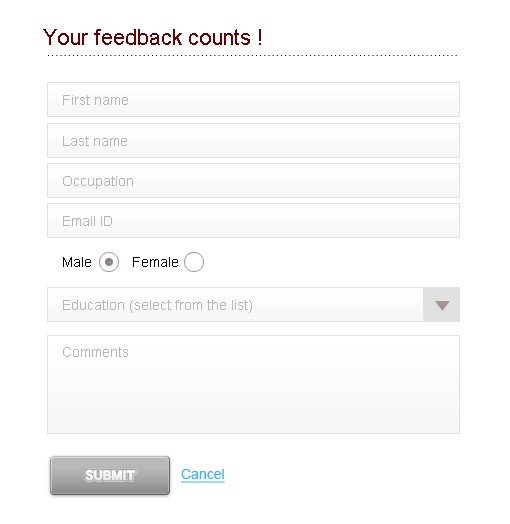
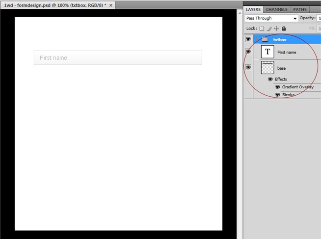
You can create this simple form in an Object Oriented way, by identifying and breaking down the various UI elements in the design. Here for example, there are a group of input fields and a submit button along with a hyperlink, which constitutes the complete form. Thinking in an OO way, each input fields can be considered an object, and if you create a basic textbox element, with editable text and the base block within a set in Photoshop, it's just a matter of replicating the set to create multiple textbox elements. Figure below, gives the layer structure of the textbox that I have created for our sample form.
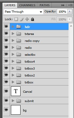
Here the textbox have been organized into a set and a duplicate of the set would be another textbox. Go edit the text, bingo! You have another textbox ready in a matter of seconds, and the layer palette looks organized and cleaner than ever!! The final layer composition would look something like the figure below:
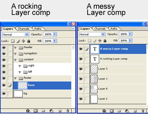
Implementing this ideology in whatever you design in Photoshop can bring in amazing results and believe me, you are gonna save a lot of time and, can build a solid repository of reusable components over time. 2. Naming conventions for layers and setsI have had really tough times, working on other designers' Photoshop compositions and had gone crazy, just trying to understand the structure of the layers and sets involved. With thousands of unnamed layers and sets, your day can be ruined, especially if you are working in an agile mode and need to make quick changes and updates. The solution here is to smartly name the layers and sets, so that it relates to the element contained in the layer/set. If you are a keen html/css coder, you definitely would know the importance of naming conventions, while building your css. The ability to completely leverage, the layer palette is something that we designers need to master to get on top. This skill / technique / best practice is the most ignored one, and I find this as the core skill of a photoshoper who loves to be productive and stay organized. Let dive right into the topic! While authoring a graphic, irrespective of the tool that you may use, it is really important to have a clear idea on the various components that make the design. For e.g. . That very idea, should be brought into the canvas through the layer palette, and the way you name the layers actually can communicate the way you visualize the graphic and I normally use this fact, to evaluate the skills of a designer, when asked to choose one out of a bunch of them! The previous concept that we covered, which is about object-oriented photoshoping have much to do with this way of organizing the composition. Here the key, is to give logical names to the layers rather than presentational names – i.e., a layer named 'blackRectangle', can be given a better name as 'qLinkSolid' depending on the element that it represents (here the black colored rectangle would have been a base section for a set of quick links) (though you need not stick to this strictly, it is really interesting to figure out how your workflow and approach changes, once you embrace this way of naming the layers and sets. Below is a comparison) For those who were wondering what 'logical' and 'presentational' are - presentational names are naming based on the presentational aspects of the element, like the color, shape, position or orientation etc. Whereas logical naming is based on the logical importance of the element that layer represents. Following is a table which puts lights on your woes of naming conventions
Not always can we come up with very detailed logical naming conventions, but it's better to take time out and understand the logical importance of the elements and name it accordingly, as this would pay off, when it's time for you to graduate to a UX designer, where the UI patterns and naming conventions can play an important role, while doing IA or wire framing. 3. Ability to replicate and practice“The most important skill that makes a killer designer!” As far as web-designing is concerned, it is the unique ability to appreciate, replicate and refine, that can get you ahead. Replicating doesn't mean copying! I am not asking you to rip a cool site that you found and show your creative skills on the expense of other's IP (intellectual property). The collaborative and open culture of internet should be leveraged properly, to enhance your skills, and not to copy paste. So, what I mean by replicate is to try to take some solid reference point design, which you think are the best, and start working from scratch to achieve the aesthetic and creative feel that you have seen in those designs. The concept of ‘Mood Boarding‘ is something visual designers like us should embrace. By this way, you would actually push your limits to a whole new level. Remember, 'you are not a good disciple, if you fail to excel your master', the famous quote by the lord of self learning – Da Vinci. So start collecting your reference points and start pushing your limits, towards the quest to become that master designer!
4. Usage of paths and pen toolPhotoshop is a treasure chest to me … the more I delve into it, the more I feel ignorant. The toolbar of Photoshop is synonymous to the Pandora box, which lets out a flood of possibilities to a designer. But there is a tool which, sits pretty out there and have been honored as the king of all tools in Photoshop, just because it is the only tool which can be mastered only over practice, practice and practice (not that all the other tools are easy to use, but this one have a special place in that terms !) You may use it to cut out images, illustrate your artwork, create stunning new graphic for a UI, but finally what differentiates the masterful designer from the others is the ease with which you use the tool and how u use the right tool for the right task. Paths and pen tools can bring about stunning improvisations in your productivity and workflow, if used smartly. Some instances that I have found useful are
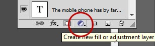
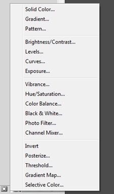
5. Effective usage of adjustment layers and stylesThe key of a rocking visual composition is flexibility and scalability!
Using adjustment layers can bring in that flexibility to the composition, so that you can make the updating pretty quickly and easily, by just sliding the slider control. This would come really handy when you are working on layouts with multiple themes and overlays, where you will be maintaining the same design elements, but keep on changing the color schemes. You can add adjustment layers for the changing the following options of the graphic:
6. Guides, Grids and notesOne regular pattern that I have noted about good designers is the way they use guides and notes. A well documented and guided composition will give that professional and organized look no matter, what you design. I would consider this as one important etiquette of a Photoshop rock star! 7. Workspace ManagementPhotoshop, as we all know is the tool of professionals across multiple domains. Web designers, print designers, post production, photography enthusiasts, 3D professionals and so on… With the armory of tools and techniques abound, Photoshop can be best leveraged, by organizing the palettes and tools that you frequently use. With the release of the latest versions of Photoshop, there are ready made preset workspaces, which the user can choose depending upon area of expertise. For e.g. a web designer would be working most frequently on layers, info, character, navigator, paths, brushes palettes and would need those palettes easily accessible, and hence a workspace where all these palettes are well placed would increase his/her productivity and workflow. As a productive and multitasking professional, you can always create your own workspace by placing the palettes / tools in a position that well suits your ease of getting tasks done. 8. Shortcuts, shortcuts and shortcuts
Some shortcuts that bring the most out me are:
These are just a few of them which I find useful in my daily encounters with PS. I am sure you have lots to share! For really detailed Photoshop shortcuts research please head to this article compiled some time ago – 48+ Greatest Adobe Photoshop Keyboard Shortcuts. 9. Last but not the least … respect and respond to your critiques!For every designer, the best supporter is their critique. Being open to changes and ready to accept criticism is a trait that every successful designer should be having. Most often criticism can bring about the actual defects and stereotypes within you, and giving that extra effort to accept changes can mould you to a better designer, person and human being. So folks, let's start absorbing strong critiques and lets fly high! Cheers ! | |||||||||||||||||||||


 Who doesn't know that, shortcuts are the shortcuts to stardom!
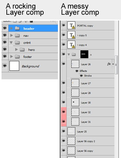
| You are subscribed to email updates from Graphic and Web Design Blog To stop receiving these emails, you may unsubscribe now. | Email delivery powered by Google |
| Google Inc., 20 West Kinzie, Chicago IL USA 60610 | |
0 comments:
Post a Comment