Abduzeedo - graphic design | design inspiration | tutorials - |
- Daily Inspiration #487
- A Brazilian Architecture Office - M² Arquitetura
- The Multiple Faces of Times Square
- The Perfect Office #33
- Clash of the Titans Text Effect in Photoshop
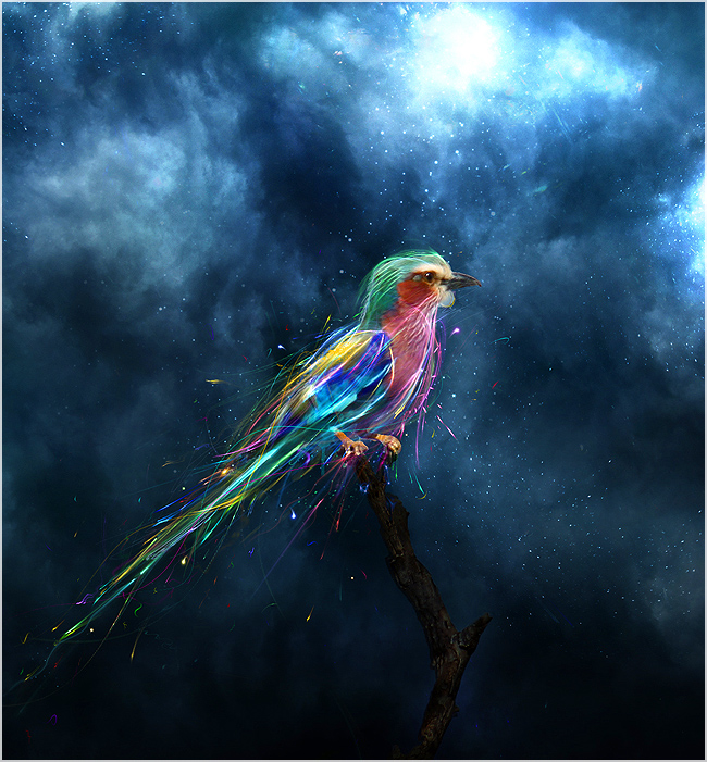
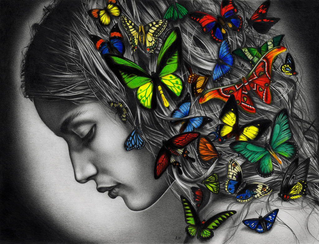
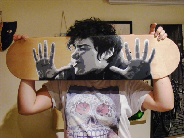
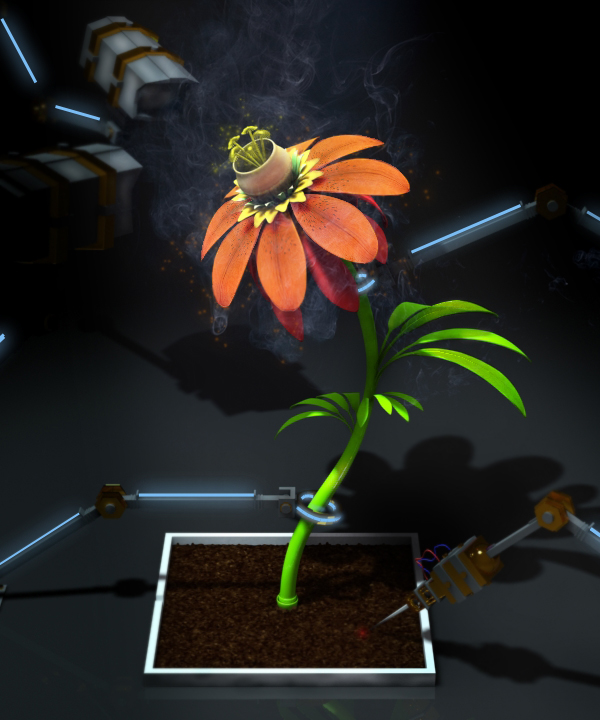
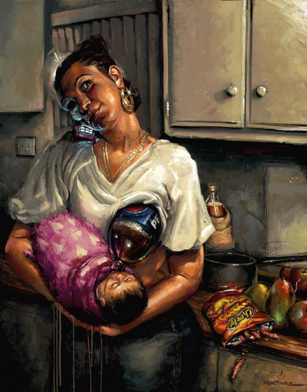
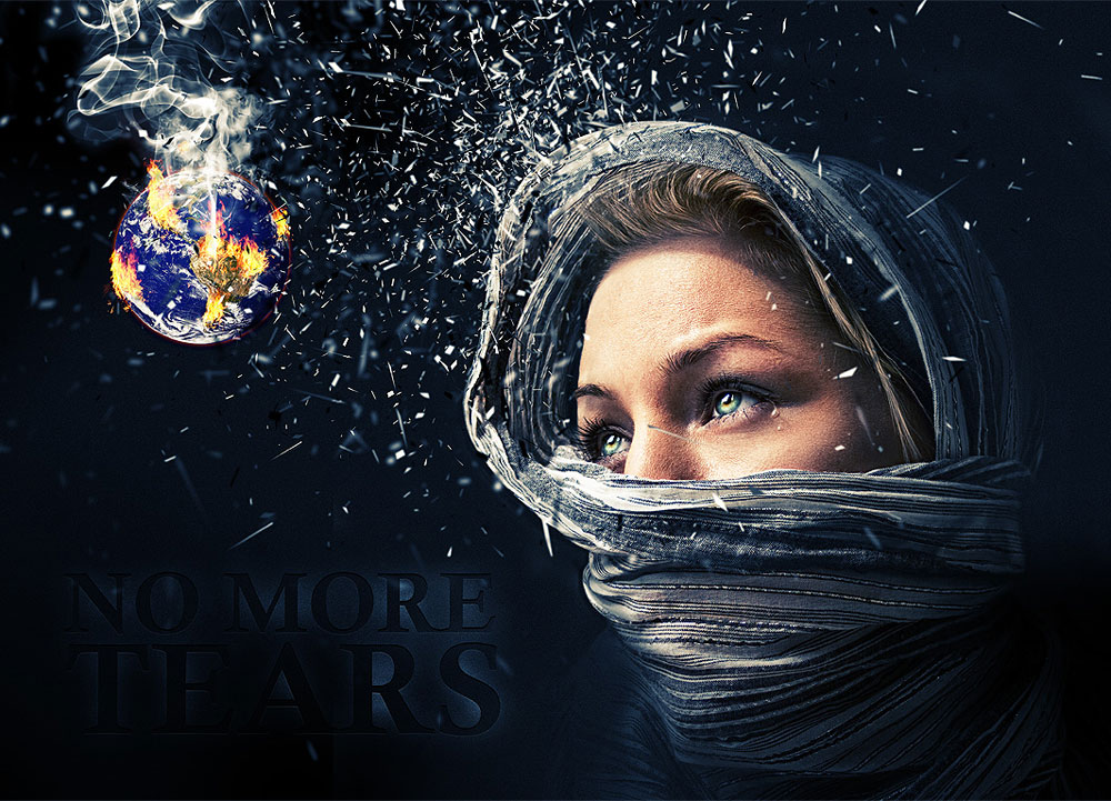
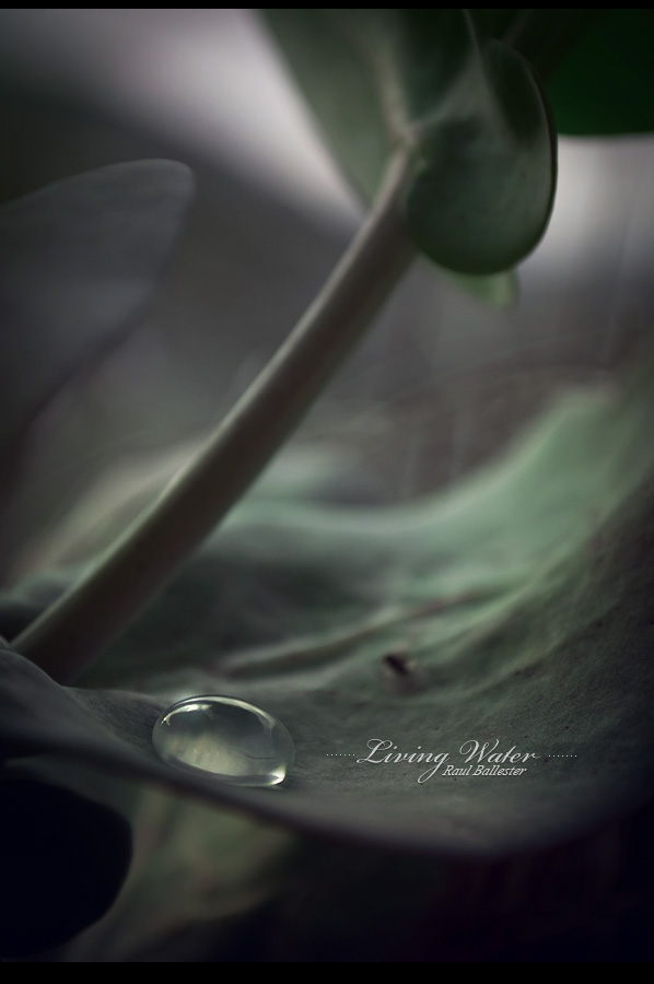
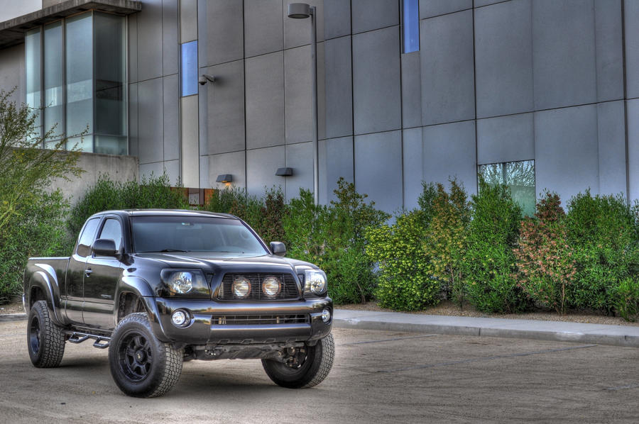
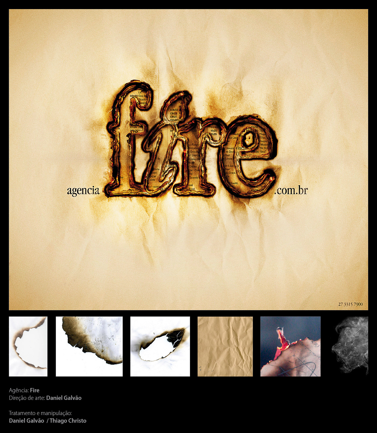
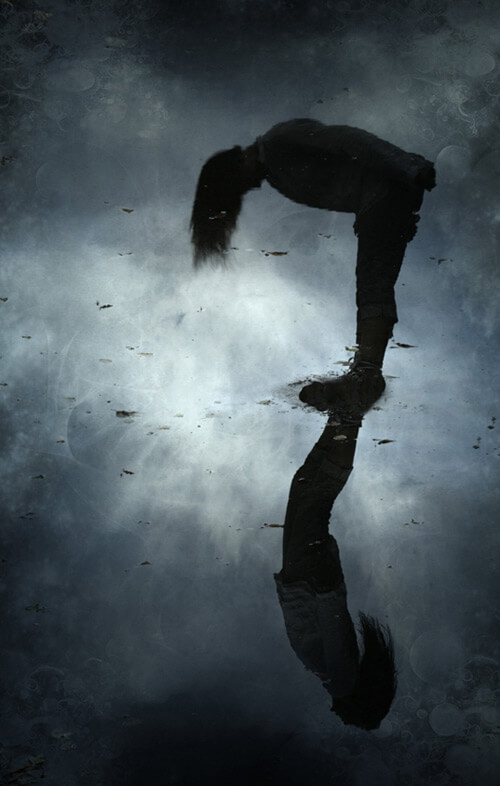
| Posted: 19 Apr 2010 02:09 PM PDT This post is part of our daily series of posts showing the most inspiring images selected by some of the Abduzeedo's writers and users. If you want to participate and share your graphic design inspiration, just send us, via email, the image with the link from where you found it, also use "Daily Inspiration" in the subject, and don't forget to send your Abduzeedo username; or via Twitter sending to http://twitter.com/abduzeedoIf possible use the HTML code: <p class="imgC"><a href="Link to the page you found the image"><img src="Link to the Image" /></a></p> Do you want to see all images from all Daily Inspirations? Check out http://daily.abduzeedo.comal b sureB.Romaincesar manuel romanDraniueDsancaEduardoeugene kimFabianoFabioGiselehecrazyJimmy CavalcantiJorge JuniorPositive PicturesricardoFXTalkingBearThiago ChristoVia TwitterSend your suggestions via Twitter to http://twitter.com/abduzeedo using #abdz in the end of the tweet. @T_Arata@thomasmburu@djbennett999 |
| A Brazilian Architecture Office - M² Arquitetura Posted: 19 Apr 2010 11:06 AM PDT I have been writing some articles showing you really nice offices around the world. And for my surprise there is one of this great offices in a brazilian city really close to me. I'm talking about an office called M² Arquitetura. As soon as I looked at it I was impressed and decided to show it to you... and I'm sure you will love it.<!--break--> M² Arquietura is located in Joinville, SC, Brazil. They are an architecture company that develops projects in many fields: residential, comercial, industrial, corporative, decoration and interiors. The current M² Arquitetura headquarter is a revitalization of an old storage place in the center of the city. The place has several industrial elements, such as apparent wooden structures, and systems of lightening and ventilation in sheds. A really beautiful place. And as I said to them, it makes me want to go back being an architect to work in a place like this!
|
| The Multiple Faces of Times Square Posted: 19 Apr 2010 06:58 AM PDT I think that most people that go by Times Square in NYC take photos, specially if you a visitor, after all it's Times Square. So I decided to make a nice collections of photos of Times Square from different people, different views, different times and the result it's amazing, check it out!<!--break--> Times SquareFrom Wikipedia Times Square is a major intersection in Manhattan, a borough of New York City, at the junction of Broadway and Seventh Avenue and stretching from West 42nd to West 47th Streets. The Times Square area consists of the blocks between Sixth and Eighth Avenues from east to west, and West 40th and West 53rd Streets from south to north, making up the western part of the commercial area of Midtown Manhattan. Formerly named Longacre Square, Times Square was renamed after the Times Building (now One Times Square) in April 1904. Times Square, nicknamed "The Crossroads of the World," has achieved the status of an iconic world landmark and has become a symbol of New York City. Times Square is principally defined by its spectaculars, animated, digital advertisements. Share your photo on the comment area! |
| Posted: 18 Apr 2010 10:31 PM PDT We've seen some great gadgets and equipment for designers. So many cool stuff, that we could actually assemble infinite perfect office spaces! Every week we'll assemble a perfect office, and we'd like you to help us. What equipment would the perfect office have?<!--break--> Not only gadgets and equipment, but also furniture, sound system, gaming stuff (for lunch time!). A designer is totally allowed to dream with the perfect office, and that's what we're gonna do here! Comment telling us your suggestions, or even better, you may tell us via twitter (mine and fabio's), using #abdz_ofc so we can check it. Alright? I hope you guys enjoy this brief selection. Cheers! ;) Copenhagen ChairMid-century modern design meets old-world club attitude in the Copenhagen Chair. Sporting an egg-like design inspired by 1950s Danish design, the chair is wrapped in hand-distressed leather for a look that belongs in a long-standing cigar bar, and sits atop a brushed aluminum base that lets it swivel 360 degrees. Also great choice for the aspiring villainous world dominator's desk. (at Uncrate) Smash Hit - ShelfFrom "The Who" to "The Clash", from Jimi Hendrix to Kurt Cobain, guitar smashing has become a time-honoured sacrament of rock 'n' roll. Bring this gesture of irreverence and fervour to your home, captured in a truly unique design that's ready to steal the show in any ambiance. Smash Hit's delicate matte lacquer finish is complemented by striking vinyl wall decors, which can be interchanged, allowing you to always update the shelf with a fresh and intriguing new look. (at Design Spotter) Monsters SeatingGiant, soft, elastic monster seating "trained to put you in very uncomfortable positions." The project is a collaboration between Pieke Bergmans and Innofa/Stretch Textiles, exhibiting at via Tortona 12 during Milan Design Week. (at Moco Loco) Offside Wenge Table FootballA convertible foosball table that can be used as a dining table. The "playing surface and bars can be removed and hung up on the wall like a painting. In its place a wooden board can be used to make it a normal table." A tempered glass table top is also available. (at Moco Loco) Log & Squirrel Self Watering PlanterPour water into the log and wait for the little squirrel to pop up and say hello. As long as you can see the squirrel you'll know that your plant is a happy little plant but if the squirrel ducks back down into the log, it's time to water the plant! It's a perfectly pleasant planter for the home or the office. (at 7Gadgets.com) iCharge Eco DX Solar PowerThe iCharge Eco DX Solar Power is capable of harnessing the Sun's power to recharge your cellphone but it is also possible to use a USB port or an AC Adapter to recharge it's included 1350mAh battery. (at 7Gadgets.com) Sketchbook Pro for iPadDarn awesome sketching app for the iPad. Check out a review here: idsketching. Adobe Creative Suite 5The only web/design/development software collection that matters gets another upgrade with Adobe Creative Suite 5. Available in five different sets, the new software includes the likes of Photoshop CS5, Illustrator CS5, InDesign CS5, Acrobat 9 Pro, Flash Catalyst CS5, Flash Professional CS5, Flash Builder 4, Dreamweaver CS5, Fireworks CS5, Contribute CS5, Adobe Premiere Pro CS5, After Effects CS5, Encore CS5, Soundbooth CS5, and a few others. Standout new features include Truer Edge technology for better masking, native 64-bit support (Photoshop, Premiere Pro and After Effects only), and the crazy-insane Content-Aware Fill feature. (at Uncrate) Apple MacBook Pro (now with Intel Core i5 and i7)The MacBook Pro lineup starts with advanced Intel Core 2 Duo processors running at up to 2.66GHz. And things only get faster from there. The 15- and 17-inch models now feature the latest Intel Core i5 and Core i7 processors — the fastest dual-core processors on the market — which reach Turbo Boost speeds up to 3.33GHz. With up to 4MB of shared L2 or L3 cache, MacBook Pro runs applications up to 50 percent faster than before. (at Apple Store) |
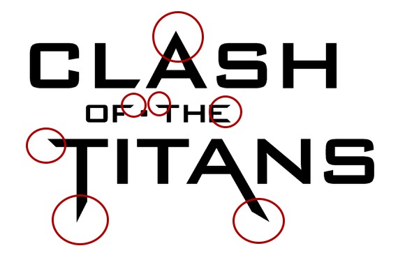
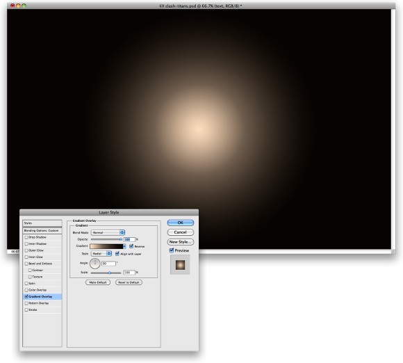
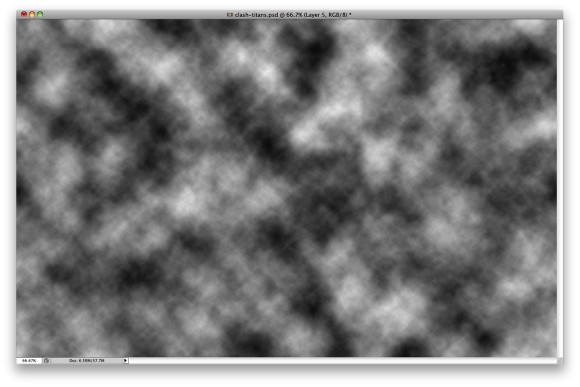
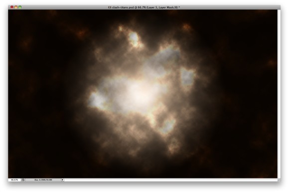
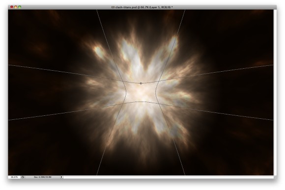
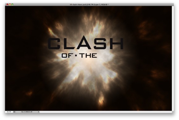
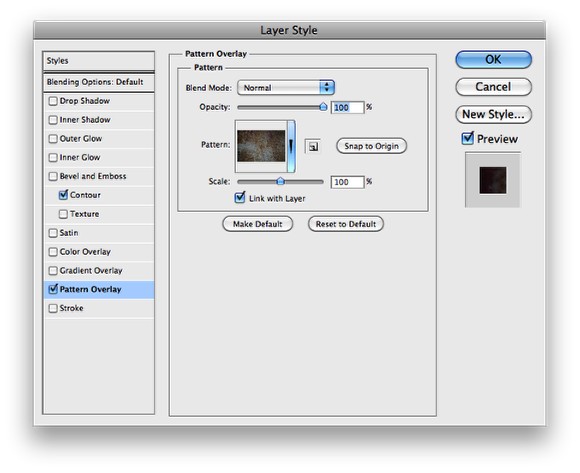
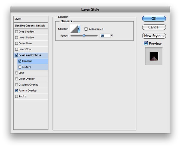
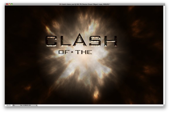
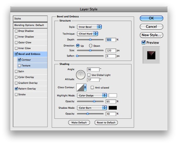
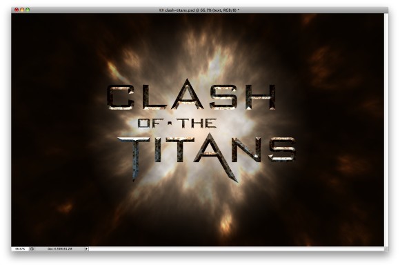
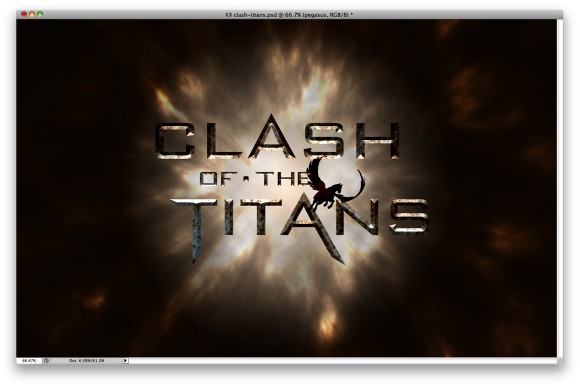
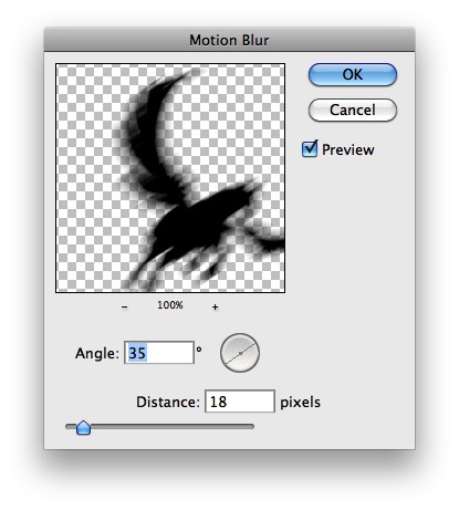
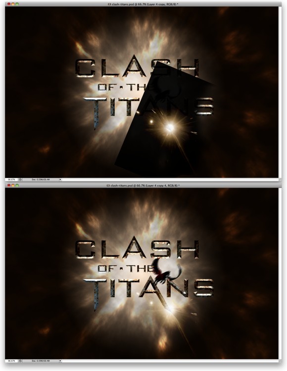
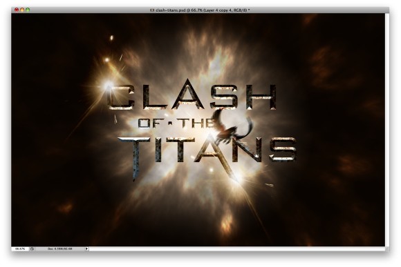
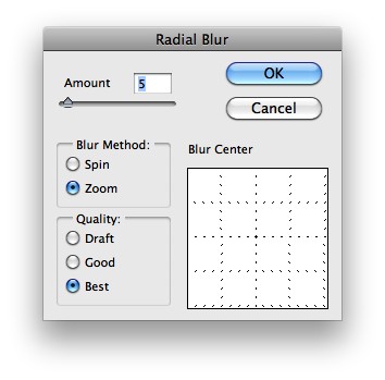
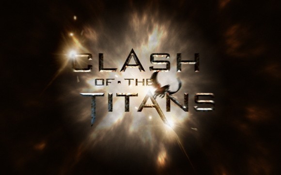
| Clash of the Titans Text Effect in Photoshop Posted: 18 Apr 2010 08:14 PM PDT A few weeks ago watched Clash of the Titans. The movie was okay, I have to admit, I was expecting much more, but it was awesome to see some huge monsters and mythologic creatures battling in this epic movie. However in the end of the movie, when the credits started showing I was really impressed with the effect and I thought to myself that I had to do a Photoshop tutorial inspired by the movie.So, in this tutorial I will show you how to create a text effect inspired by the Clash of the Titans posters and artworks. We will use layer styles and basic filters to achieve the effect. It will not take you more than 45 minutes to achieve the effect, but the outcome is really cool. Step 1Let's start our design in Illustrator, it's easier to get the text done in Illustrator, even though you can do that in Photoshop as well. When I saw the official Clash of the Titans poster I knew that font, it was the Bank Gothic, or the Bank Gothic is very similar. So with the Type Tool (T) add the word "clash", then "of the" in another independent object and then "titans", again in another object and line. All of the in uppercase. Step 2Select the texts and go to Type>Create Outlines. With the Direct Selection Tool (A) start editing the text. First the A of "clash". then the F of "of" and the T and E of "the". After that edit the word "titans" by changing the T and A. Use the image below for reference. Basically you will be moving points, but be careful to keep the same alignments and angles as the original text. Step 3Now open Photoshop and create a new document. Create a new layer and fill it with any color, then go to Layer>Layer Style>Gradient Overlay. Use a light beige #fee4c8 and a very dark brown #0f0802 for the gradient, use Radial for the Style and 100% opacity. Step 4Add a new layer and go to Filter>Render>Clouds. Make sure you have black and white for the colors. Step 5Change the clouds' layer Blend Mode to Color Dodge. After that go to Layer>Layer Mask>Reveal All. Over the Layers Palette, click on the mask thumb of the layer and go to Filter>Render>Clouds to apply the clouds to the layer mask, that will make the clouds less strong. Tip: play with masks and apply filter on the masks, you will be surprise with the possibilities and the results. Step 6Go to Edit>Transform>Warp. Select the Fisheye warp type, then move the controller towards the center of the document. That will create a really nice blur effect, much faster than the zoom blur in Photoshop. Step 7Copy the words "Clash of the " from Illustrator to Photoshop. We will do these words first because we will apply a different Layer Style preset for the Bevel and Emboss. Step 8First thing here is to search for a old and rusty metal texture. I found the one I'm using on Google Images. Open the image in Photoshop and then go to Edit>Define Pattern. After that go back to our design and select the layer with the words "clash of the", the go to Layer>Layer Style>Pattern Overlay. Select the metal pattern you have just created. Step 9After the Pattern Overlay, select Bevel and Emboss. For the Technique use Chisel Hard, for the Depth use 500%, for the Size use 120 pixels, for the Soften use 0 pixel. Over the Shading Options, use 95º for the Angle, 35º for the Altitude, then for the Highlight Mode use Color Dodge with white for the color and 65% for the Opacity. For the Shadow Mode use Color Burn with Black for the color, then 40% for the Opacity. Step 10Now select Contour, then just change the Range to 50%. Step 11Here you can see the effect you will have. Notice that the ligths are coming from the bottom, or the center of the document, and that is why we split the words. Step 12Copy the word "titans" from Illustrator and paste it in Photoshop. On the layers palette select the layer we applied the layer styles in the previous steps and with the right button of the mouse click and select Copy Layer Styles. After that select the "titans" layer and click again with the right button of the mouse click and select Paste Layer Styles. Double click on the layer to open the Layer Style dialog box. Select Bevel and Emboss, then just change the Direction to Up. Step 13This is the effect you wll have gotten so far, notice now that the light for the word "titans" is coming from the top while for the "clash of the" is coming from the bottom. Step 14If you watched the movie you will know that the Pegasus was a black winged horse, so I got an image of a winged horse from Shutterstock, you can find it over here. It's a vector image, but that is fine, just place it as it is coming from the center. Step 15To make the horse more realistic and less vector style go to Filter>Blur>Motion Blur. Use 35º for the Angle and 20 pixels for the Distance. Step 16For the flares you can create them using different techniques, you can do that using the noise gradient, the lens flare filter (least recommended) and using an image. I have used a image that is really good for that on most of my projects, the only thing I do is to change the Hue and Saturation to make the colors match the design. You can find the image I used here. As you can se the background of the image is black so the only thing you have to do is to change the Blend Mode to Screen, so the black will be transparent. Step 17Add more lens flares over some letters of the texts. Use the image below fore reference. Step 18Select all layers and duplicate them, after that merge all the duplicated layers into one layer only. The keyboard shortcut to that is Command(mac)/Control(pc) + Alt + Shit + E. Select this layer and go to Filter>Blur>Radial Blur. Use 5 for the Amount, Zoom for the Blur Method and Best for the Quality. ConclusionThe zoom blur will give that movement idea to our design, as the text is coming out of the page, exactly like the credits at the end of the movie. You can add some noise as well to give that movie style to the image. The technique on this tutorial is pretty simple, there's nothing that is difficult to be done, but the most important thing was that I wanted to show you that you can find inspiration everywhere, but it's important that you turn this inspiration into something real. The best way to do that is through personal projects ;) Download the Photoshop FileClick here to download the Photoshop File used for this tutorial |
| You are subscribed to email updates from Abduzeedo | Graphic Design Inspiration and Photoshop Tutorials To stop receiving these emails, you may unsubscribe now. | Email delivery powered by Google |
| Google Inc., 20 West Kinzie, Chicago IL USA 60610 | |























0 comments:
Post a Comment