PSDTUTS Updates |  |

| Create a Bulletin Board With Realistic Shadows, Part 1 – Basix Posted: 16 Apr 2010 06:35 AM PDT Shadows and lights can make or break a composition. Bulletin boards (or corkboards) are popular types of graphics to use in web and print designs, but oftentimes they look unrealistic due to the way they are lit and shadowed. In this two part tutorial series we will demonstrate how to create a wooden texture and then how to create authentic-looking shadows and light using the still life objects that we will include on our board. Let’s get started by creating our bulletin board and placing our first element.
Step 1 – The Corkboard TextureCreate a new document (Size: 600px by 400px). The size is up to you but these are the dimensions we will be using in this tutorial. Rename the first layer "corkboard." Tip: Make sure Paths is selected for the Rectangle Tool and Rounded Rectangle Tool throughout this tutorial. 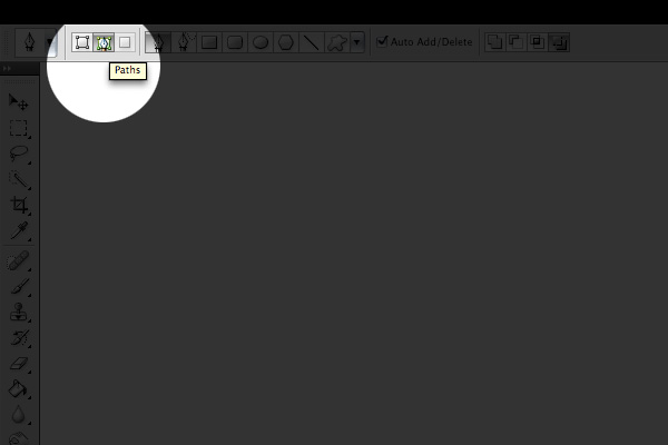 Using the Rectangle Tool, create a rectangle (Size: 480px by 280px). Tip: To give a shape a fixed size, access the panel in the Options bar. 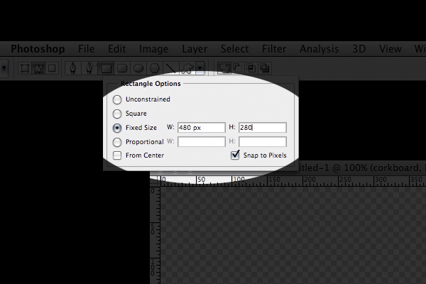 Right-click on the rectangle and select Make Selection. Tip: CTRL or CMD + ENTER as a substitute for right clicking on a path and selecting Make Selection. Make your Foreground Color #a37d54 and your Background Color #4e2f0d. These two colors are shades of brown but feel free to choose similar colors. To produce the corkboard texture. Go to Filter > Render > Clouds then deselect the selection and always deselect a selection afterwards. Tip: CTRL or CMD + D as a substitute for deselecting a selection. Continuing on; go to Filter > Sketch > Note Paper (Image Balance: 32, Graininess: 11 and Relief: 12). Go to Filter > Brush Strokes > Spatter (Spray Radius: 15 and Smoothness: 10). Lastly, let’s give it a darker color, go to Image > Adjustments > Shadows/Highlights (Shadows – Amount: 50%, Tonal Width: 83%, Radius: 208px. Highlights – Amount: 0%, Tonal Width: 50%, Radius: 30px. Adjustments – Color Correction: +20, Midtone Contrast: -17.) The image below is the result. 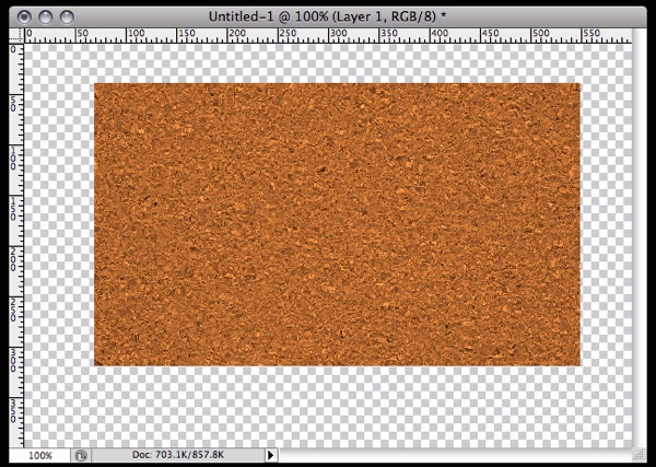 Step 2 – The Corkboard Wooden BordersIn this step, we will produce the wooden borders of the corkboard. Make a new layer below the layer "corkboard" and rename it as "borders". Using the Rounded Rectangle Tool, create a rounded rectangle (Size: 502px by 302px and Radius: 10px.). Right click on the rectangle and select "Make Selection". Tip: ALT + BACKSPACE to fill in a selection with the current Foreground Color. CTRL or CMD + BACKSPACE to fill it in with the current Background Color. Fill in this rectangle with the color #4e2f0d then deselect the selection. Tip: To select two or more layers, SHIFT + CLICK on them. Tip: To center two or more layers with each other, select the layers to be aligned, choose the Move Tool, in the Options Bar, click the Align horizontal centers and the Align vertical centers buttons: 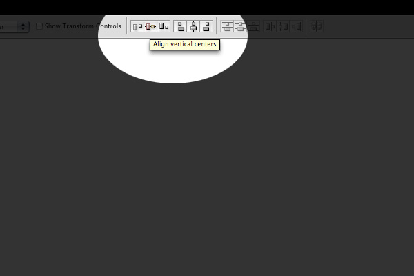 Now, center both the layers "corkboard" and "borders". The image below is the result.  Step 2 – The Corkboard Wooden Borders – Corner Gaps GuidelinesIn order to make each side of the borders look authentic, we need to create gaps in between their corners. The guidelines we’ll make in this step will be used to properly select each side of the borders and putting them on different layers. You will need to apply the procedures in this step on all corners of the corkboard. Create a new layer above "borders" and below "corkboard" then name it "diagonal border lines" or something similar. We will use these lines as guidelines to create the diagonal gaps mentioned above. Zoom into your image and using the Pen Tool, hold SHIFT and create a 45 degrees angled diagonal path on the top right corner as shown below. 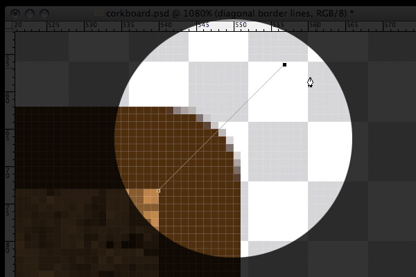 Tip: Make sure the Brush Diameter Size for the Pencil tool is 1px. 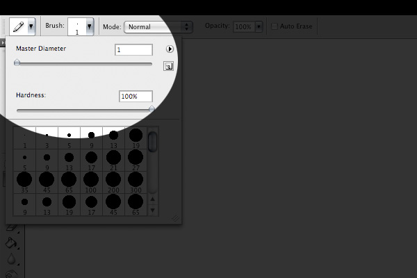 With the Pen Tool and layer "diagonal border lines" selected, right click, select Stroke Path, select Pencil from the dropdown menu, click OK then right click again and choose Delete Path. 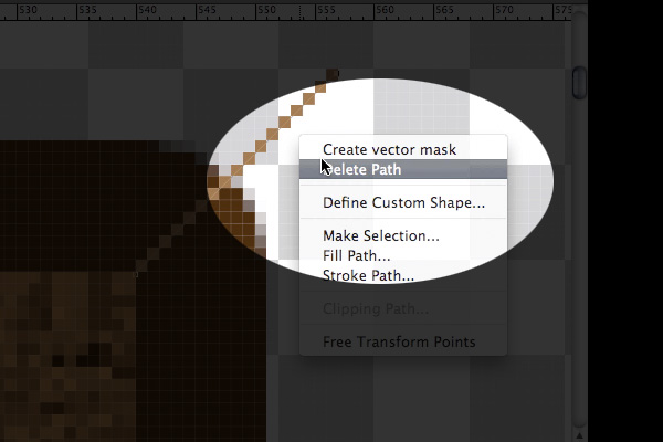 Repeat Step 2 on all the other sides of the corkboard. Step 3 – The Corkboard Wooden Borders – Separating The BordersUsing the diagonal lines we have just made, let’s use them as guidelines to select the right border of the corkboard with the Pen Tool. After having the right border selected with the Pen Tool, right click and choose Make Selection. 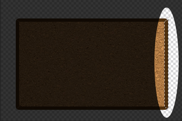 In order to put the right border on a new separate layer, with the layer "borders" selected, duplicate the layer. Rename the newly produced layer to "border right". Repeat Step 3 on all the other sides of the corkboard. After doing this, you should have each border of the corkboard on separate layers. So, now, we can delete the layers "diagonal border lines" and "borders". 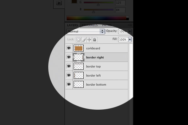 Step 4 – The Corkboard Wooden Borders – Applying The GradientsIt’s time to apply some gradients onto our borders. Let’s start with the right border. Tip: In order to access the Blending Options of a layer, right click on that layer and choose Blending Options. Tip: To add a new gradient slider, place your cursor right below the gradient preview. 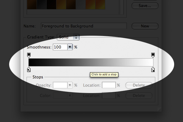 In the Blending Options for the layer "border right", apply a Gradient Overlay (Angle: 0 degrees, First Gradient Slider: #e77d15, Second Gradient Slider: #f69834, Third Gradient Slider: #804504). Now, the layer "border top", apply another Gradient Overlay (First Gradient Slider: #e77d15, Second Gradient Slider: #f4942d, Third Gradient Slider: #d16f04). Next, the layer "border left", apply another Gradient Overlay (First Gradient Slider: #0d550e, Second Gradient Slider: #f4942d, Third Gradient Slider: #d16f04). Lastly, the layer "border bottom", apply another Gradient Overlay (First Gradient Slider: #6e3c0b, Second Gradient Slider: #f4942d, Third Gradient Slider: #d16f04). The image below is the result. 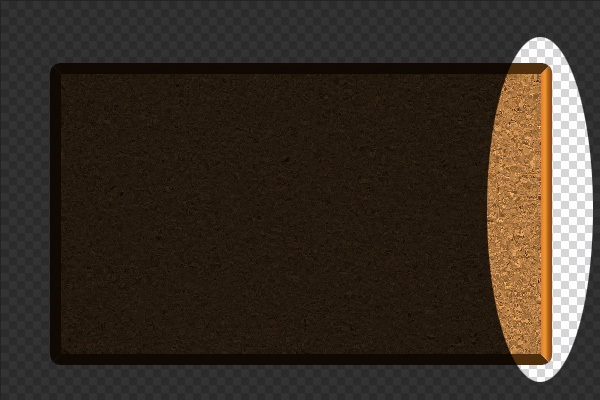 Step 5 – The Corkboard Wooden Borders – Applying The TextureRemember, you will have to repeat this step on all the other sides of the corkboard. Duplicate the layer "border right", right click on the new duplicated layer that should be named "border right copy" and choose Clear Layer Style. Tip: CTRL or CMD + J to duplicate a layer. Tip: CTRL or CMD + CLICK on the thumbnail of a layer to select its contents. Select the contents of the layer "border right copy" (CTRL or CMD + CLICK on the layer thumbnail). Fill in the selection with the color #d48631. Go to Filter > Noise > Add Noise (Amount: 33.03%, Gaussian and Monochromatic). Go to Filter > Blur > Motion Blur (Angle: 90 degrees and Distance: 24 pixels). Here is the fun part; we will make knots on our wooden borders. Go to Filter > Liquify (Brush Size: 8, Brush Density: 50 and Brush Pressure: 100). Using the crosshair in the Liquify window, pull, stretch and swirl the contents of the layer "border right copy" to make wooden knots. Tip: You can change the opacity of a layer in the Layers panel: 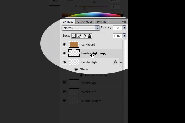 Lower the opacity of the layer "border right copy" to 50%. Rename this layer "border right wooden texture", group it with the layer "border right" and rename the group as "border right". The image below is the result. 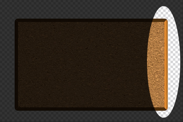 Repeat Step 5 on all the other sides of the corkboard. Step 6 – The Corkboard Inner ShadowLet’s add a slight shadow on the top of the inside of the corkboard. In the Blending Options of the layer "corkboard", apply an Inner Shadow (Blend Mode: Normal, Color: #000000, Opacity: 100%, Angle: 90 degrees, Distance: 1px, Choke: 0%, Size: 3px). The image below is the result. 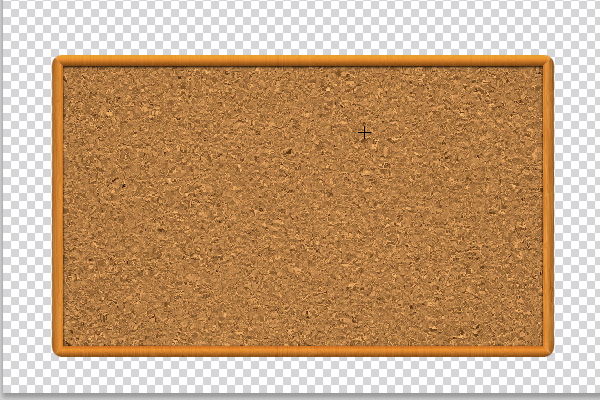 Step 7 – The PaperMake a new layer and rename it as "paper". Choose the Rectangular Marquee Tool and make a selection as below: 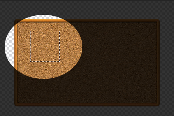 Select the layer "paper" and fill in the selection with white. In the Blending Options of the paper layer, apply a Gradient Overlay (First Gradient Slider: #d1d1d1, Second Gradient Slider: #ededed). Then, apply a Drop Shadow (Opacity: 100%, Angle: 90 degrees, Distance: 1px, Spread: 0%, Size: 5px). Right click on the layer "paper" and select Create Layers. Click OK when you see this dialog:  Step 8 – The Paper – Bringing it Into LifeThe key tool used here is the Warp Tool. Tip: CTRL or CMD + T to bring out the Free Transform Tool, right clicking on the selection and choose Warp to access the Warp Tool. Select the layer "paper" and access the Warp Tool. Grab the bottom right of the paper and pull it up so that it seems like wind is blowing it. 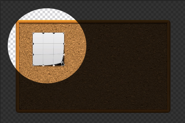 Pull all the other corners. The image below is the result. 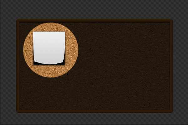 Step 9 – The Paper – HighlightsNow, we’ll create some highlights on these corners. Tip: Command + ALT + SHIFT + N to make a new clipping layer on the currently selected layer. 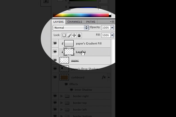 Tip: Drag a layer in the Layers panel to move it below or above another layer. 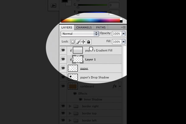 Make a new clipping layer right above "paper’s Gradient Fill", rename it as "highlight bottom right", click the Blending Mode dropdown menu and choose Screen. 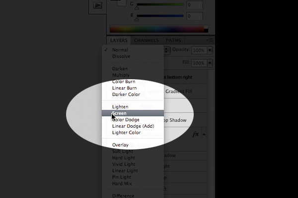 Tip: The Gradient Panel looks like this: 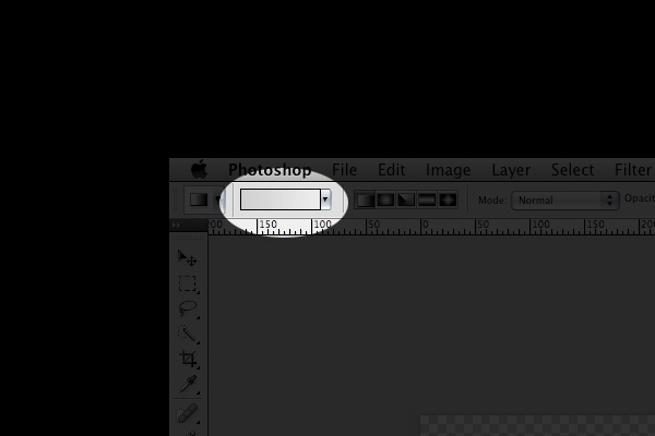 Select the Gradient Tool, click the Gradient panel and apply a gradient (First Gradient Slider: #000000, Second Gradient Slider: #ffffff, Third Gradient Slider: #000000). Drag out a gradient on the bottom right corner of the paper as shown below: 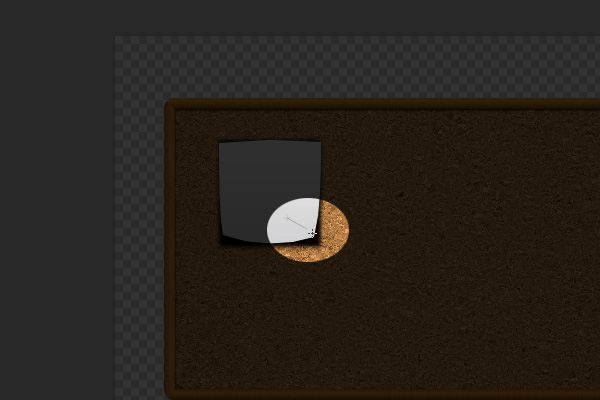 Use the Free Transform tool to resize, modify and rotate the highlight. You could also lower down the opacity of the highlight to make it look more believable. Make more highlights on the other corners of the paper. The image below is the result. 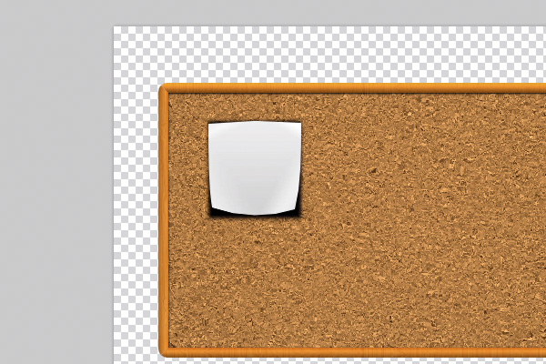 Step 10 – The Paper – ShadowsNow, to make the shadow of the paper more realistic. Select the layer "paper’s Drop Shadow", move the shadow down a few pixels and lower down the Opacity to 60%. Just like we did on the paper, warp the shadow as shown below: 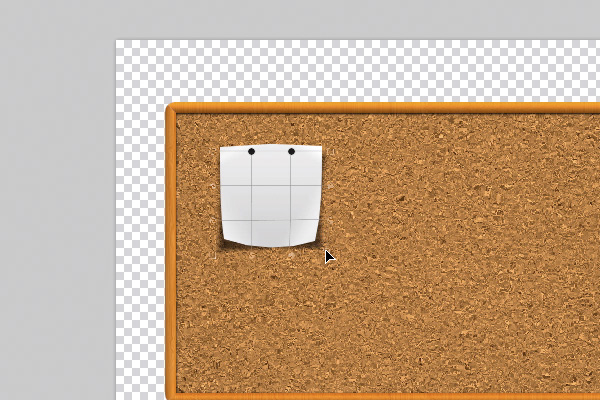 The image below is the result. 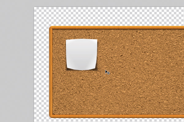 Step 11 – The Paper – Scribbling The TextLet’s write something on the paper. Make a new layer, select the Text Tool, choose a handwriting type of font, we chose "Journal" (Size: 26px), change the color of the font to #414040 and start typing some text on the paper. The image below is the result. 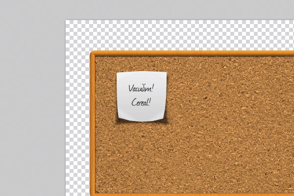 Stay Tuned for Part IIIn the final Part II of this series we’ll place more elements on our board and finalize this design.
|
| You are subscribed to email updates from Psdtuts+ To stop receiving these emails, you may unsubscribe now. | Email delivery powered by Google |
| Google Inc., 20 West Kinzie, Chicago IL USA 60610 | |
0 comments:
Post a Comment