PSDTUTS Updates |  |

- Create a Nature Inspired Surrealistic Room in Photoshop
- I Can’t Believe it’s Gone Premium!
- Psdtuts+ is Looking for Designers to Create Quick Tips
- How to Create a Fun, Red-Haired Boy Character – Screencast
| Create a Nature Inspired Surrealistic Room in Photoshop Posted: 05 May 2010 05:30 AM PDT Creating a surreal image composition in Photoshop often involves mastering the various techniques and tools that Photoshop has to offer. In today’s tutorial we will demonstrate how to create a surreal nature inspired room using many of Photoshop’s most useful and popular tools. When we are finished you will have learned how to create a room with realistic water as its floor, real clouds on the walls, and a boat floating in the water with waves crashing in its wake.
Final Image PreviewLet’s take a look at the image we’ll be creating. Want access to the full PSD files and downloadable copies of every tutorial, including this one? Join PSDTUTS PLUS for just $9/month. You can view the final image preview below or view a larger version here. 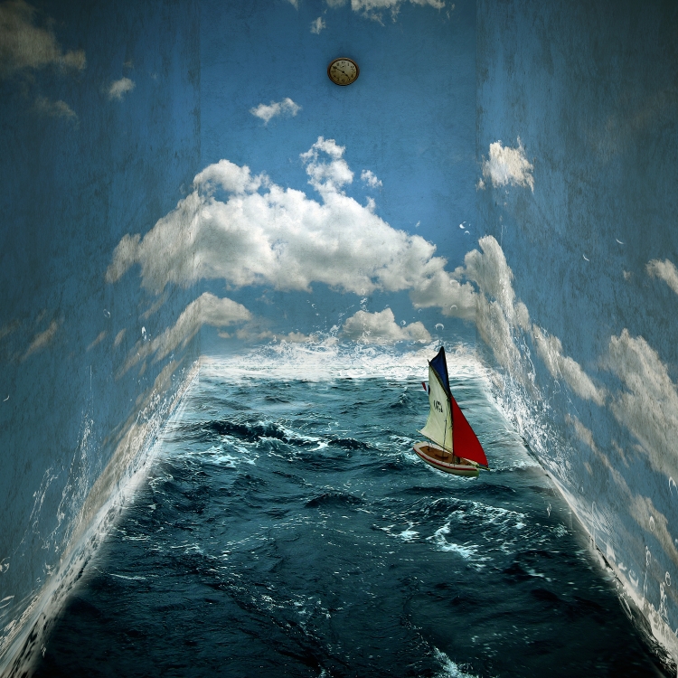 Resources
Step 1: Creating a New FileCreate a new file that is 3000 x 3000 pixels, 300 dpi, 8 bit RGB Color, with a Transparent Background. 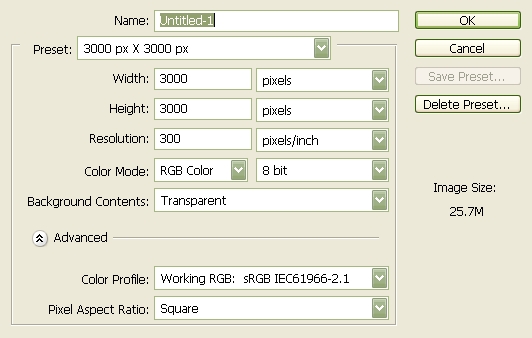 Step 2: Create the WallsTo start off, let’s open Big Blue Sky. We will be using this to create the walls of our room. So let’s transfer it to our 3000 x 3000 layer. Click our stock image, press (M) to activate our Marquee tool and select the sky; making sure to leave the trees outside the marquee box, once you’ve done that press (V) and drag the selected part of the image by holding down the left mouse button to our canvas. See example below: 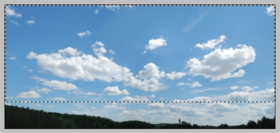 Decrease the size of the Blue Sky image to fit our canvas. Activate our ruler by pressing Cmd+R. Now that the ruler is active, create a guide at 5.3 in. See image below: 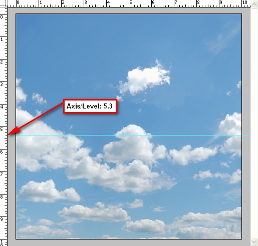 Press Cmd+T to transform our image. Resize it to come up with something similar to the image below: 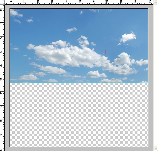 Now it is time to create the room’s perspective. Let’s set the navigator to 15% so the ruler would be counting in 1’s. See image below: 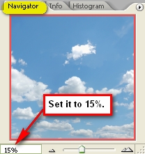 Activate your marquee tool and use it to select the area from axis 5.3 in of the ruler on the left to axis 3 in on the top ruler. An example is shown below: 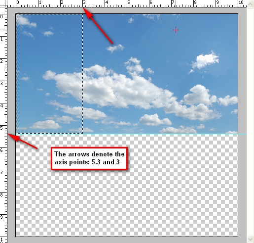 Now use the transform tool and right click anywhere on the canvas and left click on the Distort tool. Follow instructions as seen on the image below: 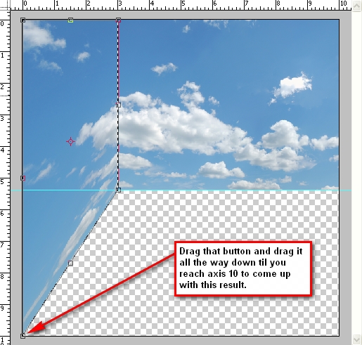 Do the same thing on the axis 5.3 in below and axis 7 in to 10 in on the top ruler. See instructions on the image below: 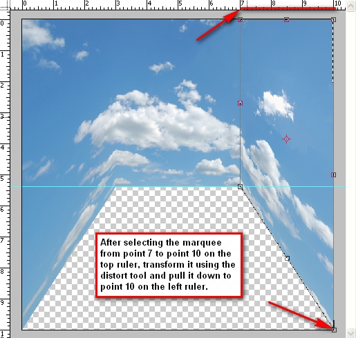 Step 3: Adding Texture to the WallsIn this Step, we will be adding a texture to the very flat looking wall. We will be putting the texture over the clouds to give it a feel of a dirty wall. Let’s open our 18 Vintage Photoshop Brushes. (Note: After downloading this brush set, extract it to ABR file to “Adobe Photoshop > Presets > Brushes”) We will need to apply the brush on a clean layer so create a new layer. Press Cmd+N or click on the “Menu bar’s Layer > New > Layer.” You may also create a new layer by pressing the paper button located on our Layer Window. Be sure to rename our new layer as “Wall texture: middle” Changing the layer’s name is easy, just click on the words Layer 1, double click on it and there you have a new name for it. Press (B) to activate your brush tool and right click anywhere in the image and click on the button that resembles the play button on audio players then left click on Replace Brushes. Replace your current brush set with our “18 Vintage Photoshop Brushes” which should appear as “vintage-paper-brush” in your Photoshop Brushes folder. Don’t worry you may revert back to your original brush set by loading your choice of brushes or if you’d like to use the original Photoshop brushes just click on the play button again and click on Reset Brushes. Now you see the brushes have been replaced. We will be using only one of the 18 brushes. The other brushes are nice but the one that I picked fits well with our image. With the proper opacity, it would make our wall look really convincing. Click on the brush that has a size of 1650px. See image below: 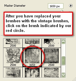 Once you’ve clicked it, the brush will appear on screen ready to be stamped to our canvas. Notice that the brush is on a horizontal position? We need to flip it to a vertical position. First set your brush Opacity to 100%. Set the Brush color to this value: #494949 on the color picker. See Reference below: 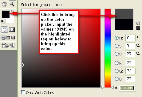 After that, apply the brush anywhere on the image. Next, transform the image by pressing Cmd+T and Rotate 90 degrees CW. Once it has been rotated let us transform it again to make it fit the wall. Be sure to activate the ruler since we will need it throughout. Transform the image and align its width from the axis 3in to 7in on the top ruler and be sure its height is in the axis 5.3in on the left ruler. Reference is below: 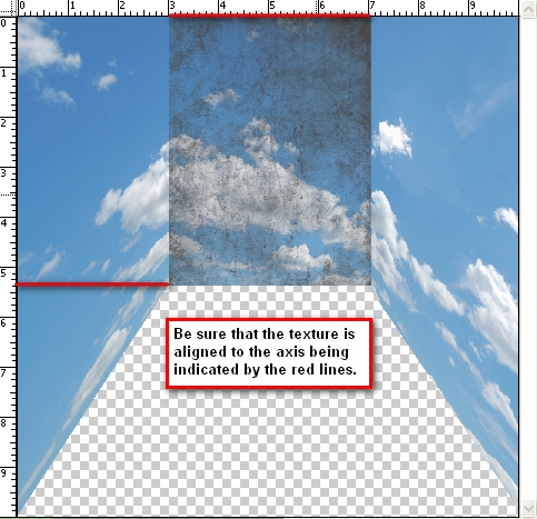 After doing that, transform the image and click Flip Horizontal. Now let’s lower the layer’s opacity. Go to the Layer Window and change the Opacity to 25%. To create the texture for the wall on the left just duplicate “Wall texture: middle” press Cmd+T and click Flip Horizontal and then rename it to: “Wall Texture: Left” We will need to distort it to fit the wall, so let’s transform the image and use the Distort Tool. Distort the texture like we did with our sky image earlier to fit the wall and make sure to align it to axis 10in on the ruler on the left. Set its opacity to 50%. See reference below: 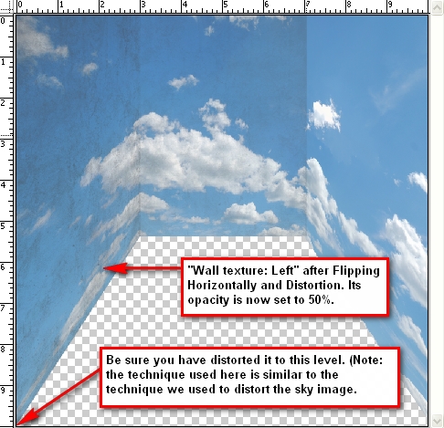 For the wall on the right just duplicate “Wall Texture: Left” rename it to “Wall Texture: Right” and drag it using your Move Tool (V) to the right. It should now look like this: 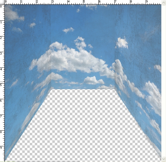 Group all the Wall textures to keep things organized. To create a group, “go to Layer > New > Group” and name it “wall textures.” Let’s darken some parts of the wall to enhance the contrast and appearance. Activate your Burn tool by pressing (O) and clicking on that tool to bring out the menu shown on the image below for instructions: 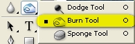 Set the Burn tool values to the following:
The reference below shows the region to be burned or darkened. 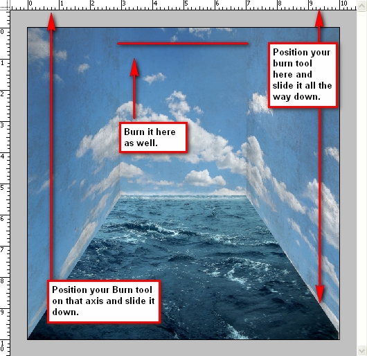 Step 4: Creating the FloorFor our floor, we will be using the image Stormy Sea. Open the file, use the marquee tool and select the sea and drag it to our 3000 x 3000px layer and put it under all the layers that we have created. Transform it to fit the canvas and make it look like the room’s floor. See reference below: 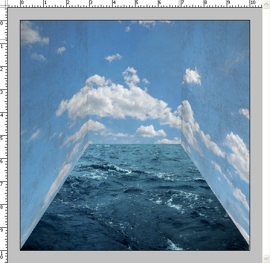 Step 5: Creating the WavesA sea without waves wouldn’t look or feel like a real sea right? So let’s add some waves on the walls to make it feel an authentic sea. Create a new layer, name it “wave1”. Activate your brush tool and replace it with the brush set: Waves Brush by anaRasha. When it opens, pick the wave brush which has a size of 600px. Press (D) to revert the foreground color and background color to its normal state which is black and white and then press (X) to revert back it to their original position. You should now have the color white selected. Press (B) again to activate the brush. Use these brush values:
See image below for instructions: 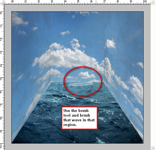 Rotate the image by pressing Cmd+T and clicking Rotate. Rotate it so that is it straight and aligned with the sea; right click on that selected area and stretch the image (press free transform and stretch it) so it fits perfectly with our floor. Instructions are shown below: Next, let’s create a new layer for our new wave and name it “wave2.” We will be putting this on the right wall. In total there will be 13 waves. Activate your brush tool, make sure that the brush setting you’re using is still the Waves brush by anaRasha and click the wave brush with the size: 526px. Do not change the brush size, just use the default size and then brush it over the right wall, just beside “wave1.” Make sure to rotate it to be aligned with the wall. Press Cmd+T to transform it once again and this time click Scale, for we will be resizing it to be aligned until axis 8 of the left ruler. Just erase the unwanted waves that appear. I would recommend using an Eraser Hardness of 0% and a Opacity of 100%. You can do that by clicking the Eraser tool or pressing (E) and then changing the Hardness to 0%. See reference below: Create a new layer and name it “wave3.” Open your brush tool again and click on the wave brush which has the size 461px. Use the default size and brush it over the right wall just in line with “wave2.” (You can move it using the Move tool or V) Remember to erase the excess waves. See image below: 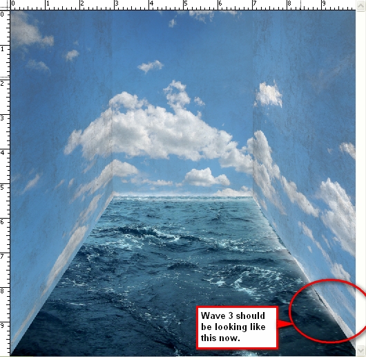 Create a new layer for “wave4.” Use the same brush we used for “wave3.” Brush it on the right wall just beside “wave3.” Remember to rotate it to be aligned with the present waves and erase the excess waves that you see. See image below: 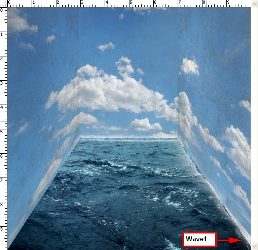 Now for the left wall, just duplicate “wave2” and “wave3” and align them to the left wall. Do the necessary rotations to align it with the wall. See reference below: 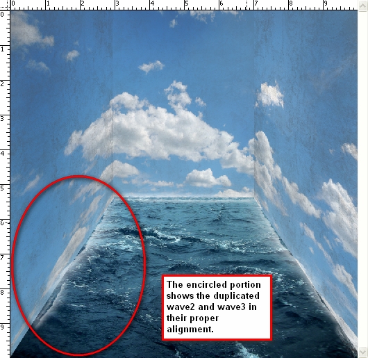 Step 6: Creating the Splashes on the WallsNow we will be creating the splashes on the walls. Activate your brush tool and replace the current brushes with the Water Effects brush by fiftyfivepixels. We will be adding some authentic-looking water splashes with the help of these brushes. Create a new layer and name it “wave5.” Activate your brush tool once again (Take note that the brush opacity should still be set to 100%) and follow instructions from the image below: 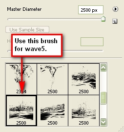 Change the brush size to 1411px and brush it over “wave1.” Erase the excess waves. The result should be similar to this: 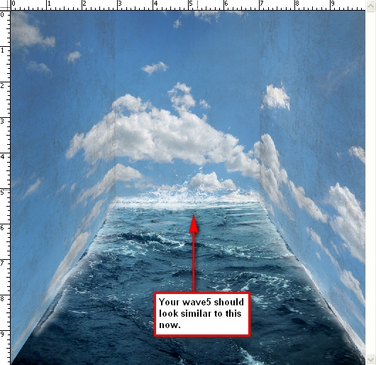 Create a new layer and name it “wave6.” Open your brush tool and select the brush indicated by the image below: 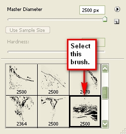 Once you’ve selected your brush, change its size to 1014px. Brush it on the left wall over the duplicated “wave2” and “wave3” layers. Then use your Distort tool via the Transform tools and distort the layer so it is aligned to the wall, making it look like it is splashed on the wall. The result should look something like this: 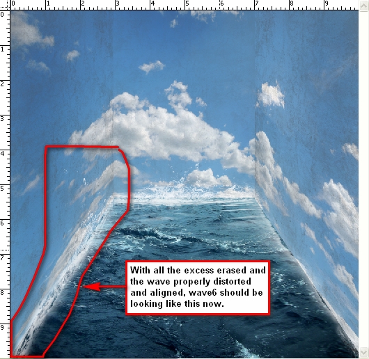 Create another layer and name it “wave7.” Pick the brush as shown in the image below: 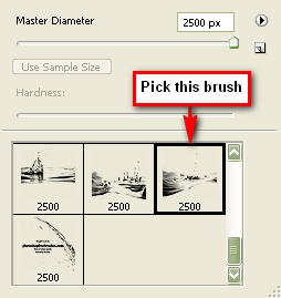 Use the default size which is 2500px. Apply the brush in this manner as seen in the image below: 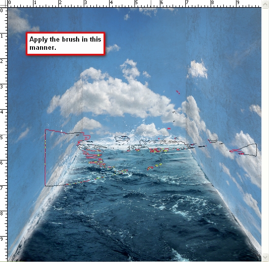 Remember to erase the unwanted waves. The result should be similar to this image: 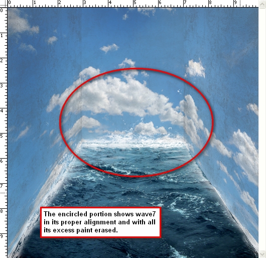 Create a layer and name it “wave8.” Pick this brush from the brush palette (waves brush by anaRasha) as seen in the image below: 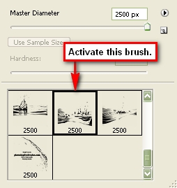 Apply the brush like this: 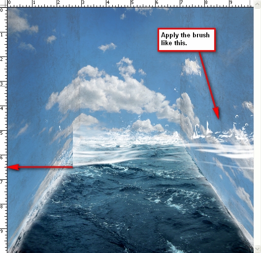 Now we will be distorting “wave8”, this will be a bit tricky so pay close attention to the images shown below: 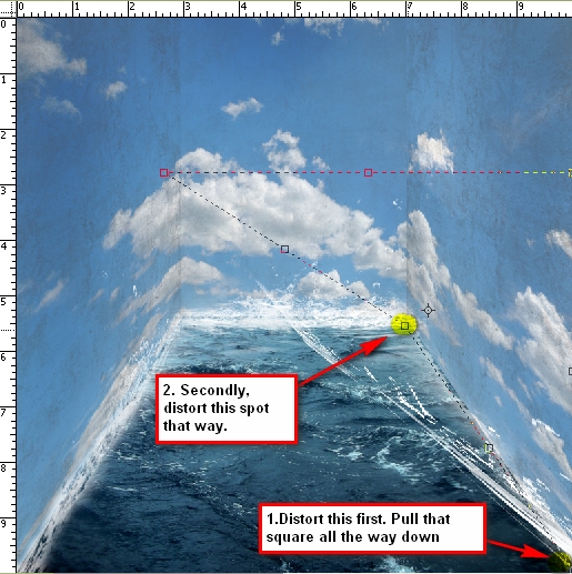 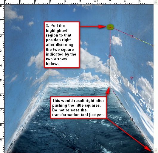 Erase the excess waves. 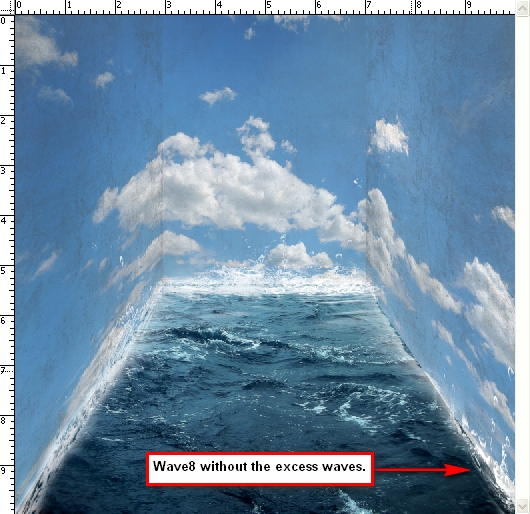 Create another layer and name it “wave9” and pick the brush as shown in the image below: 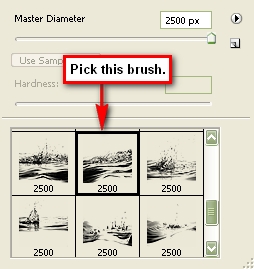 Use its default brush size which is 2500px and apply it to the image as shown below: 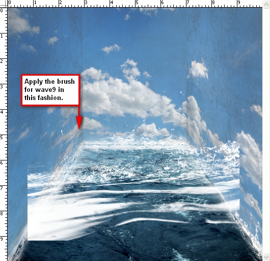 Hit the Cmd+T key (transform tool) and click on Distort. We will be using the same distort technique as we used in “wave8.” See reference below: 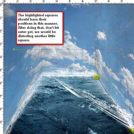 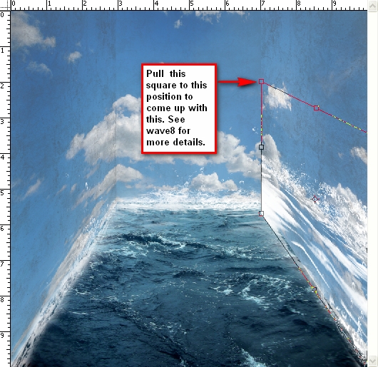 Erase the excess waves to come up with an image similar to this: 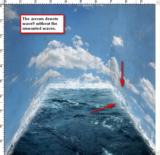 Create a layer and name it “wave10.” The brush that we will use is shown in the image below: 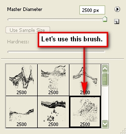 Apply the brush on the center of the image without changing the brush size, and then activate the Transform tool and click Rotate 90 degrees CW. Resize it and move it to the right wall – to where “wave 9” is located. After you’ve done that, transform the image by using the Distort Tool so it would be aligned to the right wall. Scale it to the size of “wave9.” See image below for instructions:  Duplicate “wave10”, activate the Transform tool and click Flip Horizontal. Move the duplicated layer using the Move Tool to the spot shown in the image below: 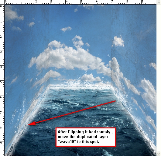 Step 7: Inserting the Boat and the ClockNow that the background is complete, let’s add our subjects. Open Clock by Mind IllusionZ. We’ll be using the Polygonal Lasso Tool to separate the clock from its background. Now, activate the Polygonal Lasso Tool (L). You’ll find it in the Tools Window just below the Marquee Tool. See reference below: 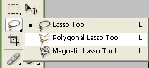 Now that you’ve cut the clock, let’s move it to our canvas by using the Move Tool (V). Rename the layer to “clock.” Activate the Transform tools and scale it down to the level shown in the image below: 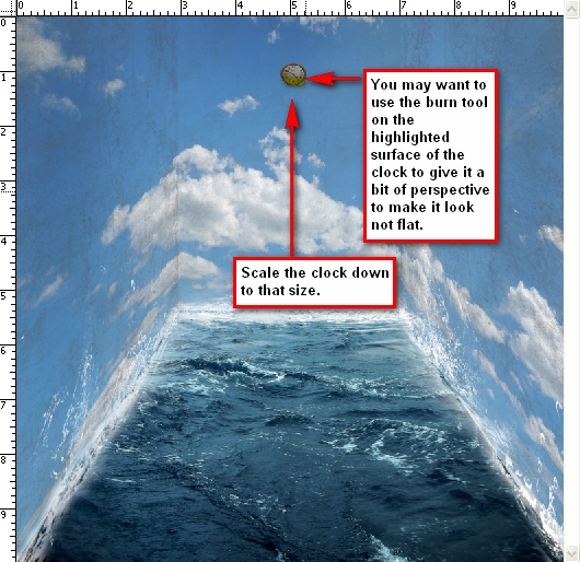 Create a new layer and put it under the clock’s layer and name it clock’s shadow. We will be adding some shadows to the back of the clock to give it depth and to reduce its flatness. Activate your brush tool and right click on the image to bring up the menu and click Reset brushes. Resize your brush to 150px (recommended) and then set its opacity to 25%. See reference below: 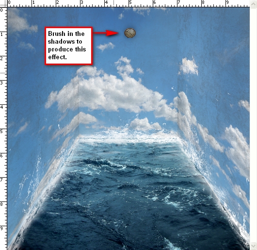 Now let’s add the boat. Open Toy Boat and cut it out from its background using the Polygonal Lasso Tool. Once you’ve done that move the boat using the Move tool to our canvas and put it on top of all the layers. We will need to change its Brightness/Contrast, so select the boat’s layer and “go to Image > Adjustments > Brightness/Contrast.” Set its values to:
Then Flip the boat horizontally via the Transform tool. Scale it down to the level shown in the image below: 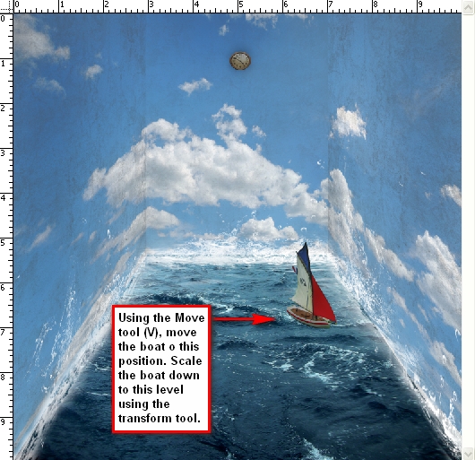 Now let’s add waves to boat. Click the Stormy sea layer which is located under all the layers and activate the Clone Stamp tool (S). Use these values:
See the image below for instructions on where to clone: 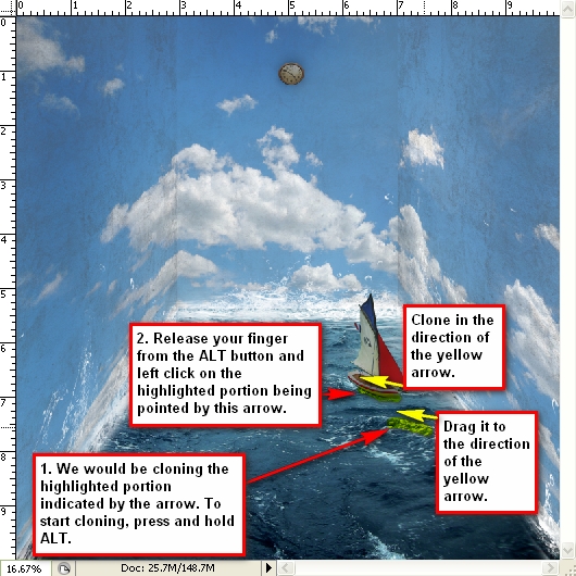 Step 8: Retouching the ImageTechnically, our image is complete but let’s spice it up a bit more. First let’s add more shadows to the walls to give it some more contrast. Create a new layer and name it “shadows.” Just put it under the boat’s layer. Activate your brush tool and use these values:
You’ll need a huge brush for this. I would recommend using a brush size of 1400px. See image below for reference as to where we would add the shadows: 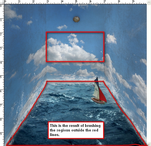 Let’s create a Gradient Map to increase the image’s contrast. “Go to Image > Adjustments > Gradient Map” or you may click on the Create a New Adjustment Layer button (circle button) just beside the “Create a Group” button in the Layer window. See the reference below for the shortcut: 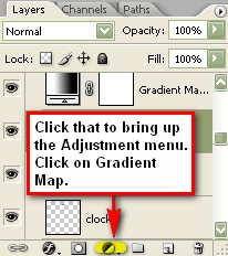 Once you have the gradient map on your Layer window, you will notice that the whole image turns into a high-contrast Black & White image. We don’t want that; so click on the Blending Mode which is found on the Layer window. Click on the word Normal to bring up the menu and find the setting labeled: Luminosity which is found in the bottom most part of the menu. Set the Opacity of the Gradient Map to 100%. The result should be similar to this: 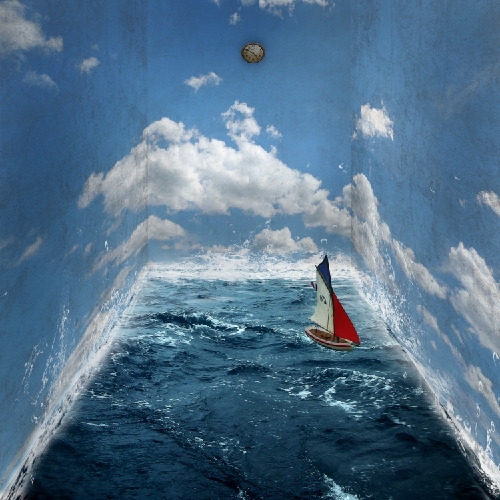 Now let’s make the image a little bit darker to increase its impact. We will be using the curves tool. Click on the “Create a New Adjustment Layer” button and input these values:
The result should be similar to this: 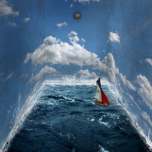 Step 9: Creating the VignetteLet’s create a vignette to further enhance the perspective of the image. To do that, we need to create a new image. “Go to File > New or press Cmd+N.” Use the same settings as the current image. Create a new file with the same settings as with our canvas except that the background contents should be white (Refer to Step 1) Once it has been created, “go to Filter > Distort > Lens Correction.” Find the tab Vignette and use these settings:
Drag that vignette layer to our original image and put it on top of all the layers that we’ve created, and then use these settings:
You can adjust the opacity if you wish but I would strongly recommend 75%. Notice that the bottom part of the image seems a little dark. Use your Eraser tool to erase it. Make sure to use the following values.
See image below to see where you will need to erase. 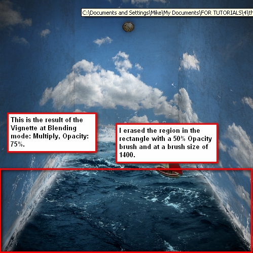 Step 10: Giving the Image Another RetouchAt this point our image is mostly complete but let’s add some finishing touches for good measure. Increase the image’s contrast. Click on the Create a New Adjustment Layer button and pick Brightness/Contrast and enter these values:
Now let’s adjust the Color Balance. Click again on the Create a New Adjustment Layer button, and pick Color Balance and enter these values respectively:
Create another Gradient Map from the Adjustment layer button and set it to Luminosity, Opacity: 25%. Adjust the Brightness/Contrast once again but input these values:
Let’s add more Cyan and Yellow to our image. Create another Color Balance Adjustment Layer from the Adjustment Layer button and input these values respectively:
You may also want to lower the Opacity down to 70% so it is not too green.
Step 11: Sharpening and Saving as PSDGo ahead and save your file. We can further enhance this image by sharpening it. “Go to Filter > Sharpen > Smart Sharpen” and input these values:
ConclusionTake a look at the final image that we created. Subscribe to the PSDTUTS RSS Feed for the best Photoshop tuts and articles on the web.
|
| I Can’t Believe it’s Gone Premium! Posted: 04 May 2010 05:47 PM PDT Tuts+ Premium just got more awesome. Cgtuts+ and Activetuts+ have now joined our Premium program. Your Premium Membership already grants you access to the best and most in depth Photoshop, web development, vector, audio and After Effects tutorials and files. With CG Premium and Active Premium, you now have access to high-end computer graphics, Flash and ActionScript tutorials and source files. We now offer 7 Premium programs for $9 a month. That’s $1.29 per Premium program, per month. You’ll get up to 28 new Premium tutorials and downloads in total each month as part of your membership. You'll also get instant access to 283 exclusive tutorials and 716 source files – and counting – already available to Premium members. Make sure you’re getting the best and most valuable education you can and say thank you to Tuts+ – become a member. Want to know more? To kick-off CG Premium, members will instantly get access to a brand new tutorial exclusive for Premium members. In it, you'll learn how to Model, UV, and Texture a Mac-10 Submachine Gun
Over the course of this 10 hour monster of a tutorial, you will gain access to time saving professional gun modeling tricks and techniques that are universal to any 3d modeling application. We’ll give you an in-depth look at using the revolutionary and intuitive Headus UVLayout to quickly and effectively lay out all of the gun’s UVs, and finally, some tried tested and true texture painting techniques that use a careful balance between diffuse, specular, and bump maps to create realistic and convincing final metal textures. Learn the Secret to High-End CG Weapon CreationFollow professional CG artist, Ben Tate, as he demonstrates his entire process of modeling, UV mapping and texturing an extremely high quality Mac-10 submachine gun. In the first part of this mammoth series, we will discuss a variety of efficient and innovative modeling techniques to create a medium density model. You will learn how to break the model down into into its respective parts in the blockout stage, and the approaches and tools to use when crafting the more complex shapes and parts. We’ll also discuss where and where not to use subdivision modeling to speed things up further. This tutorial is intended for intermediate to advanced CG artists who are looking to take their skills up a notch, or maybe learn a new trick or two. 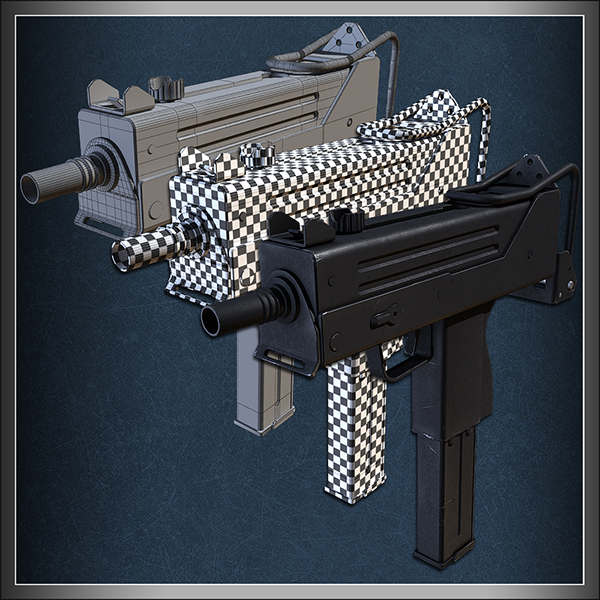
Build an OOP Based Turntable in AS3You’ll build a turntable with controls which will allow users to view and rotate an object in 360°. You’ll use Object-Oriented Programming techniques so that you end up with a class (in a package) that can be re-used from project to project. Professional and Detailed Instructions InsidePremium members can Log in and Download! Otherwise, Join Now! Here’s a taster of what you can expect from this tutorial.  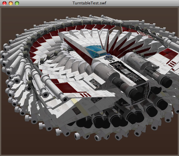  Our Premium tutorials will be added weekly in addition to our existing publishing schedule. Once you’re a member you can log in at the Tuts+ Dashboard and go to Premium Content to get started.
|
| Psdtuts+ is Looking for Designers to Create Quick Tips Posted: 04 May 2010 01:20 PM PDT Quick tips are 3-5 minute screencasts, short articles, or short 6-10 step tutorials on how to do something simple, quick, but useful. There are lots of tips, tricks and techniques that can be packaged into brief educational material. Read on if you have some ideas for submitting a Quick Tip to Psdtuts+, we’d love to hear from you.
Submitting Quick TipsWe post numerous quick tips each week, and pay $50 USD as the base rate for these. Following is information on creating these. You can learn more on our updated page: Submit Tutorials, Tips, Articles, or Other Content. Quick Tip: Short Written TutorialsSee our Written Tutorials section for information on putting together a written tutorial. Quick Tip tutorials are similar, except these are shorter and more focused (6-10 steps). Here is an example: Quick Tip: Screencast/VideosSee our Video (Screencast) Tutorials section for information on putting together a video/screencast tutorial. Quick Tip screencasts are similar, except these are shorter and more focused (3-5 minutes). Here is an example: Quick Tip: ArticlesSee our Articles section for information on putting together written articles. Quick Tip articles are similar, except these are shorter and more focused (around 500 words). Here is an example: Submit a Quick Tip Concept for ReviewYou can send in for review a single JPG image, and a short paragraph quick tip pitch, prior to writing or recording your quick tip. You can do this by following this link: Submit a Completed Quick TipOnce you’ve finalized your work, completed quick tips can be submitted here: In cases where the final file is larger than 15mb you can contact the editor through the Psdtuts+ Preview Submission Form and discuss sending the file via a service like yousendit.com. Other ContentThere is quite a bit of diversity of content we publish on Psdtuts+, and we’re expanding all the time. Learn more about writing tutorials, putting together articles, or recording screencasts, in addition to making Quick Tips on our updated page: Submit Tutorials, Tips, Articles, or Other Content.
|
| How to Create a Fun, Red-Haired Boy Character – Screencast Posted: 04 May 2010 08:30 AM PDT In today’s screencast we will revisit a tutorial by Anastacia Sholik that demonstrates how to illustrate a fun red-haired child in Adobe Photoshop. This tutorial shows how to use shapes, layer styles, brushes, and other tools and effects to add dimension of depth to our character.
View the written version of this tutorial How to Create a Fun, Red-Haired Boy Character
|
| You are subscribed to email updates from Psdtuts+ To stop receiving these emails, you may unsubscribe now. | Email delivery powered by Google |
| Google Inc., 20 West Kinzie, Chicago IL USA 60610 | |
0 comments:
Post a Comment