PSDTUTS Updates |  |

- Creative Illustrative Lettering Challenge – Part 1
- 60 Spectacular Examples of Photoshop Design and Art
- Win $1000 by submitting work to Creattica!
- Quick Tip: Create a Carbon Mesh Background in Photoshop
| Creative Illustrative Lettering Challenge – Part 1 Posted: 26 May 2010 05:08 AM PDT
This session we proposed a challenge to two illustrators. We asked each of them to take our own “tuts+” brand name and illustrate it with a creative lettering solution. Learn how each of them went about solving this, and the concepts they worked with to bring about the final work. In this Part 1 of this challenge, we’ll look at Wojciech Pijecki’s solution and how he combines expressive and abstract concepts, with lots of colorful elements, transforming this brief into a vibrant work of art.
This Post is Day 10 of our Illustrative Lettering Session. Creative Sessions About this ChallengeInspiration for doing this challenge came from the awesome “tuts+” solution presented in the post PsdTuts+ Presents: Exclusive Wallpapers By Tim and Bram Vanhaeren. We decided to give two illustrators a creative illustrative lettering challenge that involved illustrating the “tuts+” name. Let’s take a closer look at the brief and then look at the solution from Wojciech Pijecki here on Psdtuts+. In part two we’ll look at how Jacob Bian solved the same brief with a more 3D feel over on Cgtuts+. Creative Brief for this ChallengeFor this challenge, we kept the brief simple, which would allow for the illustrators to really go in a creative direction that inspires them:
We also sent along some basic formatting requirements as well: “For format it should be made reasonably large scale, but display well at 600px wide. We’ll then link to the larger version for viewers to see. Also, please include a written description of how you solved the creative brief and present your solution.” Wojciech Pijecki’s Solution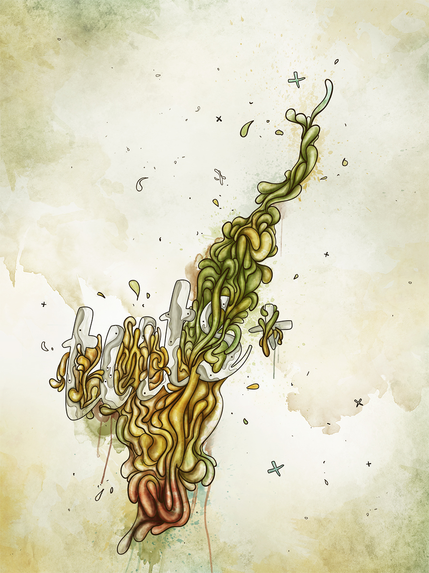 Wojciech’s Description of His Creative Solution I wanted to create expressive abstraction, combining simple type treatment with lots of various elements. The first step to solve the brief was proper preparation. Before anything started, I took the theme and searched for the best resources. As it says “lettering,” I decided that the font must be pretty neat and mixable with some abstract elements. Also, as the topic says “illustrative,” there must be something eye-catching besides the lettering. So here was the preparation solved: good brushes, textures and font. It’s worth remembering, when speaking about a creative solution, one thing is sure: the design has to be noticeable, eye-catching and spectacular. It’s never easy to get the idea “how should it look like.” Sometimes it just hits your head right after reading the brief and design theme. But anyway, everything goes around experimenting with different elements, shapes, positions, etc. until you get the right feeling that it is it. In this particular project I started by typing the name “tuts+,” positioning it and discovering a good background. It’s way easier in the first stages of creating a project, when you at least can create your background halfway, as then you can see how the letters are working in the illustration. As said, in the beginning I set my direction that this design will be something expressive and abstract, so this means lots of elements and some vibrant colors. It’s very hard to maintain mass elements without hurting the lettering. So either you make the letters filled with abstraction and the rest of design remains calm, or you leave the lettering very simple and the rest of design is massive. I’ve gone a little beyond this, as I created a mass of swirly shapes, combined them with letters and gave the text also a little bit of a swirly touch. For this particular case I mixed lettering with drawing and some photo manipulation. And to make the lettering stand out just a little bit, I gave it a “lighter” feeling than all the abstract surrounding elements, using less colors, less shapes and less saturation. So, though the lettering is nicely blended with the swirls, it’s still visible, and everything remains massive. Beside text and swirls I spread lots of small elements all over the project illustration for more balance. It’s very important not to overload your project, so this should be a careful process. All the elements including lettering were positioned obliquely to make it feel more dynamic. I also used a non-centered composition (the lettering moved more to the side) to give some variety to the composition. So this way the brief was solved and executed. It’s worth remembering, when speaking about a creative solution, one thing is sure: the design has to be noticeable, eye-catching and spectacular. |
| 60 Spectacular Examples of Photoshop Design and Art Posted: 25 May 2010 10:49 PM PDT
Today we’re launching a redesign and refresh of our popular Creattica gallery of inspirational work. The site features almost six thousand items, many of which are just mind-bogglingly amazing. Anyone can submit work for inclusion to the gallery, and we pick the best of the best for showcasing. Plus the latest work gets shown right here on the Psdtuts+ sidebar.
This post is a taste of some of the exceptional Photoshop work you can find in the Creattica Photoshop Gallery. Scroll down to check it out, and jump to the end of the article to learn about the redesign and some of the new features now available on Creattica.
                             
Creattica Design RefreshA year ago we migrated our small Faveup gallery to its new home at Creattica and the site has been growing quickly ever since. The new design was an improvement, but it’s been showing its age recently, and it had an awful lot of bright red for a site supposed to be aimed at showcasing work. So we’ve given the logo a refresh, toned back the design so it’s more about the work and generally cleaned up the site.  The Old  The New! Showcasing … Everything!Today we showcase 3D, Advertising, Posters, as well as our old favourites: Business Cards, Logos and Websites. And with our redesign we’re adding a whole lot of new categories for Email Design, Mobile Design, Vector Graphics, Photo Retouching, Icon Design, Brochures, Book Covers, Tshirt Designs, Skate & Snowboard Art, and Desktop, iPad and iPhone Wallpapers. If you’re interested in submitting to the new categories, be sure to check out our competition where you’ll be in the running to win $1000 in cash! New FeaturesOf course a new design is not complete without lots of new features! So we’ve built in a lot of great new functionality, particularly focused around finding great creatives to work with:
We hope you enjoy the new Creattica and get a wealth of inspiration from the amazing work of talented creatives around the world. If you have any feedback about the new site, the new design, the new categories, or pretty much anything else then Fill in the Feedback Form or leave a comment! |
| Win $1000 by submitting work to Creattica! Posted: 25 May 2010 10:47 PM PDT
Today we’ve launched our refreshed inspiration gallery Creattica and, along with the updated design and new features for finding and contacting creatives for hire, we’ve also added some new categories! To help get the new sections off the ground, we’re giving away $1000 in cold, hard cash to one Creattica user. Read on to learn how you can win all those moneys!
 So we’ve got ten new categories of inspiration now up on Creattica: Email Design, Mobile Design, Vector Graphics, Photo Retouching, Icon Design, Brochures, Book Covers, Tshirt Designs, Skate & Snowboard Art, and Desktop, iPad and iPhone Wallpapers. All you have to do is submit your work to one of these twelve categories before June 1st. We’ll run our usual review process and any items showcased in the new categories will be an eligible entry! One approved item will be selected at random and the lucky winner will get US$1000 in cash, paid to a PayPal account. How to EnterSubmitting your work is super easy:
Terms & Conditions
Good Luck! |
| Quick Tip: Create a Carbon Mesh Background in Photoshop Posted: 25 May 2010 09:30 AM PDT
In this quick tip tutorial, we will demonstrate how to create a cool ‘carbon cut-out’ effect using mesh and carbon textures made from scratch. Let’s get started!
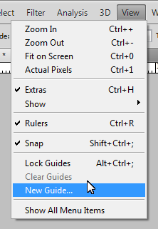
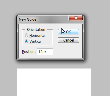
Step 1: Creating the Mesh PatternCreate a new document, 50×50px and name it "Holes". Fill the background in with #FCFCFC. 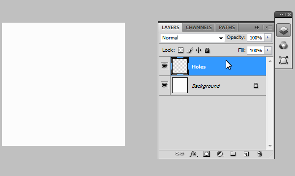 Step 2: AlignmentNow we need to make a grid to help us layout the holes for the mesh pattern, so we need to create precise guides by going to: View > New Guide. And make the following separate guides:
  Step 3: Adding the HolesUsing the Elliptical Marquee tool (M), set the selection style to "Fixed Size" and enter 14px for width and height. Cmd + Click on the cross sections highlighted on the image below. This should create a perfectly centered eclipse around the cross in which we will fill in black (#000000). Repeat for the remaining points. 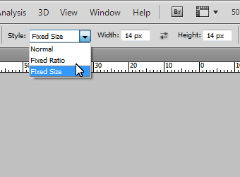 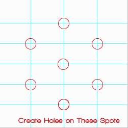 Should look something like this: 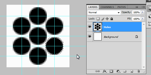 Step 4: Adding DetailAdd the following layer styles: (Inner Shadow: Black, with Distance set to 1 and Size set to 3. 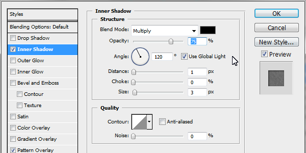 Pattern Overlay: Pattern selected from Photoshop’s default ‘Artist Surface Pack’ called ‘Oil Pastel on Canvas’ , set opacity to 36%. 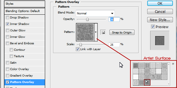 Step 5: Saving the PatternUsing the Rectangle Marquee tool (M) select the inner rectangle (as seen in the image). With it selected go to: Edit > Define Pattern (You may need to expand the menu, by clicking on "Show All Menu Items"). Call it "Mesh" and press Ok. 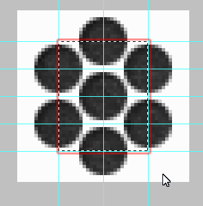 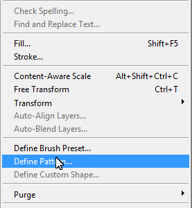 Step 6: Creating the Carbon PatternCreate a new document, 100×100px in size. Create a new layer (Cmd + Shift + N) and call it "Vertical Tile." Using the Rectangle Marquee tool (M) set the selection style to "Fixed Size" Using 25px for width and 50px for height. Make a selection in the very upper left hand corner and fill it in black (#000000) for the vertical tiles.
Add the following layer styles: Color Overlay: with the color set to: #252627.
Stroke: with the color set to: #121213, size on 1 and position set to: Center. 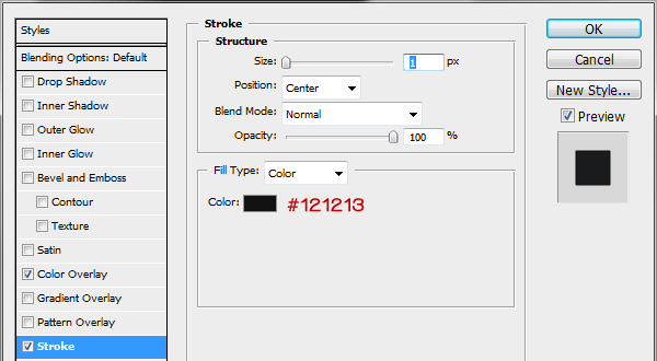 Step 7: Horizontal TilesWe need to now create the template for the horizontal tiles, so create a new layer (Cmd + Shift + N) and call it "Horizontal Tile". Using the Rectangle Marquee tool (M) change the "Fixed Size" to 50px for width and 25px for height. Click right next to the vertical and make the selection flush in the upper right hand corner (as seen in the image below). Fill it in with black.
Add the following layer styles: Color Overlay: with the color set to: #1a1b1c.
Stroke: with the color set to: #121213, size on 1 and position set to: Center. Step 8: Repeating the PatternWe have the templates for both the horizontal and verticals tiles; by duplicating the layers (Select layer > Cmd + J to duplicate) we now have copies in which we can arrange in a pattern (Pattern template below) Making sure they are flush and not leave gaps (As this will affect the final outcome of the image). Repeat duplicating and ordering the layers to get the finish pattern (as seen below).  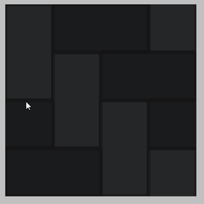 Step 9: Saving the PatternAgain using the Rectangle Marquee tool (M) select the whole document (or Cmd + A). With it selected go to: Edit > Define Pattern (You may need to expand the menu, by clicking on "Show All Menu Items"). Call it "Carbon" and press Ok. 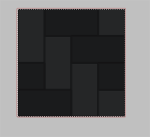 Step 10: Putting it All TogetherCreate a new document to what size suits you (I will use 1000×700px for demonstration purposes). Create a new layer (Cmd + Shift + N) and call it "Mesh", fill it in with black (#000000). Apply the Mesh pattern we made previously via layer styles (as seen below). Pattern Overlay: The patterns we made are saved in the last pack you selected, so in our case the Artist Surface was our last. Select the Mesh pattern from the pack. 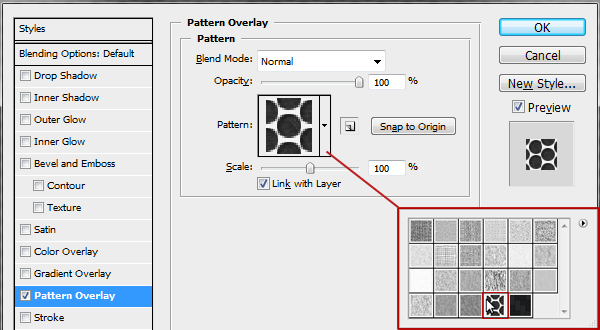 Create a new layer (Cmd + Shift + N) on top and call it "Carbon" and fill it in with black (#000000), apply the Carbon pattern we made previously via layer styles (as seen below). Pattern Overlay: Select the carbon pattern in the same folder, and drop the scale down to 25%. 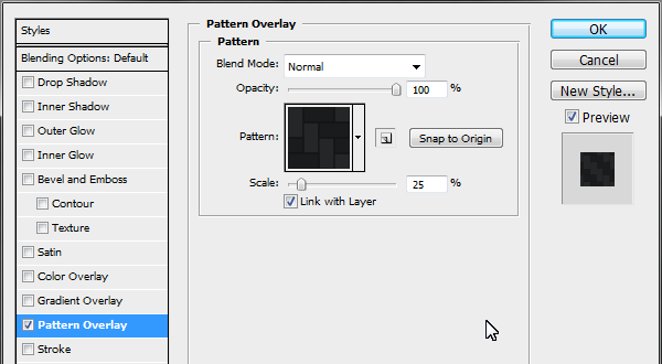 Gradient Overlay: Starting color #000000 to #2e3033, drop opacity down to 65%. 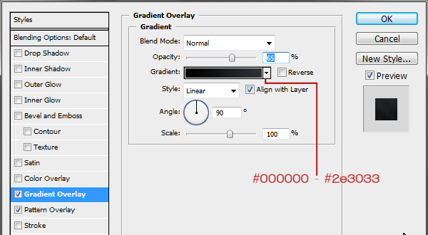 Step 11: “Cutting out” the carbonSelect the Carbon layer and again using the Elliptical Marquee tool (M); making sure the selection style is back to "Normal" make a rough oval selection from the middle most bottom of the document to the centre right portion. Press delete to remove that portion to reveal the mesh layer beneath, deselect the selection (Cmd + D). 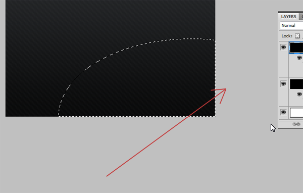 Step 12: Adding Highlights and ShadowsCreate a new layer (Cmd + Shift + N) between the Carbon and Mesh layer and call it "Carbon Shadow." Using a large soft brush (200-300px) with its hardness turned down to 0, opacity to 50% and color set to black (#000000), start to draw along the "cut-out". Use a technique of overlapping brush strokes to build up the shadow under the lip of the carbon, and to fade out towards the center of the uncovered mesh. 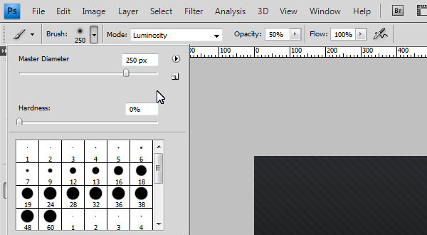 To add extra detail we can create a very slight highlight on top of the carbon to give it the effect of catching the light source. Create a new layer (Cmd + Shift + N) on top of the Carbon layer and call it "Carbon Highlight" Using the same brush but using white (#FFFFFF) instead of black, Cmd + Click the Carbon layer, to load the selection and keep our highlight in. Now start to paint across the lip very softly to create that soft highlight, turn down the opacity down to 25%. 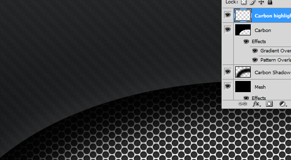 Final ImageYou’re Finished, I hope you enjoyed the tutorial!  |


| You are subscribed to email updates from Psdtuts+ To stop receiving these emails, you may unsubscribe now. | Email delivery powered by Google |
| Google Inc., 20 West Kinzie, Chicago IL USA 60610 | |
0 comments:
Post a Comment