PSDTUTS Updates |  |

- Quick Tip: Remove a Person From a Photo With Photoshop CS5’s Content Aware Feature
- Create a Wooden Texture in Photoshop Optimized for 3D Rendering – Basix
- Evolving Your Illustrative Typography, Through Experiments and Techniques
| Quick Tip: Remove a Person From a Photo With Photoshop CS5’s Content Aware Feature Posted: 28 May 2010 09:55 AM PDT
With the launch of the new Adobe Suite of programs comes the long awaited Adobe Photoshop CS5. Packed with new features to speed up your workflow it truly is the most advanced edition of Photoshop to date. One of the new features we will be looking at today is called Content Aware. This feature allows you to quickly fill in a selection with surrounding content making it look like a part of the original image. In this case we will choose to remove a person from a photo, this can be done in less than five minutes. With the additional image enhancements this tutorial will take you less than 10 minutes to complete.
Original ImageBefore we begin, download the image that we will be working with. As you can see, there are two individuals in this photo. In today’s tutorial, we will use Photoshop CS5’s Content Aware Feature to remove the man on the left.  Step 1Using the content aware tool on different images produces different results. An image with a gradient background such as the sky in this image is quite tricky to work with. Open beach.jpg in Photoshop. 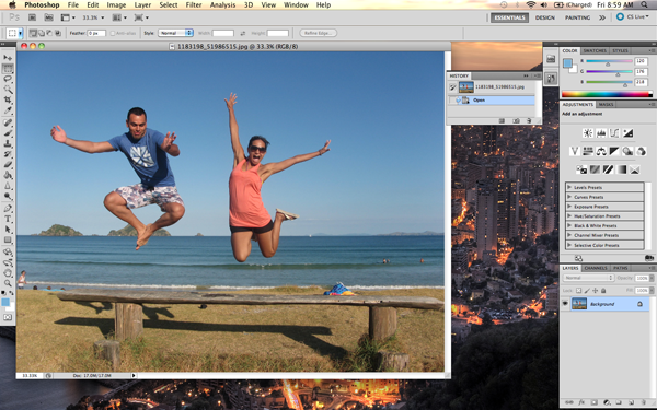 Step 2We are extracting the person on the left from this photo. Using the Pen Tool, (P) Begin by making a path around the subject. The nice thing about using content aware is that you do not have to be exact when making a selection. In fact, do your best not to cut too close to the subject. 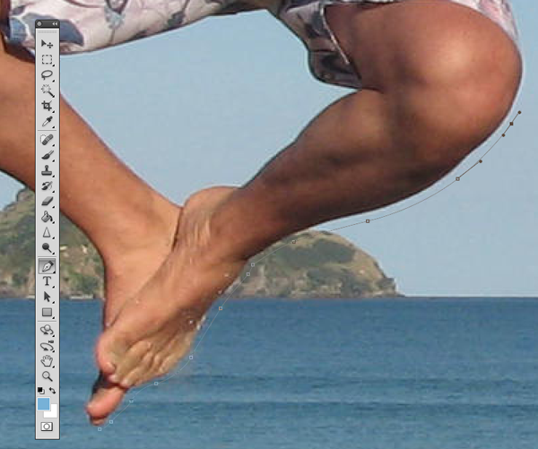 Notice in the image below how far I am drawing the path from the subject. Try to keep this distance all the way around. If you go too close, Content Aware will take pixels from the subject. If you cut too far it will take pixels from the woman on the right.  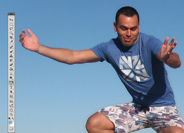 Step 3Once you complete the path around the subject, turn it into a selection. This can be done by right clicking on the path and selecting Make Selection. 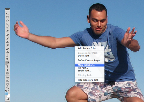 A dialog box will pop-up, make sure the feathering is set to 0px. Leave all other options as they are. Click OK. 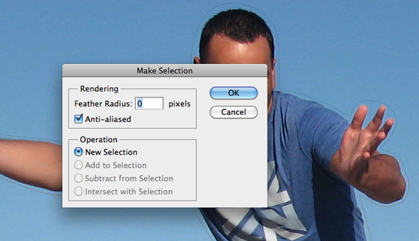 Step 4Now we have an active selection around our subject. In this step we will make the subject disappear from the image using Content Aware Fill. To do this, go to Edit > Fill. 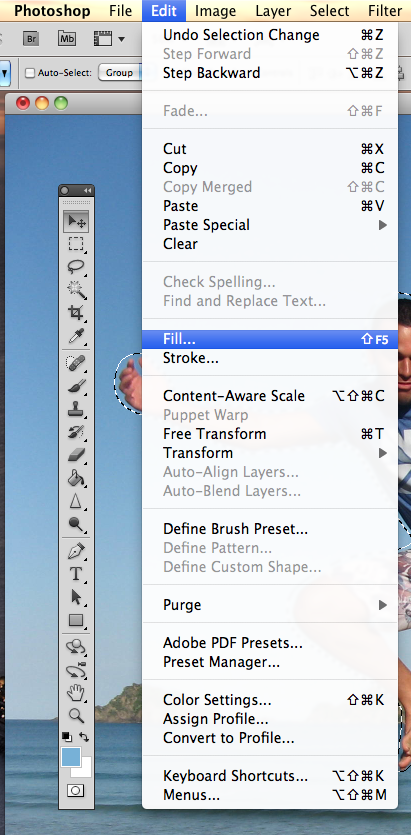 A dialog box will pop-up, make sure the Content Aware option is selected. Blending mode is set to normal and the opacity is at 100%. Hit OK. 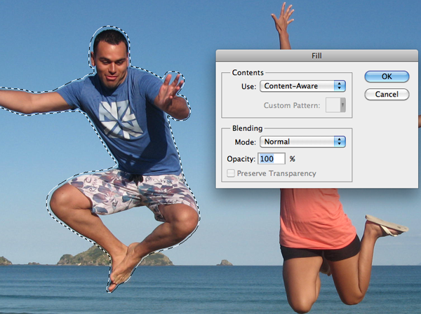 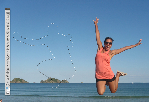  You can cancel the selection at any time by making another selection or just clicking anywhere else on the page with any selection tool. Step 5In this step we will remove some of the other artifacts in the image using the same process. The content aware tool did miss a spot where the subject's foot originally was. To do this, draw a rectangle around the area using the rectangle selection tool. And use the content aware fill as we have done in the previous steps. 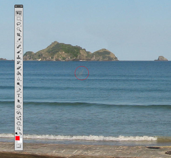 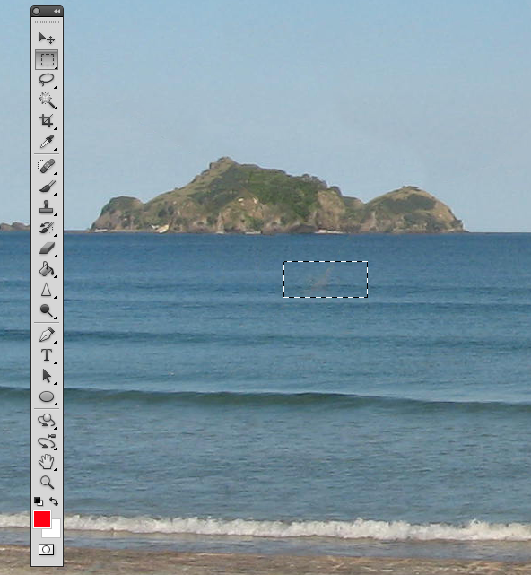 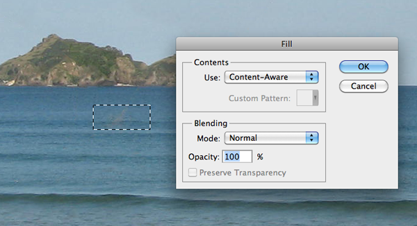 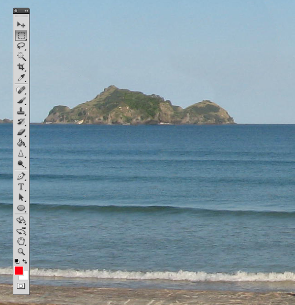 Now let's remove the people towards the right of the image. Create a rectangle selection around them and use the steps we just demonstrated to remove them. 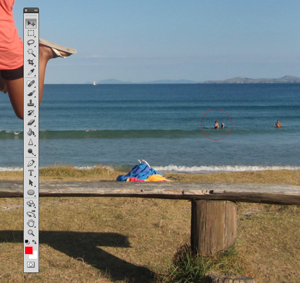 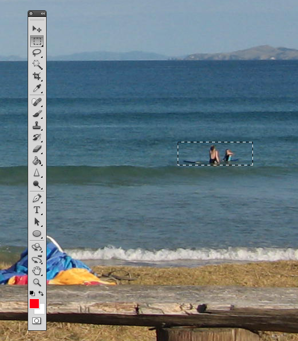  Step 6 (Optional)Using the Crop Tool (C) lets crop the image so that the focus is drawn to the woman jumping. To do this, just crop out an area of the image that you would like to keep. Beware of the shadow that is left behind from the person that we have removed. You can use the Content Aware feature to remove this shadow but I have decided to crop it out altogether. 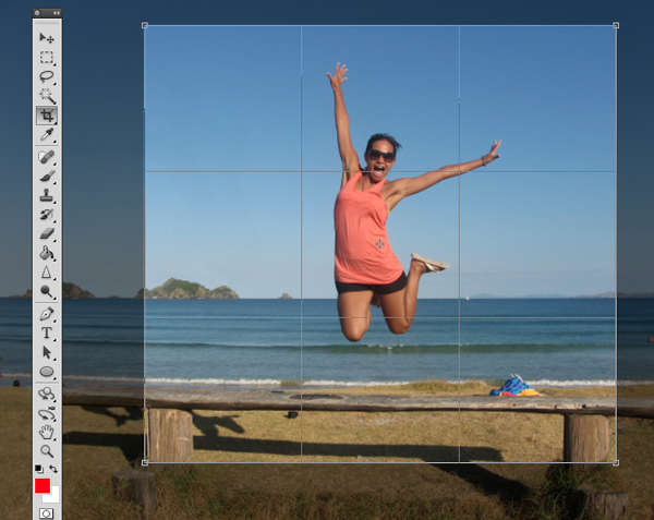 Click the checkmark at the top to keep this area. Photoshop will discard the content that is outside of your crop area. Step 7 (Optional)In this step we will enhance the photo by giving it a more vibrant look. The colors currently appear somewhat dull. There are many ways to accomplish this but we will use Color Curves. To do this, go to Image > Adjustments > Curves, (Cmd + M). A dialog box will pop-up and we will select each of the channels, R, G, B and work on them separately. Select the Red channel from the dropdown menu. We are going to make two points on the graph. One in the bottom of the top right square, and one in the top of the bottom left square. 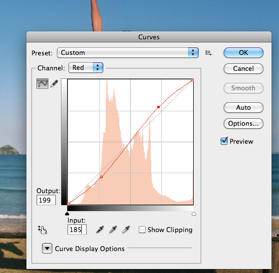 Once you have made these points, make sure you enter the values for each. For the top right point the Output value is 199, and the input value is 185. For the bottom point the values are 56 and 68, respectively. You can play around with these setting and adjust them to whatever you feel is appropriate. Repeat this for each of the colors, Green and Blue. 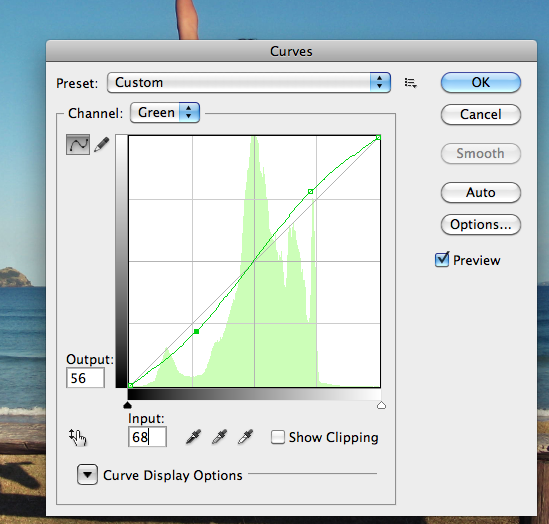 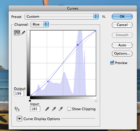 Final ImageYour image should now look something like the one seen below. As you can see, we have removed the man on her left with very little effort using Photoshop CS5’s new Content Aware Feature.  |
| Create a Wooden Texture in Photoshop Optimized for 3D Rendering – Basix Posted: 28 May 2010 06:00 AM PDT
There are a lot of techniques out there to create wooden textures in Photoshop. Photoshop is a powerful application and it enables you to produce wooden textures photographically and from scratch. In today’s tutorial we will demonstrate how to create a wooden texture from scratch using some of Photoshop’s handy filters. You can then use this technique to create textures for your 2D or 3D projects.
Step 1Start with a New Document 800×800 px. Leave everything else as is. 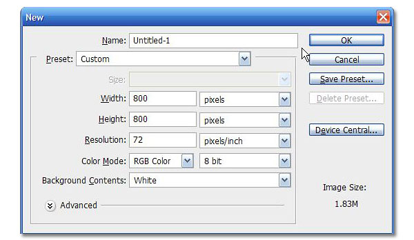 Step 2Set Background and Foreground colors. Foreground should be a desaturated woody orange and background should be a dark shade of brown close to black. 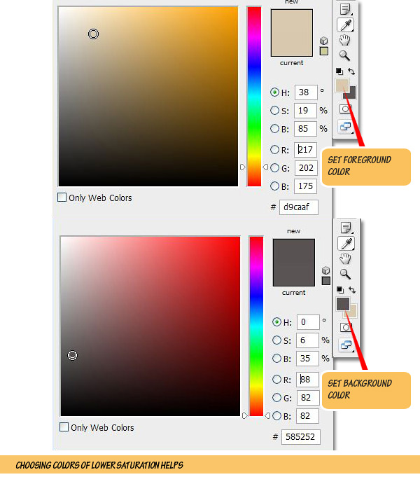 Step 3Go to Filter > Render > Fibres. Keep number of threads low by reducing the Variance value and keep them straightened by a high Strength value. Feel free to hit the Randomize button if you are not satisfied with the initial look. Zoom In [+] and out [-] in the preview window for better guidance. 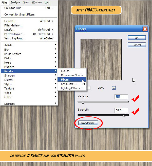 Step 4After getting a satisfactory grain double-click on the "Background" layer to unlock it. Press Cmd+[J] to duplicate the layer. This is to preserve the original grain pattern in case something goes wrong. 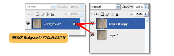 Step 5Go to Filter > Liquify or Press Cmd+Shift+[X]. In the Liquify panel/window use the Forward Wrap [W] tool to paint mild disturbances in the grain layer. Enable the Stylus Pressure option if you’re using a pressure sensitive Tablet (like WACOM). 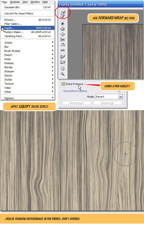 Steps 6 – 9Use Twirl Clockwise[C] tool to paint twirls over expanded areas created by the Forward Wrap [W] tool. Pressing [Alt] key reverses the twirls. Use Forward Wrap [W] tool again to rearrange the look and size of the twirls. Hit OK button to commit changes done in Liquify window. Finally Rename the layer to "wood base". Now we are going to turn this layer into a grainy coarse surface. NOTE: Wood grain creation technique source: Luke Ahern [3D Game textures, Focal Press, 2006] 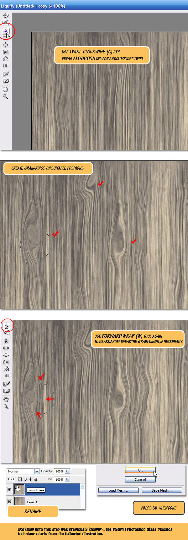 Step 10Open the Filter Gallery (Filter > Filter Gallery) and go to Glass effect in the Distort category, apply it with the following settings: Distortion: 4, Smoothness: 4, Texture: Frosted, Scaling: 100%, Value of Distortion/Smoothness may have to be changed if texture size is different from the one I used (800×800). Hit OK to exit the Filter Gallery window and press [CMD]+[Shift]+[F] to bring in the Fade dialog box. Select Darken as Fade blend mode and tweak Opacity if necessary. 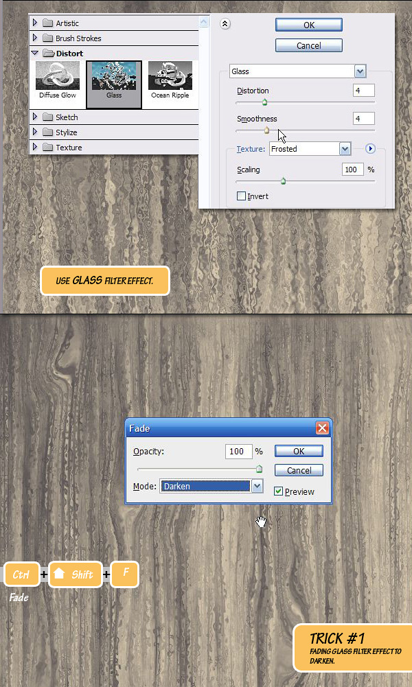 Step 11If you remember all of this is happening in the "wood base" layer. Keep the layer selected and apply another filter: Filter > Filter Gallery > Texture > Mosaic Tiles. With default settings the result will look very awkward but once you split the first two sliders (Tile Size to min: 2 and Grout Width to max: 15) in opposite directions the result may surprise you. Now crank-up the Lighten Grout slider to a high value and you have a cool wood texture in your screen. We are wanting for a neutral look (diffuse only) wood texture, so Fade the effect to Darken and remove all the shininess. Also tweak Opacity if needed. 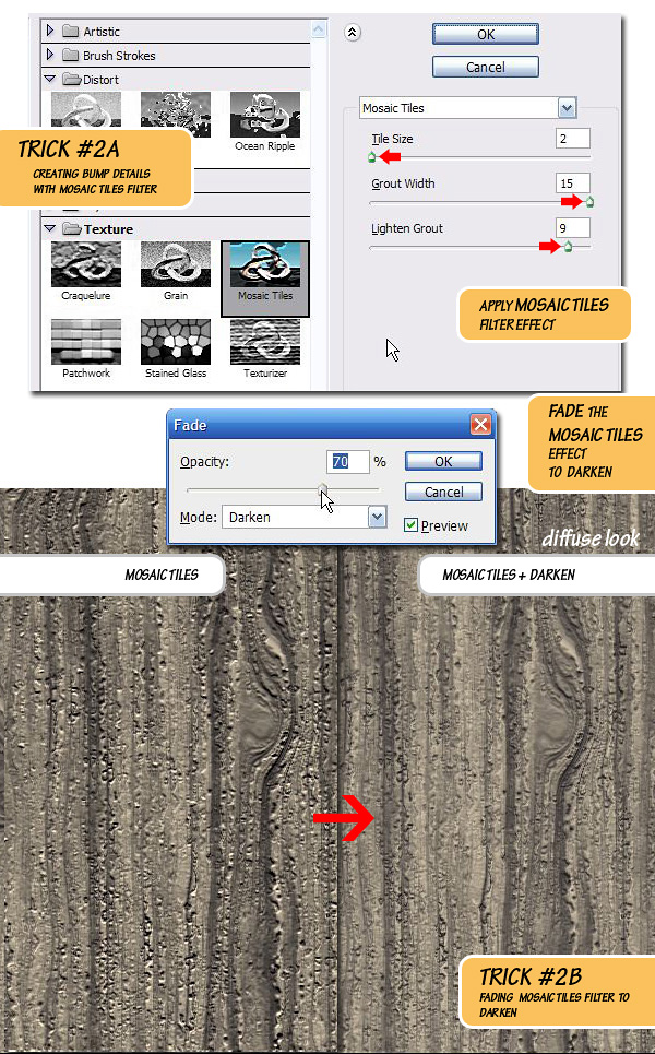 Step 12Duplicate [Cmd]+[J] the "wood base" layer and put it into a new Group called Group 1. This is again to preserve the texture. 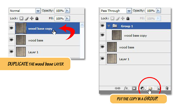 Step 13Inside this new Group, create a Gradient Map adjustment Layer as the top layer. 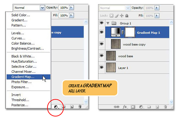 Step 14Double-click on the Gradient Map icon to open the Ramp (not shown, use background-foreground gradient type), double-click on it again to open the Gradient Editor. Keep the Color Start (background color) untouched and saturate the Color Stop (foreground color) a bit. 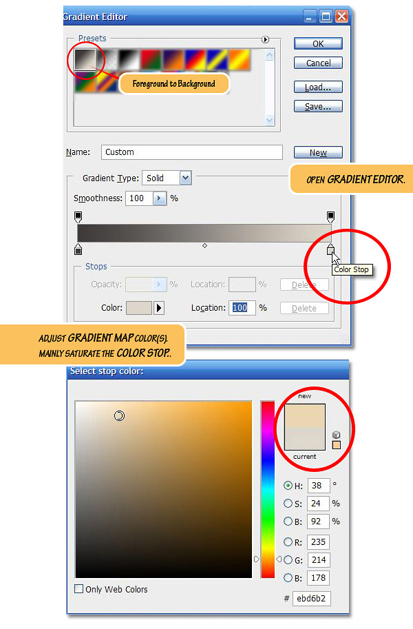 Step 15Change the Blending mode of this Gradient Map layer to Color Dodge, as you can see, initially the result won’t look all that spectacular. 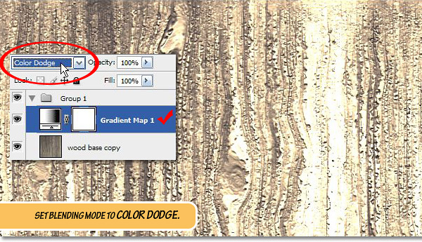 Step 16Below the Gradient Map layer, create a new adjustment layer Exposure. 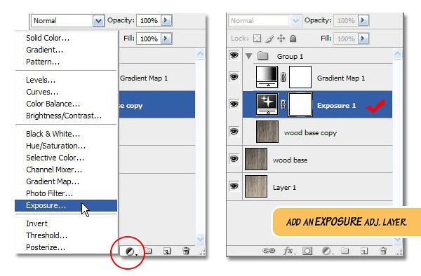 Step 17Tweak the sliders in Exposure adjustment layer as shown to get a desired look. Adjust the Exposure (highlights) slider first, and then adjust the Gamma Correction (midtones) and finally the Offset (brightness offset). 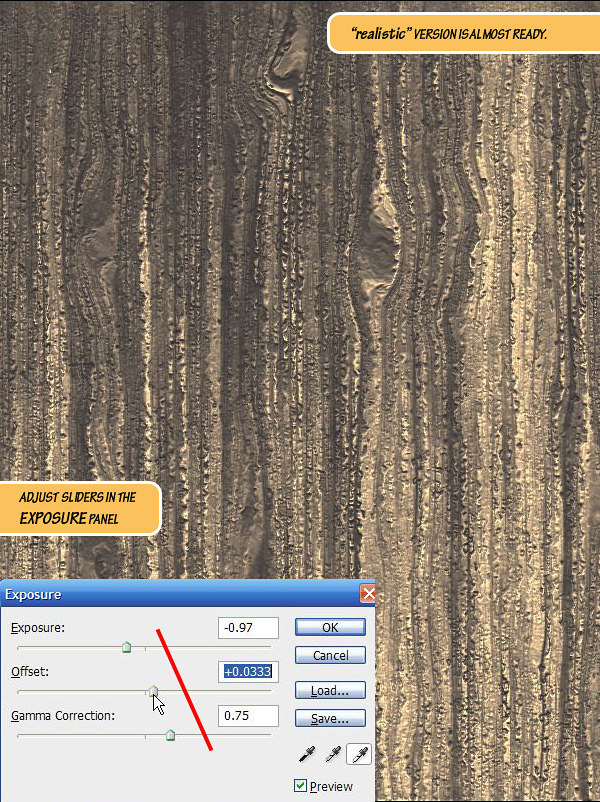 Step 18Duplicate the "wood base copy" layer once more and rename it to "blur." 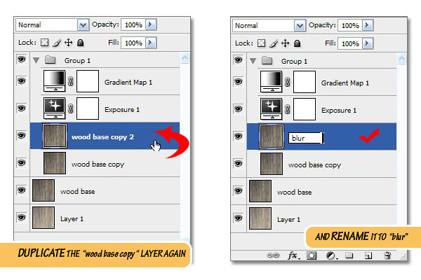 Step: 19To the layer "blur" apply Filter > Blur > Gaussian Blur effect with a Radius value of 1.5 px. This value may vary depending on the document size. 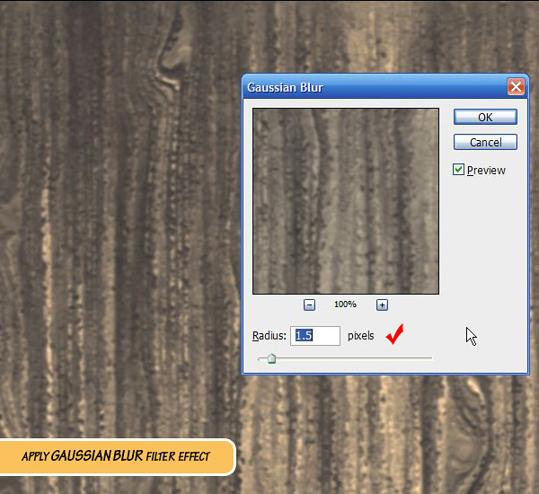 Step 20Fade the Gaussian Blur effect to Darken to give it an ambient occlusion/dirt look. If the image had more contrast the resulting texture would look like Japanese style anime. Here is an example of ‘anime look.’ 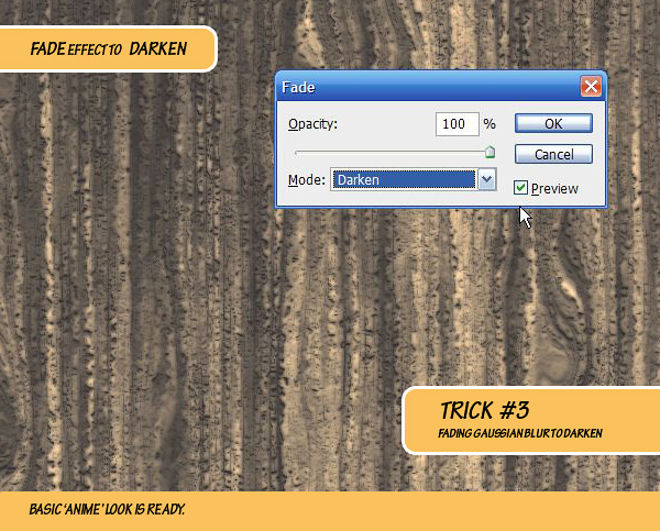 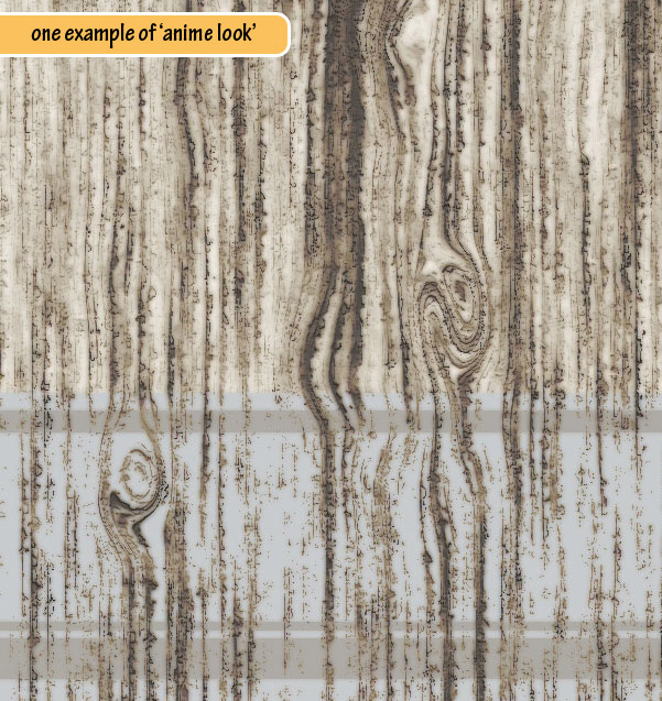 Step 21Go back to the Exposure adjustment layer and tweak the values (mainly Exposure:) to improve the brighter areas. 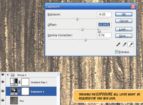 Step 22To ‘dramatize’ the effect we can go one step further and add some more contrast to the texture. Inside Group 1, add a new Black and White adjustment layer. Crank up the Reds and Yellows (as these two colors define the brighter areas of our image) and set the blending mode to Soft Light. 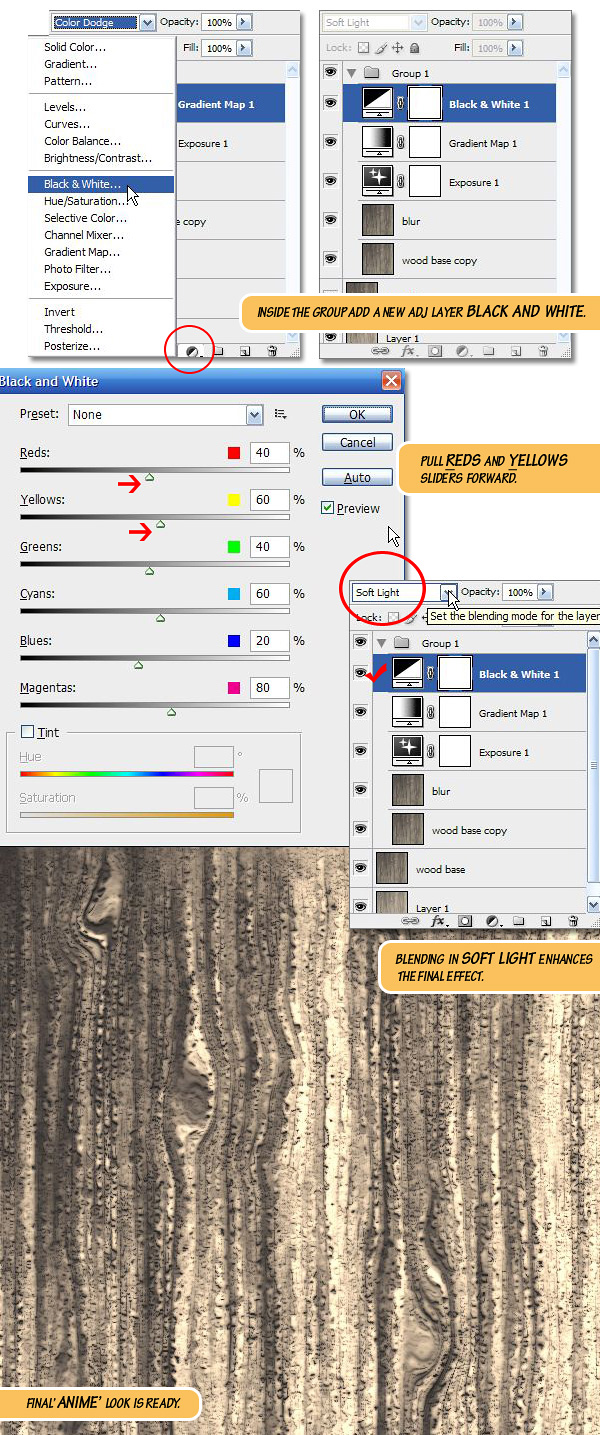 Final Image PreviewTake a look at some of these alternative examples. 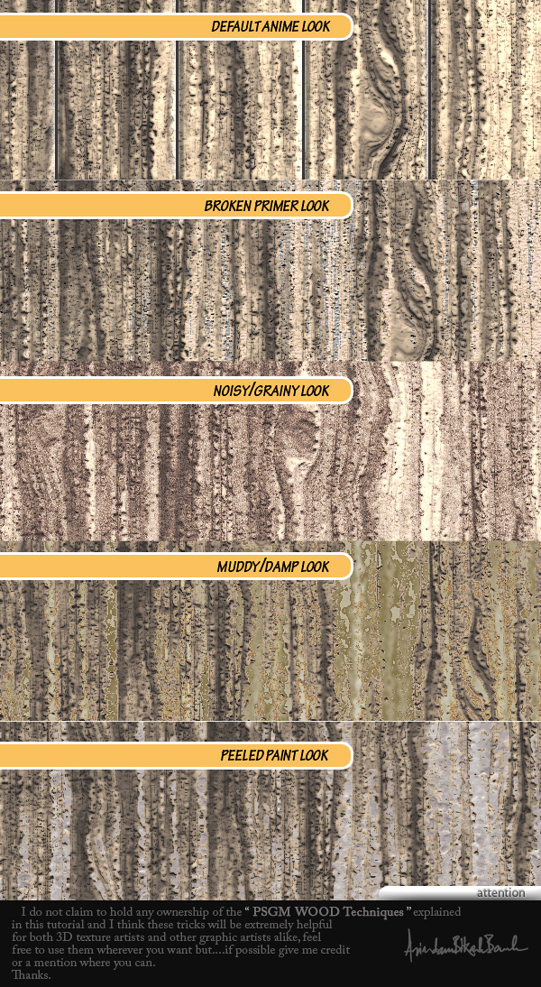 3D RendersThis texture can easily be applied to a 3D rendering. 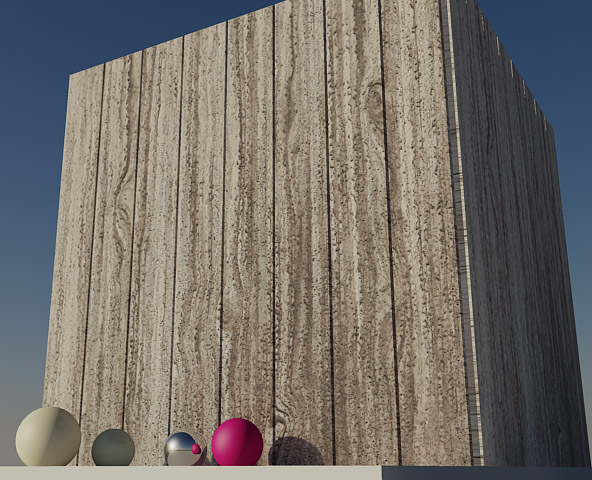 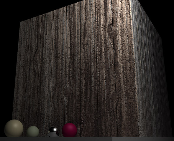 |
| Evolving Your Illustrative Typography, Through Experiments and Techniques Posted: 28 May 2010 05:49 AM PDT
To grow and develop your illustrative typography style first involved letting go. Don’t get overly concerned with your style early on. Give yourself the time needed to experiment. Try different techniques, different mediums, different approaches. Give yourself the space to make mistakes and learn from them. By practicing your illustrative lettering with craft personal projects you’ll gain experience with your tools. Over time, you’ll develop methods and techniques that will help you to deliver consistent professional results.
This Post is Day 12 of our Illustrative Lettering Session. Creative Sessions About Illustrative TypographyBasic typography is found in any form of communication. From the many fields it encompasses, there’s a new trend that’s becoming increasingly popular. Illustrated type stems from traditional typography and is not a dismissal of the old. It is built upon the fundamental rules of type and seeks to bring it to another level by merging letter with image. It uses the simplicity and straight-forwardness of writing while offering visual impact to an otherwise bare message. This relationship is what illustrated typography is all about.  Developing Your Illustrative Typography StyleAs creative people, we are aware of many styles, a handful of which we particularly like and use as a source of inspiration for our work. People that we perceive as successful in their field have somehow managed to use these influences to find their own manner of creating – one which represents themselves. Their unique style has made them popular and easily recognized. It’s safe to say that developing your own style is a crucial part of artistic development. Style is Always EvolvingThe best way to find your style is to fist stop trying so hard to find your style. Allow me to explain. When starting out, too many people worry too much about having a unique style. They mistakingly think that having one means doing the same thing over and over again for different clients. In fact, your style evolves over time, and it’s not at all a bad thing. It’s necessary and completely unavoidable, so embrace it. Your Choice of Tools and Resources Affects Your StyleAnother thing you need to understand about your style is that it’s enabled and shaped by the tools and resources you have at your disposal. Take any cuisine for instance. A country’s style of cooking is marked by the natural ingredients that are found within. Creating your own style works much in the same way. Everything you create is enabled by the tools you have, and limited to the resources you can use. For instance, I wouldn’t be able to create realistic, paint-like typography without Cinema 4D’s Metaball tool and materials. Readily available resources will shape and form your technique, so what you need to do is experiment widely with the tools you have. Experiment WidelyTry different techniques, different mediums, different approaches to the same problem. Don’t limit yourself to the computer; use traditional methods too. In time, you will gain experience and will inevitably want to elaborate the topic. Bit by bit, you will stick to a tried and tested method you will have developed all on your own. Looking back, your entire process of personal development has been nothing more than a series of involuntary choices built on top of each other. Don’t be afraid to break out of the mold. Keeping to a style should make people recognize and remember your work, and not confine you to a strict visual guideline. Remember, experiment widely.  The Importance of Personal Work
We’ve already determined that in order to develop a style, you need to experiment. The best way to do this is through personal, non-commissioned work. That way, you have no limitations or preset requirements and can afford to make big mistakes. The point of any experiment is, obviously, to gain experience. The first stage is to think of a technique you want to try out. Let’s take one of my own experiments as an example. I learned online how to sweep a rectangle object along a path to create complex 3D swooshes. I set out to apply this technique to typography, and used the Sweep NURBS tool in C4D to create the word “Enough,” from the phrase “Can’t get enough of this.” The problem? Many people haven’t been able to even understand the words in the illustration. I probably would give up trying to read the thing myself, if not knowing the words from memory. Big improvements often come after failure. The lesson I learned here is to not get carried away visually, and focus more on the functional aspects of typography. Use the momentum of creativity to experiment, but stop right away when you think you’ve made a mistake and improve.  Striking the Right BalanceThe secret to a functional typographic illustration is maintaining a balance between an ease of understanding and convincing graphics. From my experience, favoring clear readability over bold imagery is the better choice, especially in commercial projects, where the message must be easily understood. Choose a Good FontThe easiest way to insure good readability is to build your illustration on an existing font. You can create a custom face, customize an existing typeface, or simply build the image directly on top of a font you selected for the project. Use the characters as a guide and keep all modifications within the outer edge of the original face in order to get easily distinguishable letters.  Utilize Space and Context in the BackgroundAnother aspect of a good mix is the interaction between type and background. Richly detailed typography usually demands a simple background. As with traditional typography, illustrated type requires white space. Inactive regions will keep your design clean and prevent it from being cluttered. Many designers actually prefer the simple black or white background. My personal preference is to create an environment that is closely related to the type. It’s meant to solidify the concept and put everything in context. The FutureWithin the context of digital tools, illustrated typography feels young and vibrant. While there is a deep tradition within graphic arts of using image and type together to communicate, new tools and techniques will continue to push the styles within which we communicate. Highly stylized illustrative type is quite popular right now, from magazine covers, to New York Times headlines, and movie titles, we’re seeing an awesome amount of high quality material on a regular basis. What we have here is more than a simple fad though. It’s something one can base a career on. Give yourself the time needed to develop your skills with illustrative typography, as it’s an evolutionary process learned one project at a time. This Post is Day 12 of our Illustrative Lettering Session. Creative Sessions |
| You are subscribed to email updates from Psdtuts+ To stop receiving these emails, you may unsubscribe now. | Email delivery powered by Google |
| Google Inc., 20 West Kinzie, Chicago IL USA 60610 | |
0 comments:
Post a Comment