PSDTUTS Updates |  |
| Group Interview: Client Based Photo Manipulation Process Posted: 05 Jun 2010 05:03 AM PDT It’s not possible to imagine advertisements, and designs, without photo manipulation – but in most cases, the work done by a designer isn’t even mentioned. However, you all know that it’s highly challenging and often difficult to do client based design and illustration work, such as photo manipulation. We’ve asked eight highly-skilled and well-known photo manipulators about their process and workflow for solving their client’s briefs. They have illustrated their answers with a specific example from their work as well.
The Group InterviewJames White, SignalnoiseMy first step when doing a client based photo manipulation is to ask what the goal of the piece will be, where it will live, and what the art piece will be used to promote. Under normal circumstances, the client has a general idea of what they want incorporated, whether that is a logo, photo, slogan or whatever, so it’s very important for me to get this information before going anywhere near my sketchbook. I try to find out why the client is excited about this given project, and use that information to form the majority of the concept. After I have an idea of what the client is expecting, and what message the piece will enforce, I then move onto sketching out several variations and directions that might work for the final.
I always start with the sketchbook. The best way for me to work through the initial conceptual stage is to get away from the computer, grab a few of my art and design books for inspiration, and head to my local watering hole to start drawing. I will sometimes create 30 or 40 thumbnails exploring visual ideas, type treatments, composition, etc. until I land on (or near) an idea that might work. The client never sees my sketchbook because, to anyone other than me, the thumbnails resemble crude hieroglyphs drawn by a simpleton. But to get around this I will create a few vector mock-ups in Illustrator to show the client. This version of the thumbnail allows me to quickly explore color treatments using basic shapes and typography, and makes things easier to visualize onscreen. I will typically send the client a few vector versions of my best thumbnails. Once the client has a general idea of the concept and direction, and approves. I will then move to building the final illustration in hi-res. Since my final illustrations are very complicated with many elements, layers and effects, I try to keep the client in the loop as much as possible by sending them in progress versions in case they can offer any feedback along the way. I chose to send you this poster design, entitled “Elle.” This isn’t a client piece in the conventional sense, but it presented a very unique challenge. Earlier this year I was asked by Getty Images to attend a meeting for a new platform they were launching called Thinkstock, an online stock imagery source. I was given the option to create a piece of unique artwork inspired by their images, where we could use any of their vast library to create. There were no limitations, which brought with it an infinite number of directions I could go visually. Daunting, to say the least. I started looking through their library for anything to jump out at me and landed on a photograph of a lovely lady. After a few days of knocking ideas around and creating many sketches along the way, I landed an the concept I wanted to pursue. I assembled a pile of many images from their photographs and proceeded to piece them together in Photoshop based on my initial concept. The client was happy with the piece, so much so that it was featured in Creative Review magazine as promotion for Thinkstock.  Saad Moosajee, SaadArtMy first step is to decide what sort of manipulation I will be doing, which is accomplished by thoroughly reading the brief. After I have done this I will usually run 1-2 images of the style I am planning to use by the client to make sure it is exactly what they are looking for, and then begin the manipulation.
It really depends how I come up with conceptual solutions for clients. Sometimes I can get a good idea just from a brief, but this also depends on whether or not you have an art director for the project. This project was completed for 361 degrees China, one of the biggest sports company in the entire country. The brief was initially provided by The KDU, which involved a simplistic and graphic illustration of the logo with as much detailed as possible packed within the logo. The color scheme was supposed to be fairly monotonous using orange. The client really wanted a powerful illustration that grabbed the viewers attention which could also be converted to a T-shirt Graphic later on. This was my final result, which was composited using Cinema 4D, and Photoshop CS4. The image was used in the KDU’s presentation towards 361 and will also as a T-Shirt later on in the campaign.  Mike Campau, SeventhStreetHow I go about solving a client brief depends on what the client supplies. Sometimes they have a flushed out idea and they provide a comp or rough skinny line. In this case I would just start researching the details of the design, looking for textures, props, elements, and any parts and pieces that will help me build the final concept. In other cases, a client can just give me a verbal or written concept with no visuals and it is up to me to start pulling together reference and images to build a concept around. This involves surfing the net, rummaging through my collection of stock, or going out on location and shooting reference. I find this tends to spark my creative concepts more than sketching does, as I can get inspiration from something unexpected or from the experience of a location and not relying on what preconceived vision is in my head.
I usually do all my concepts visually using photoshop. I will take all the elements and images that I came up with from my research and start roughing them together. More big picture stuff, not worrying about details, masks or perspectives. Just to get an idea of size and composition. This process is obviously very fluid and is constantly evolving, sometimes the finished piece looks nothing like what I started with. During my projects, I will keep the client up to date on progress with WIP jpegs that they can mark up with comments and input. In this digital age we live, it might seem strange, but sometimes a meeting with a real person or an actual conversation is needed to better explain the direction of the project or to get better insight from the client. This process usually happens 3-4 times during a project and sometimes even more depending on the complexity. This was an image I did for Campbell-Ewald and their client Chevrolet. It is being used for their fishing simulator that is traveling around the country on the FLW Outdoor fishing tour, and of course under a tight timeline. For this project, I was supplied a rough comp, some stock photo assets and a hard drive filled with a location shoot for the truck, background and talent. This was a challenging project as they wanted the illusion of the camera being placed right at the water line, but they didn’t shoot any underwater shots. So, everything had to be created in Photoshop, using elements I shot myself and a few of my own tricks. In the end this image was composited from 51 separate shots… but that wasn’t it. Once the image was finally pieced together, I had to give the image an overall lighting effect that created a more modern feel. This project also included a separate image for the back of the trailer that was also pieced together from multiple photos. All in all, the project took one week to complete, with client reviews and feedback just about everyday along the way.  Ferdi Rizkyanto alias PepeyFor a client based work, usually my first step is to understand the client’s brief and identify the core message that they want to deliver to their target audience.
It’s always helpful to take time to do all the necessary research. I found that the more I explored, the easier it was for me to come out with a few ideas in how to communicate the messages. The ideas themselves could be something familiar but presented in a different and unique manner (something new which they haven’t seen before or something that will attract attention). Of course, some of these ideas are not always easy to implement, I need to keep sharpening my creativity skills by trying to learn new things and push myself to pay more attention to details in every execution to get the desired visual results. I sent this project in for the Hugocreate competition. Hugocreate wants to spread the message that for every HUGO Man or HUGO Element bottle sold during the “One Fragrance, One Tree” campaign, HUGO Fragrances will plant a tree in the Amazonian rain forest. After exploring the issue, I came up with a few ideas, and one of them is the forest with the river as the main visual because of it’s familiarity with the Amazon rain forest and to help create the feeling of being a part of something big. Next I created a fast rough draft to see if it will have the desired result. After I’m sure about it, the next step is to execute and finalize it.  Wojciech Pijecki, ZeroboundBasically many clients ask for feedback often. Before you even start to work, sometimes you need to show a sketch or explain the way you plan to do the illustration. If I wasn’t provided with any work samples or sketches from then client, I simply settle all the details and expectations. Then I’m ready to start working on the very basic form of the design. The very first steps are based on experimenting with lots of unextracted pictures and mixing them into something that makes sense. But you have to strictly follow client expectations.
There is no gold conceptual solution for clients. It’s obvious that each case needs a different approach. Definitely you always need to fit to clients needs and tastes. It’s very hard to fully force your concept, as every client will rip open your illustration and change it into something way different than you planned to do. About finalizing works: First I set my rate for a project, then I always take some prepayment, as many clients like to just vanish with their offers and promises. Concerning the payment: If it’s international, the quickest solution for me is Paypal. If it goes within my country, then we use regular bank transfers. This project was created on behalf of Brainnovative company for a Polish sport clothing store. I was responsible for the background illustration and Brainnovative created the rest web design including the coding. I was provided some work examples of how this should look. Although we had a clear point on everything, the task was pretty hard. The final product couldn’t be overloaded and distracting but had to remain as a nice, dynamic, connected illustration which points to sport. Beside that, there were some other expectations – for example to combine a basketball player into the illustration, etc. As usual, photo searching/exchanging process was very tiring. Also the final approval took some time as there are always some details to touch up. In the end, we’ve gone radically to a horizontal flip of the whole design, but this kind of worked out very well. I came up with the final design pretty fast and I was very surprised that there were no more expectations and pressure from client. So this project was really executed with pleasure.  Marcel Pirosca, studioulThe first step I do is read the brief. Then I personally spend some time disconnected. I try to visualize the message in various ways. Although you practice this consciously, sometimes nothing comes up. An idea could pop up at anytime when you’re not thinking consciously about it. It happens to me a lot in my sleep.
That’s why I take a break before starting. The moment I got something going, I build on it, twisting and turning that idea until I finally have a concept in my head. This process can involve sketches/doodles or just plain thinking. After that a lot of planning follows on how to obtain each visual element. Do I need to take some pictures? Can I find some stock? Can I compensate here and there with 3D? When I got an answer to these question and have something which is technically achievable, I can start working. I imagine coming up with conceptual solutions in a way that is achievable with the tools at hand. Fortunately for me, I have a small photo studio which I can always use to enhance my pictures. If needed, I take pictures of people, objects, whatever fits in that room, and blend them all together in Photoshop. Once you have the basic idea, you know what you go after. I often take shots of the same subject from different/similar perspectives, so I have plenty of variations to choose from. Sometimes I replace parts of them from two similar shots. It is generally easy to do that as long as you have the same lighting. The Photoshop work complements this stage, by allowing you to create collages and basically putting all these images into context. It is sometimes hard to see if your image conveys the right message, that’s when you need to take a break and come back with a fresh eye. This whole image began from a photograph I took, which I thought had a pretty impressive perspective. I kept looking at it and wondered how I could use it. First thing you notice is that the guy’s looking like a surfer. I tried to develop on that and thought about the kind of elements I could add to make it even more interesting. The next thought came to mind. Wouldn’t it be cool if he actually rode on a music volume stretching out to infinity? Easier said than done. To add a bit of dynamic movement the composition stretches over the diagonal fading away in the distance with elements moving both in the foreground and background. I never wanted to use blur to give that impression, since it would’ve only taken away from the details I worked so hard to create. All in all, from conception to execution, this image had taken about five days to create, stretched over a few weekends. I did a whole tutorial on the technical side of things, which can be found here: Create a Funky Perspective of a Model Riding Digital Volume. Bram Vanhaeren, into1After going through the brief a few times, I write down some keywords, the main keywords like, "Fresh", "Young", "Colorful but Playful". Then I quickly go through some galleries to find a matching stock to work with. Once I found some good stock I make a ’sketch’ in Photoshop with it, few elements to create the mood and show it for the first time to the client to hear if the stock image is correct, so I can order it and finish the artwork. Very important in this business is to keep an eye open for your deadlines. What you don’t want, is to finish 5 artworks on the same day. So when you get a brief, this is where you start and try to finish the project as soon as possible. If the client has no deadline, that’s a lie. They will always pick a date a little bit later. So try to start on it right away, after the briefing. So it’s fresh in your memories.
My job is a graphic designer, so most of the time the clients come to me with a concept and all solutions. Then it’s my job to translate their wishes into an image. Of course I will give it some twists, but then again the director have to agree with it. In my case it’s my brother most of the time. So it’s not a big deal. I do have some tricks to come up with solutions, for example, research on the wrong places. Somehow, every time I’m looking for a concept, I find it in the most bizarre places. I will use the work Passion as an example. To be honest, I started on this project with no budget and no plans. All I wanted to do is to help the community DesignersCouch as a friend and create a wallpaper for their website. But the wallpaper received more exposure then I thought and it turned into their flyer, which was handed out at the Phoenix Design Week 2009. I spoke with the director of DesignersCouch about my artwork and he told me it should be creative on many levels and targeted to students and young professionals. But creative was the most important keyword, because it is a creative network. Then I started to think about a concept that matches every keyword and I came up with the idea. Dancers are perfect examples of artists. They’re passionate, they work hard, they’re creative in their choreography and you can perfectly mix music and art. So the concept and idea was chosen and all I had to do is mix it up and work it out. I found a lovely stock image of a dancer, she has a powerful look and she shines passion and hard work. So it was the perfect stock to work with for this concept. Then I drew some elements in illustrator such as the piano, the brush, and the clock. Finally, I added some movements and stuck to the color theme of DesignersCouch and finished the artwork. In the end the director was really surprised and happy to see this wallpaper and offered me some jobs. So don’t be afraid to start something to support a group or event, there is always a chance they will contact you and offer you some amazing opportunities! Alex Varnese, alexvaranese.comMy method is somewhat unique in that where others might use photo manipulation to solve a given problem, I create my assets from scratch in 3D. As a result, I have the ability to deliver visuals to a client that are, within reason, custom-made forms to fit their concept exactly. There are trade-offs, of course, such as the sheer volume of additional labor required, as well as the fact that unless I’ve got a generous schedule and budget to work with, true photorealism usually isn’t feasible. But at the end of the day, there’s something very satisfying about being able to create something truly new; a visual idea that didn’t exist before the project began. I don’t think there’s any definitive answer to the question of how one comes up with a concept, but most of my clients approach me with a piece of my existing work already in mind as a reference. I try not to pimp out my personal art as a menu for commissioned design projects too much, but there are certainly times when it comes in handy to do so. As a general rule, the more you’re known for your work as an individual, the more likely it is that you’ll get receptive, engaged clients who want you to be yourself instead of acting like a hired gun who will solve their problems in an faceless, interchangeable way. Once I’ve got an idea in mind, I tend to make things digital pretty quickly. I’ve found that blocking something out in 3D — or even 2D with a program like Illustrator — gets the point across to a client much more easily than sketches. Hand-drawn comps are great when you’re trying to convey a very specific detail like a shape or a layout, but when it comes to hitting the client with a complete visual idea for the first time, the digital route makes it much easier to faithfully approximate the color, mood, texture and general vibe.
One of the best examples of my process is Elektrotrash, a "found art typeface" I designed by cobbling an assortment of parts together into letterforms. I knew I wanted to create lettering that looked like a random collection of discarded, real-world items like broken audio cassettes, circuit boards and the like, as well as abstract elements to flesh out the shapes, but I didn’t have a very clear sense of the big picture. It’s not uncommon for me to jump right into production without a lot of planning beforehand, but the complexity of the compositions and the depth of detail prevented me from doing so in this case. This was a situation where sketching was the most appropriate route; I knew what kinds of elements I wanted to work with, but I needed a quick way to visualize how they might live together. Once I’d drawn a general idea for each glyph, production was fairly straightforward. I created the individual parts; first, then arranged them into the desired shapes based on the sketches. Some trial and error remained, of course, and numerous details changed between the original sketches and the finished product, but that’s to be expected. The real beauty of the result, however, was that it differed so much from my first visualizations of the idea. Despite the planning and attention to detail that went into the process, I still managed to end up with something that was worlds apart from what I initially had in mind when the concept came to me. Whenever possible, I try to embrace that uncertainty and appreciate the fact that the outcome may surprise me. In the end, all that matters is ending up with something worthwhile.  |
| Give a Medieval Game Logo a Rough Stone Look – Basix Posted: 04 Jun 2010 06:05 AM PDT Designers are often asked to take a pre-existing one or two-color logo and give it dimension. In today’s tutorial we will take a black and white logo and give it a rough stone look in just a few short steps using textures and layer styles. Let’s get started!
ResourcesThe following resources were used during the production of this tutorial. Step 1Create a new document that is 1200×750 px and download the Caribbean font. Then, type out the title of the game as shown. Once you are done, rasterize both layers and duplicate them. Take those two layers and merge them together. Finally, duplicate that layer, send it to the back and add a 24 px stroke to it using a layer style. 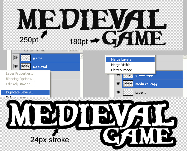 Step 2Now merge the layer with the stroke with an empty layer to rasterize the stroke and get rid of the layer style. Then use the Paint Bucket to fill in the gaps between the letters. 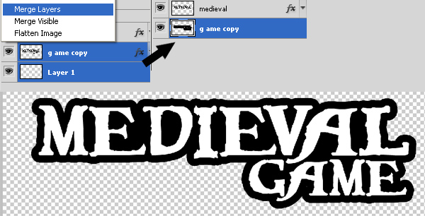 Step 3To add texture to the word “medieval.” place the Stained Concrete texture over the text. Then use the magic want tool to obtain a selection of the word "medieval." Now select the texture layer and select Cmd + J to create a new layer using the selection. 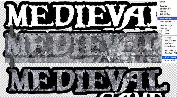 Step 4Select the new texture Medieval layer and go to layer style then check "bevel and emboss" and enter the values like its shown below. 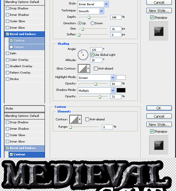 Step 5To make the bevel effect more prominent, dodge and burn it as shown below. The red brushes are "dodge" and the yellow brushes are "burn". 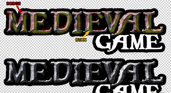 Step 6Use this Concrete Texture to add to the word “game.” Repeat Step 3 to achieve a similar result as below.  Step 7Now select the new textured game layer and go to layer style, then check "bevel and emboss" and enter the values like its shown below. 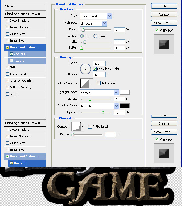 Step 8Choose the black stroke layer and go to "bevel and emboss" and enter the values as shown below. 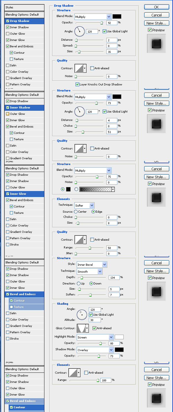 Step 9Now choose the black stroke layer and apply a gradient like the one shown below. 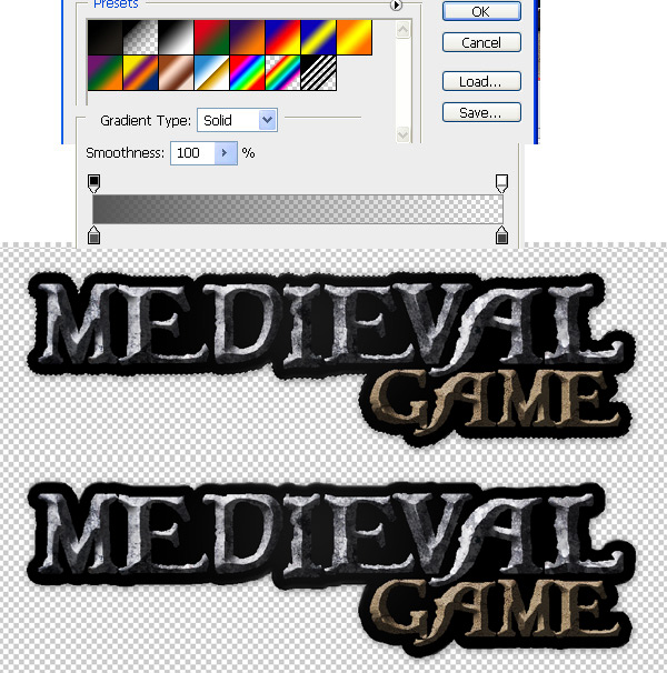 Step 10Use this Concrete Texture as a background, after you add it, make a duplicate, go to filter > sharpen > sharpen and lower the opacity of the duplicated layer to about 60%. Now select the brush tool and chose a nice rounded brush around 200 pt, and select black color and set the opacity to about 60%, add a new layer above the texture and start drawing on the edges of the canvas, to get something like below. 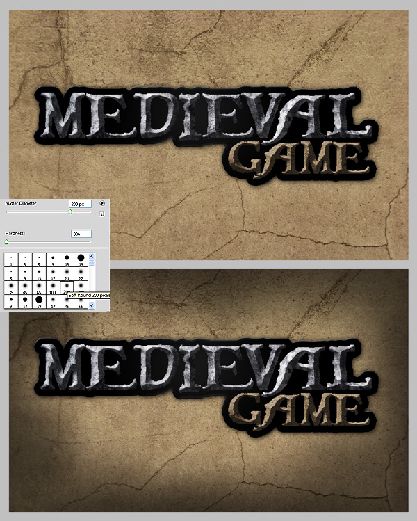 Step 11Now duplicate the layer with the black brush on the edges and set the first layer to "overlay" and the second to "normal." 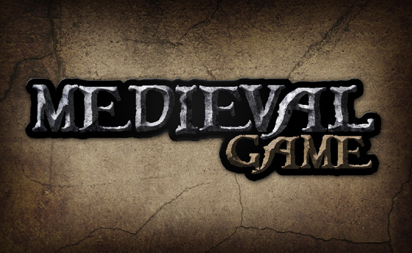 Step 12On top of all layers make a new layer to add some highlight/reflections. On the text choose a 1pt brush and set color to white, and the opacity to 70% and start drawing on the edges of the text, to make the edges more polished and shiny, this will make the logo look more detailed and realistic. See the image below for details. 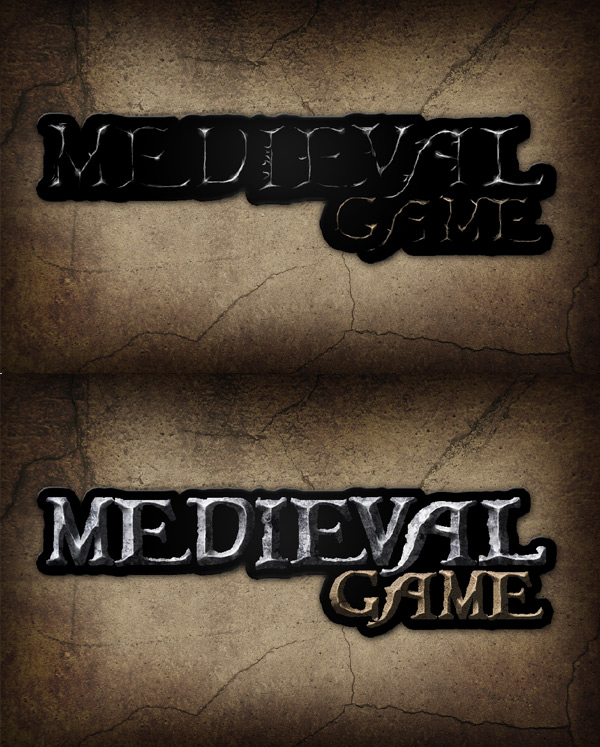 Final ImageWell, that’s it! The final image is below. I hope you’ve learned something and please let me know if you have any questions. 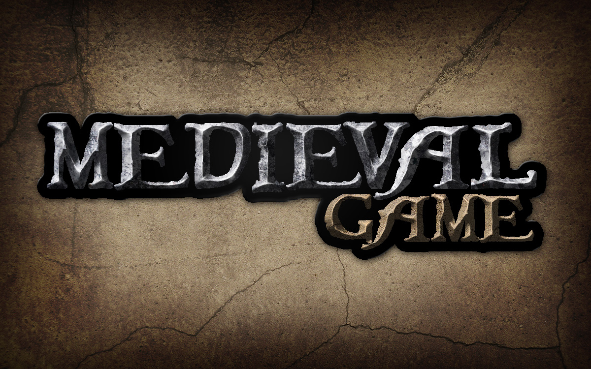 |
| You are subscribed to email updates from Psdtuts+ To stop receiving these emails, you may unsubscribe now. | Email delivery powered by Google |
| Google Inc., 20 West Kinzie, Chicago IL USA 60610 | |


0 comments:
Post a Comment