1stwebdesigner |

| Medical Websites in the Realm of Modern Design Trends Posted: 10 May 2010 02:00 PM PDT
I have browsed through all CSS galleries with zero results, made a search in Google for medical centers and even checked Google keyword suggestion tool for all the possible keywords people use to find hospitals and medical centers online… and it’s really desperate! Overall I have checked over 500 websites and just a few had a hint of modern design and the idea of the inspirational showcase post went into oblivion :) Still, I think this article will be useful for any designer working on the medical project as I’m going to analyze the structure of the websites, the important home page elements, the menu and other design aspects. At the end you will find a showcase of 24 non standard medical websites that can help you start with your own design as well as help medical centers to plan a scheme for a successful user-friendly medical website. First of all let’s look into disadvantages of the old style designs for the medical center website:
1. Small website width and as a result:
2. Usage of small fonts and as a result:
3. Non professional/small/cut photos and imagesI’m not sure if that’s really me who got used to modern creative websites, large spaces and easy access to information, but I think that the old-style websites are simply inconvenient to use. Let’s analyze what the key-points of successful medical website are and what elements I’d expect on the website home page as a regular user looking for some services or advice.
1. Something telling me not to panic.The relaxing light color scheme and some phrase in the header saying they can help no matter what. Small flash animation showing the photos of nurses, surgeons, doctors with convincing calming phrases would be perfect. 2.Search area.Search area is vital. That means easy access to the needed information. 3. Testimonials area.I feel a bit scared and desperate and I want to know what others say. In other words I need someone to calm me down and tell that everything is gonna be okay. 4. A big obvious button to Request an Appointment.Well that’s exactly the reason why I have finally come to the website of the medical center. I want to request an appointment and I’d be grateful if you could point me to the right direction right away. Comparing to other websites that’s the same calls to action, they should be big enough and obvious. 5. Phone number.The phone number should be in big letters somewhere on top right area. If that’s an emergency I’ll definitely would like to make a call. 6. Quick links.Quick links to women’s health, physical health, healthy living or to frequently requested patient and visitor information. 7. Big multilevel menu on top.Big multilevel menu on top giving access to all the sections possible. This is probably one of the website types when the larger number of sub menus can’t hurt. It’s simple, if you know nothing about medicine or doctors you won’t be able to find anything on the medical website without these multiple helping links. 8. Community engagement.Link to forum, blog or some knowledge center. People are social creatures yet afraid of doctors and all of us would probably study all the possible literature and cases before visiting the doctors. Here’s when the forum with the doctor advice would be real handy.
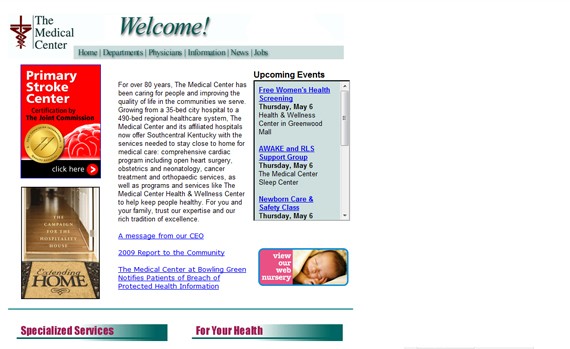
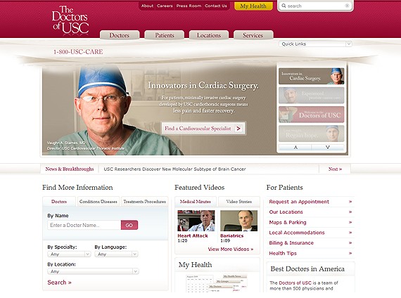
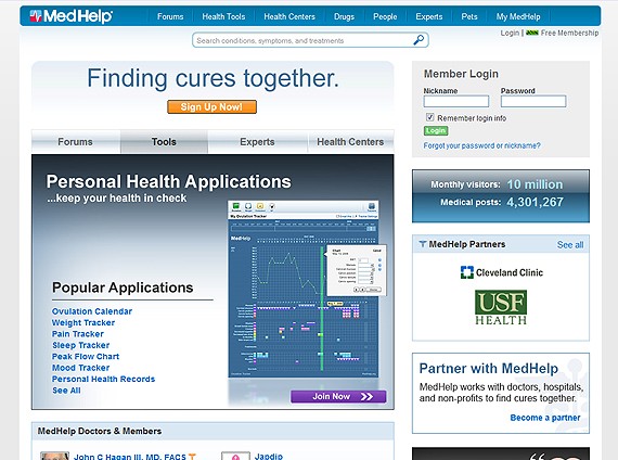
Making this small analysis and comparing multiple old style and more up-to-date websites I have come to conclusion that this ancient websites suck not because I miss all the modern cool elements, big buttons or cute boxes, but mostly because there’s simply no place for the information that visitors were seeking for and expected to see. Thus, building a website for a medical center or hospital keep in mind that space is really important. Think about people who would visit the website, about their behavior and psychology, talk to your friends, parents and grand parents as in this case that might be more helpful than your 10 years of website design experience. Below is a collection of 24 medical websites that truly stand out from the crowd. They are both for website planning and design inspiration and I’d be happy to see a website created by you or your company in this list in the near future. Stay tuned and good luck! 24 Really Nice & Non-Standard Medical Center Websites1. Doctorsofusc
2. University of Illinois Medical Center
3. MedHelp
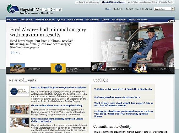
4. Flag Staff Medical Center
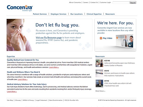
5. Concentra
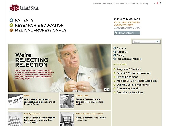
6. CSMC
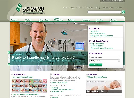
7. LexMed
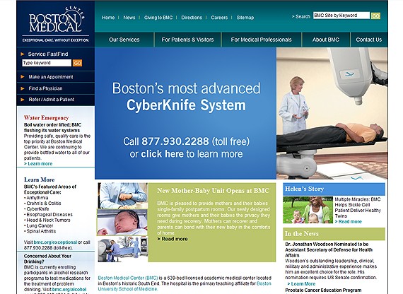
8. BMC
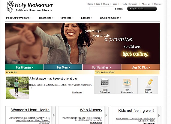
9. HolyreDeemer
10. Health Angle
11. GapMedics
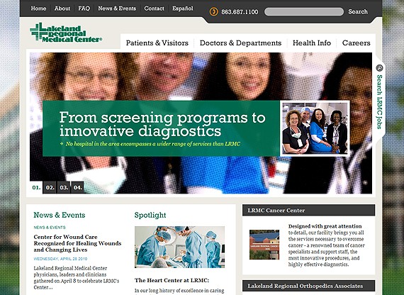
12. lrmc
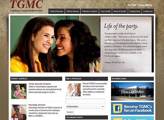
13. Tgmc
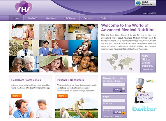
14. Shs-Nutrition
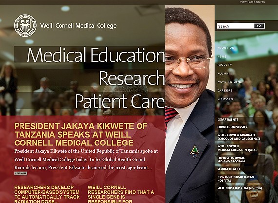
15. Med.Cornell
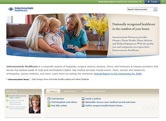
16. Intermountain Healthcare
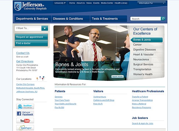
17.Jefferson Hospital
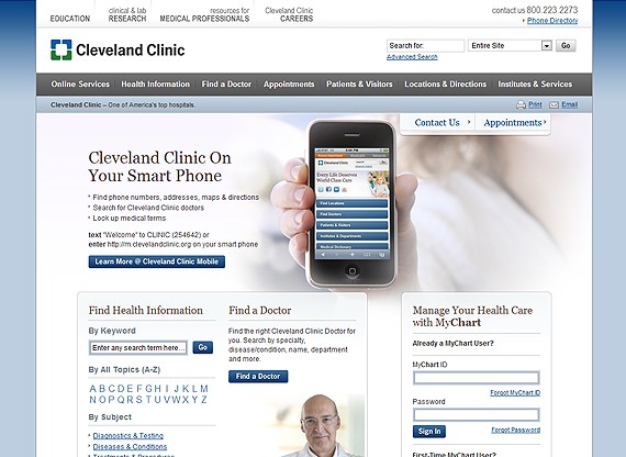
18. Clevel And Clinic
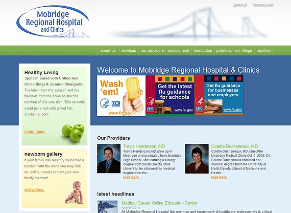
19. Mobridge Hospital
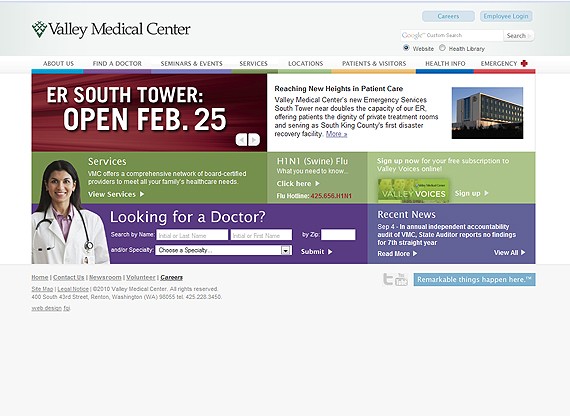
20. Valley Med
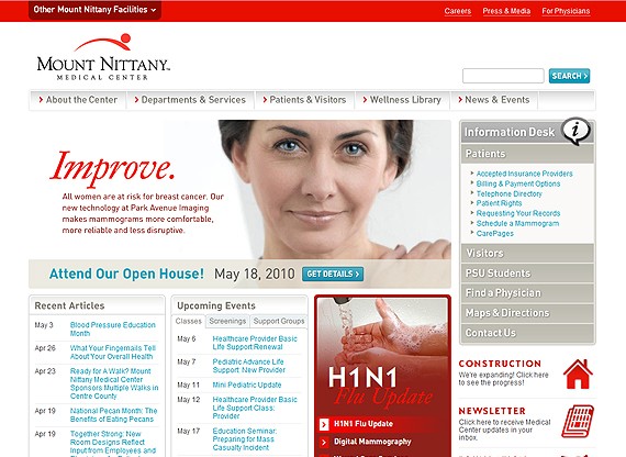
21. Mountnittany
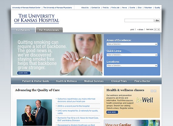
22. Kumed
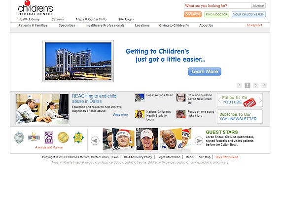
23. Childrens
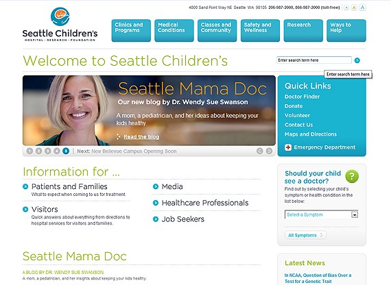
24. Seattle Childrens
|
| Case Study: Call to Action in Web Design Usability Posted: 10 May 2010 03:00 AM PDT
We keep informing them every time we make something 'more prominent' we are taking prominence from the previously highlighted sections, effectively making nothing stand out. While researching the topic, to formulate an evidence based repost for our client, I discovered numerous reasons why it's essential to distil your calls to action down to only the core outcomes you want from your audience.
Be wary of causing choice paralysis
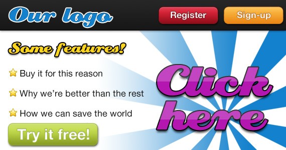
Choice paralysis occurs when users are supplied with too many similar choices. The abundance of choice leaves consumers confused as to which option to take. They end up not making a choice at all, in fear of making the wrong decision. Your calls to action should have clearly distinct outcomes
If you need to provide your users with more than one call to action on a page, try to ensure that your users understand the difference between them. For example, having one call to action labeled 'Sign-up' and another labeled 'Register' would make it very difficult for any users to decipher which option they should take. If both calls to action seem to lead to the same outcome the likelihood of confusion increases. We don't read pages, we scan them
If users read everything on a Web page in the order they are displayed, numerous calls to action wouldn't be as much of a problem. The individual would read the supporting paragraph, decide they want to read more about that and hit the corresponding link. However, as Steve Krug describes, "we scan (or skim) them, looking for words or phrases that catch our eye", which means it is unlikely that your users are going to read the accompanying paragraphs and will instead choose where to go next by the text within the call to action. The more call to actions they have to scan through, the higher the chances they will choose the wrong one. There are only so many ways to make something stand outEvery time our client asks us to make something 'stand out' on a page they don't seem to grasp our warnings that this will dilute previous calls to action. I think the reason for this is because they are used to seeing the page in its previous state and therefore have become desensitized to the previous calls to action. So when we add another one this stands out, to them, far more than any others. However, a new viewer of that page has no previous experience with it and therefore everything is new to them and therefore fighting for their attention. There are only a few different design techniques that can be used to make something stand out; contrast, white space, size, positioning etc. With this in mind, when you have numerous calls to action on a page it is very unlikely that any of them will stand out more than others. More choice leads to greater dismay because expectations are raised
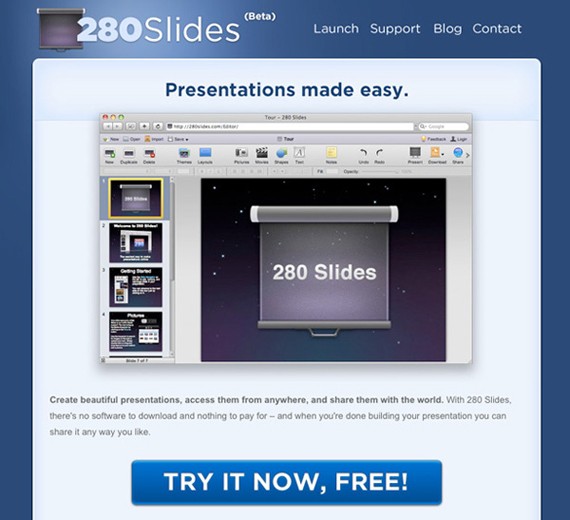
Our client's homepage consists of a number of pods, with each pod representing a different segment of their target audience. We tried to create broad pods, to ensure that everyone who visits the site instantly notices a section that could potentially be for them. However, our client wanted to present some very specific roles along with our broader suggestions. This presented the problem that a visitor to the site could see these more specific options and believe that there would be a specific role for them, thus raising their expectations. When they discover that their specific area hasn't been represented, they could wrongly decide that this site doesn't have what they are looking for. However, if we were able to keep the number of pods to a minimum, users would be more likely to want to explore a section that could possibly relate to them. To concludeWhen thinking about the possible calls to action on your site, be sure to ask yourself exactly why every call to action needs to be there. More calls to action lead to a more complicated interface and could possibly lead to more dissatisfaction. Try to highlight only the most important actions on your site, otherwise you could risk none of your calls to action being noticed. Finally, I thought I’d leave you with an excellent example of a focused call to action. The guys at 280 slides have decided they want their users to try a demo of their product and so this is the only call to action on the homepage. They could easily have given numerous options to their users increasing the cognitive load, however they have done a great job of focusing their audience on the task they think is most important to them.
Related readingThe Paralysis of Choice and How to Improve Sales and Customer Satisfaction Call to Action Buttons: Examples and Best Practices 10 techniques for an effective 'call to action' |


| You are subscribed to email updates from Graphic and Web Design Blog To stop receiving these emails, you may unsubscribe now. | Email delivery powered by Google |
| Google Inc., 20 West Kinzie, Chicago IL USA 60610 | |
0 comments:
Post a Comment