1stwebdesigner |

| 9 Usability And UX Pitfalls: Learn How To Avoid Them Posted: 15 Jun 2010 02:00 PM PDT
If we want to be ahead of the design curve: get more satisfied clients, and happier users, we need to make sure that both we and our clients understand what these points are, and how to solve them. When designing and developing a website, there are many different things that we focus on:
Remember, as Jacob Neilsen once said:
The inverse is also true, a good, well designed website is a great way to represent your brand, and to get your message out there. Read on for a brief list of some of pitfalls that can bring your site down, and how you can solve these issues just below. 1. Hard To Find Content You Are Interested InThese sites are known, but design is outdated and what about usability?: 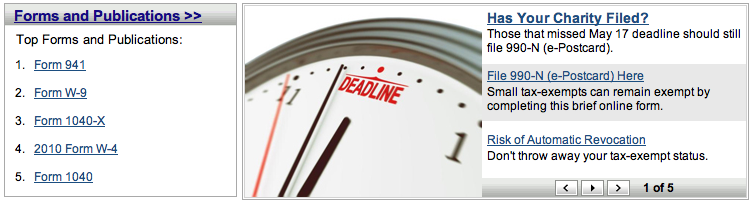 Form number what now?  The spinning dominoes are the links to the content... 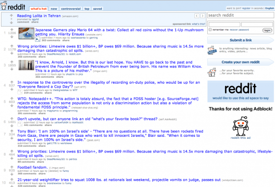 Ah, reddit.com, my old foe. I like the concept, but the content hurts me How many times have you been to a website, eager to search for some pertinent information about:
..or other factors, only to find the content is nigh on impossible to find. How many times have you had friends ask you for help when searching for certain information because they just didn’t know how to find the right information? Government departments and utilities especially, I’m looking at you! I’m sure everyone has had their own soul destroying experiences with sites like the IRS. Browsing the web shouldn’t be this difficult – as we are often told, content is king. We need to ensure that content takes pride of place on its’ throne, that users can find all the information that they are looking for. We shouldn’t have to go in and out of a million different menus before we find the correct content. Solution You know best what information is important for your users, make sure this information is easily accessible. So you have a lot of content on your site?:
A blur test (where you add say a 10% blur to your design images) can help to make sure what you want to be visible really does stand out. Use usability testing sites like IntuitionHQ.com to see what’s working and what’s not. 2. Poor layout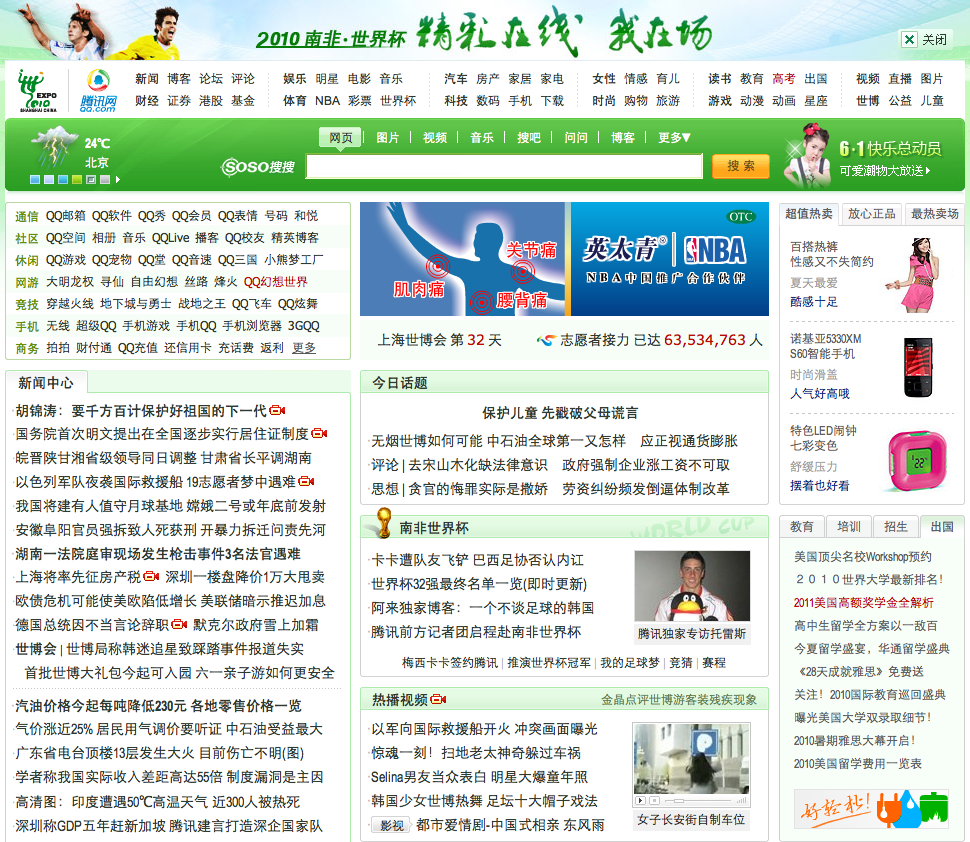 I know this is in Chinese - it means you can see all the text flying at your face even more  Text, everywhere. Want to know more? Click! Anywhere!  Functional? Kind of. Pretty? Not even close. Of course, another reason why content is so hard to find is poor layout.
OK, some of these statements may be exaggerations, but I’m sure all of you have come across sites that have done all of these things and worse. Again, this is taking the ‘content it king’ thing a few steps too far – you should really put it all in it’s appropriate place – I think a lot of news sites try and shove all the content on the front page because they think that’s the only place we’d ever possibly look. If things are neatly laid out, we won’t have this problem! Solution
Just because some poorly laid out sites succeed, doesn’t mean you should try and follow their trend. They succeed despite poor design and poor layout, not because of it. It also means they are more susceptible to losing out to more functional designs in the future. Don’t listen to clients when they tell you to do something which you know doesn’t work, and use usability testing to prove your point – the results can’t lie, and they have nothing to argue with. 3. Confusing menus It turns out the orange bar with the question mark is for navigation...  As they say, a picture is worth a thousand words...  Nice enough looking site, but what do flash and HTML mean to most people? People are generally pretty familiar with menu navigation,but..:
Also, make sure people know how to get back where they came from… This is a big issue for ordinary users. Solution
These little things do make a difference.
4. Poor menu layout and design: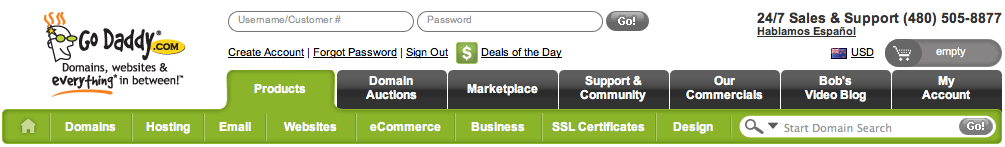 Menus, menus everywhere, but nothing to be found  I suspect most people aren 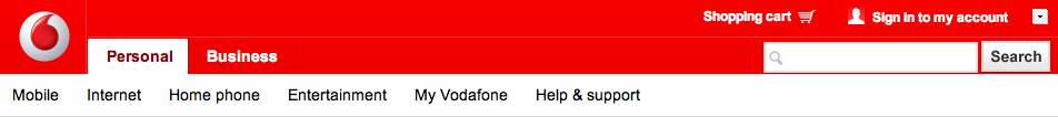 Pricing feels like it might be a popular option, but nowhere to be found Many sites also suffer from poor menu layout and design:
Neither of these outcomes benefit you. Solution You should be using different analytics tools to tell you:
Make use of this information. For content driven sites, try linking to relevant articles from previous articles, and actually using categories and tags so people can find the relevant information. With advertising – try and keep it to the sidebar and end of articles, and even then you should limit it’s numbers, flashy-ness, and make sure it fits in with your site. 5. No or poorly done indicators of progress:Dell - Seems easy enough 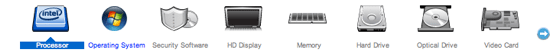 But wait, there's more! And where does it end? Nobody knows. Some sites do this, some sites do it very poorly, and some sites don’t give any indicators of progress at all. When it isn’t done or isn’t done well, it makes a really frustrating user experience:
It really does make for a frustrating user experience, and leads to much higher abandonment too. Oh, people like to know when they’ve actually finished the process too. Try and make signup and purchase as easy as possible:
Solution People love to know where they’re at, and how much further they have to go. Tell them. The easiest way to do this is just a list with steps – Dell got this half right, and then decided to add about a million sub-steps, so it’s kind of wasted. Doing this right is so simple, and yet often forgotten. A little ’success button’ or the like when signup or purchase is finished wouldn’t go astray either. 6. No way to provide feedback And contact or feedback?... Feedback? Check! Four levels deep? Hmm Contact? Feedback? Nowhere to be found OK, Facebook probably has the best excuse for this – if contact details were floating about, they would probably get millions of enquiries every day from the same kind of people who find the login page via google, and complain when they find other sites instead. However, for smaller sites getting feedback from users is invaluable. Even for bigger sites, the people who complain probably represent a large number who care but just can’t be bothered or don’t know how to let you know their feelings. Solution Feedback forms are about the easiest thing you could set up. The feedback you get from them is priceless. And wouldn’t you rather your users came complaining to you than left for your competition? The fact that people care enough to contact you is a sign of success for you site, so go ahead and make it easy for them to get through:
The choice is yours, but having several options is a good way to ensure there is a method to please everybody. And while you’re at it, people love about pages too, even very simple ones will do – your analytics results will surprise you with just how many people click through to these pages. 7. Use of social media: Just about everyoneThis makes me feel sad. We all know social media is taking over the web these days. Every man and his dog needs to have Facebook, Twitter, Digg, LinkedIn… Well, the list just goes on and on really. This is a really great way to connect with your audience, to let them know what is going with your site, company, brand etc, and to generate buzz about your company. BUT, and this is a big but, about 99% of people on these services never update their pages or have 3 or 4 followers on twitter (OK, we all start somewhere, but if their last tweet was months ago, maybe it’s time to let go). Solution Explain to your clients, it’s great if they use social networks, but they need to have a strategy. If they want to use social media, they need to use social media! This means good content, regular updates, and actually connecting with people. Maybe if Kevin Costner builds it, they will come, but this doesn’t work for everyone – for most people you get out what you put in. If they won’t use it, don’t do it. It looks really unprofessional when these sort of organisations just let things hang. 8. Too Many Options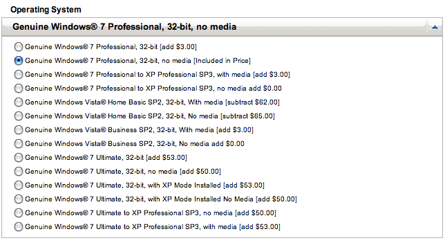 Um, what?...  My head hurts just looking at this Sorry reddit - just too many choices. If there is one thing Apples recent success has shown us, it’s that most people don’t care that much about having millions of different options to choose from. They want maybe a couple of basic choices at best, and something that works. I’ve lost count of the number of sites I’ve gone to which try and sell me on a million and one different things, 99.99% of which I don’t want, rather than just presenting me with fewer options which I can actually choose from. I don’t need 50 different options for web hosting, 3 or 4 different tiers will do me fine. I’d tell them that through the feedback form if they actually had one… I’m sure you’ve all had people come to you with complaints like this:
Solve it. Solution Keep it simple. You know your users/customers/readers best. Figure out what they want, and just give them that. They honestly don’t need millions of different options, and the time spent customising for every last one of them just simply isn’t worth it, and confuses the hell out of most ordinary users, as well as making for a really frustrating user experience. 9. Links, forms and buttons that don’t workYou can crap out, but website won’t tell you why you can’t go on – Countless. 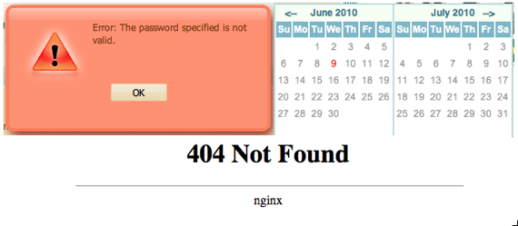 The password (on sign up) that won't work; The unclickable calendar; And the least helpful 404 Ah yes, the old favorite; after all that time filling in the feedback form, signup form etc., you click the submit form and… Error, the form is broken. And you know what, we won’t save all the data you just entered, so you’d better enter it again.
Solution Test, test, test. This is one of the most basic usability flaws you can have, and one which has a great impact on your site. These kind of negative experiences really push people away from sites, and make them never want to come back. The more you test, the more you will find. Of course, there needs to be limits, so when you go live make sure the feedback form is there and works too! If you are going to have mandatory fields, make sure they really need to be mandatory – a sign up without complete information is still better then. I was recently signing up for a service that demanded to know what state I’m from. The only problem is, I’m from New Zealand, and we don’t have states here – and of course, there was no prompt to tell me what they actually wanted to know. When people do hit a 404 page, try and have some useful information there so they can get to the information they want. ConclusionOf course there are many other pitfalls, these are just a few key examples to get you started. Nobody can be perfect either, the point is, the more you think about it, the more you test, the better your sites will be. The better the site, the happier the client, and the more success you will have in the long run. On top of this, usability testing is another service you can sell on to your clients, and which adds a lot of value for them too. It’s win-win; you get more money, and they get better sites. Do you have any pet peeves about usability, UX, or design in general? Be sure to let us know in the comments! Your feedback is very welcomed! |
| Free WordPress Theme : A Simple Magazine Posted: 15 Jun 2010 03:00 AM PDT
A Simple Magazine is provided to user under the open source GPL License, you can use it for all your project or at least use it as a foundation for your next projects for free and without any restrictions. Please link to this article if you would like to spread the world. A Simple Magazine is released especially for 1stwebdesigner readers. Features
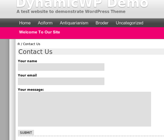
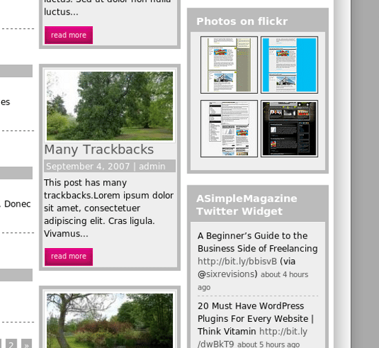
Theme PreviewsFrontpage Archive page Contact page Share button Flickr and Twitter Widget DemoYou can see the functional live demo of A Simple Magazine. DocumentationRead the documentation page of AsimpleMagazine, to learn how to use this theme. DownloadASimpleMagazine (ZIP, 184.2 kb) |


| You are subscribed to email updates from Graphic and Web Design Blog To stop receiving these emails, you may unsubscribe now. | Email delivery powered by Google |
| Google Inc., 20 West Kinzie, Chicago IL USA 60610 | |
0 comments:
Post a Comment