PSDTUTS Updates |  |

- More Than 620 Bokeh Background Textures
- Incorporating Surrealism Concepts into Your Digital Artwork
- Create a Textured Female Robot in Photoshop
| More Than 620 Bokeh Background Textures Posted: 22 Jun 2010 05:45 AM PDT
As I’m sure you already know, textures can come in very handy; whether you’re using them to subtly add interest to your work, or in full-blown, award-winning photo manipulations. Bokeh is the term used to explain the blur, or the aesthetic quality of the blur in photography, and is usually seen in good quality macro shots, in the areas that lay outside the depth of field. As bokeh is more than often very pleasing to the eye, photographers tend to purposely produce bokeh in their images, and sometimes deliberately take out-of-focus shots to take images that show nothing other than bokeh. Designers have picked up on this, and over the years there has been a huge increase of bokeh being used in graphic, print, and web design. This round-up consists of a whopping 626 textures, both free (the majority) and premium, which you can use to spice up your photos, as backgrounds for your latest web design, and, as most of them are high resolution, even in your print design projects.
Free Bokeh TexturesTake a look at these incredible free bokeh textures available on the web. Five Colourful Bokeh Textures (5 Textures)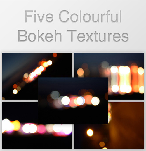 Out of Focus: 30 Free Bokeh Textures (30 Textures) Colored Grungy Bokeh Textures (5 Textures) Raining Light Bokeh Pack (11 Textures) Crazy Firework Bokeh Stock (1 Texture) Heart Bokeh Textures (3 Textures) Bokeh Collection (4 Textures) Bokeh 2 (1 Texture) Bokeh Textures Pack (10 Textures) Bokeh Texture 3 (1 Texture) High Resolution Bokeh Texture (5 Textures) Bokeh Texture Pack 001 (20 Textures) Rainy Night Street Light Bokeh (1 Texture) Grungy Bokeh Pack (6 Textures) Bokeh Collection II (5 Textures) Bokeh Stock Images (11 Textures) Glitter Bokeh Texture Pack (33 Textures) Bokeh Texture Pack 002 (10 Textures) Bokeh Pack 2 (27 Textures) Regularjane’s Bokeh Textures (11 Textures) Christmas Bokeh Stock Pack (15 Textures) Bokeh Super Pack (14 Textures) Bokeh Pack 5 (22 Textures) Bokeh Texture Pack 003 (14 Textures) Bokeh Pack 6 (30 Textures) My First Bokeh (1 Texture) Bokeh Texture Pack 004 (7 Textures) Bokeh Pack 3 (39 Textures) Royale Bokeh (4 Textures) Lensbabie Bokeh Stock 2 (14 Textures) Bokeh Texture (1 Texture) Lensbabie Bokeh Madness Stock (13 Textures) Bokeh Textures (5 Textures) Bokeh Textures (10 Textures) Freaky Distorted Bokeh (5 Textures) Night Bokeh (4 Textures) Color Bokeh Textures Pack (4 Textures) Bokeh Pack 4 (20 Textures) Bokeh Bubbles Icon Textures (24 Textures) Grungy Abstract Bokeh Textures (3 Textures) Heart Bokeh Pack (6 Textures) Water Bokeh Stock (9 Textures) Natural Bokeh (4 Textures) Bokeh VII (3 Textures) Premium Bokeh TexturesTake a look at these incredible premium bokeh textures available on the web. Circle of Bokeh (1 Texture, PSD Included – $3) Light Bokeh Abstract Background (14 Textures/Backgrounds, PSD Included – $4) Bokeh Effect Background (10 Textures/Backgrounds, PSD Included – $3) 60 Bokeh Abstracts (60 Textures – $5)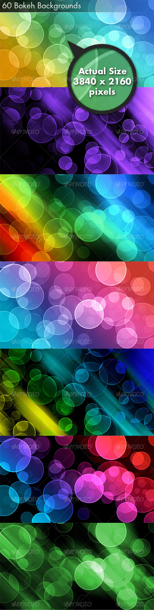 7 Bokeh Textures (7 Textures – $6) Bokeh Backgrounds (4 Textures – $3)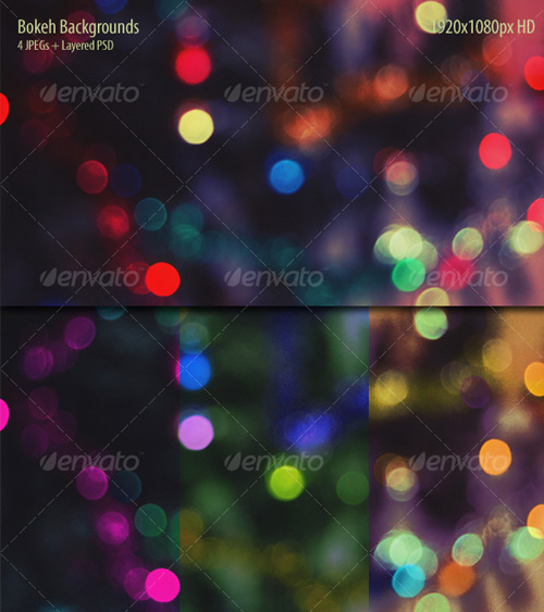 8 Bokeh Effect Backgrounds (8 Textures/Backgrounds, PSD Included – $4) 44+ Mosaic Bokeh with Pluses (44+ Textures/Backgrounds, PSD Included – $5)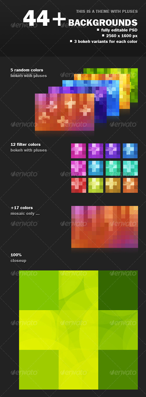 8 Colorful Abstract Backgrounds (8 Textures/Backgrounds – $8) You May Also Like…
|
| Incorporating Surrealism Concepts into Your Digital Artwork Posted: 21 Jun 2010 07:55 AM PDT
Have you ever wanted to incorporate Surreal concepts into your artwork, but weren’t sure how to approach it? In this article, I share my personal pipeline for fusing Surrealist notions with my imagination to create fresh work. Learn to unleash your mind, capture your dreams, and fuse wild ideas into well crafted digital works of art through experimentation, planning, and execution.
This Post is Day 8 of our Digital Illustration Session. Creative Sessions IntroductionI am in no way a Surrealist technique master, nor am I a Surrealism scholar. I am not here to discuss what Surrealism is and how it’s done right – as there are no rights or wrongs. What I will share with you in this article is strictly my personal approach to creating Surreal digital artwork by incorporating the Surrealism approach with my own twists. Below, you will find five sections, which roughly define my pipeline of how I approach creating Surreal artwork and basically any otherworldly work. They are formatted from early conceptual notions, to actual execution, things to look out for during creation, and final tips that may help you with the entire process.
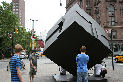
“Parade of the Dreamers,” by Jeff Huang, For Desktopography 2009 Unleash Your MindNo, this is not relating to the Matrix, but it is an important matter to discuss. When it comes to creating your own artwork, you must remember that you aren’t trying to please anyone but yourself. You are not aiming to please a client, nor do you have to worry about revisions. Self-satisfaction should be your goal in creating personal artwork. The biggest misunderstanding is that people often try to stress their imagination and try to force themselves to think of something extraordinary. You do not have to do that. As a matter of fact, it makes matters worse because you may force yourself too hard, be stuck, and end up getting frustrated. To avoid all of that, I believe one should just let go, relax, and let their imagination do the work. You’d be surprised how much better the imagination works when you aren’t forcefully trying to get it to work. Remember not to get frustrated. You may find yourself stuck at times, but that’s alright! Move on to doing something else! Go take a walk, watch TV, buy some groceries, go have dinner with your loved ones. What I’ve learned is that I often come up with ideas when I least expect it. Life itself inspires, and if you just go about it daily, there are an infinite amounts of things that we see, hear, and feel that will spark our imagination. Below is an example of something I’ve seen here in NYC that certainly inspires.
“Alamo (The Cube),” is an outdoor sculpture by Bernard (Tony) Rosenthal, which is located on Astor Place, on the island of Manhattan in New York City. Capturing Your DreamsSo you’ve come up with an idea and want to execute it. Here are a couple things to do in order to capture that idea before it fades away:
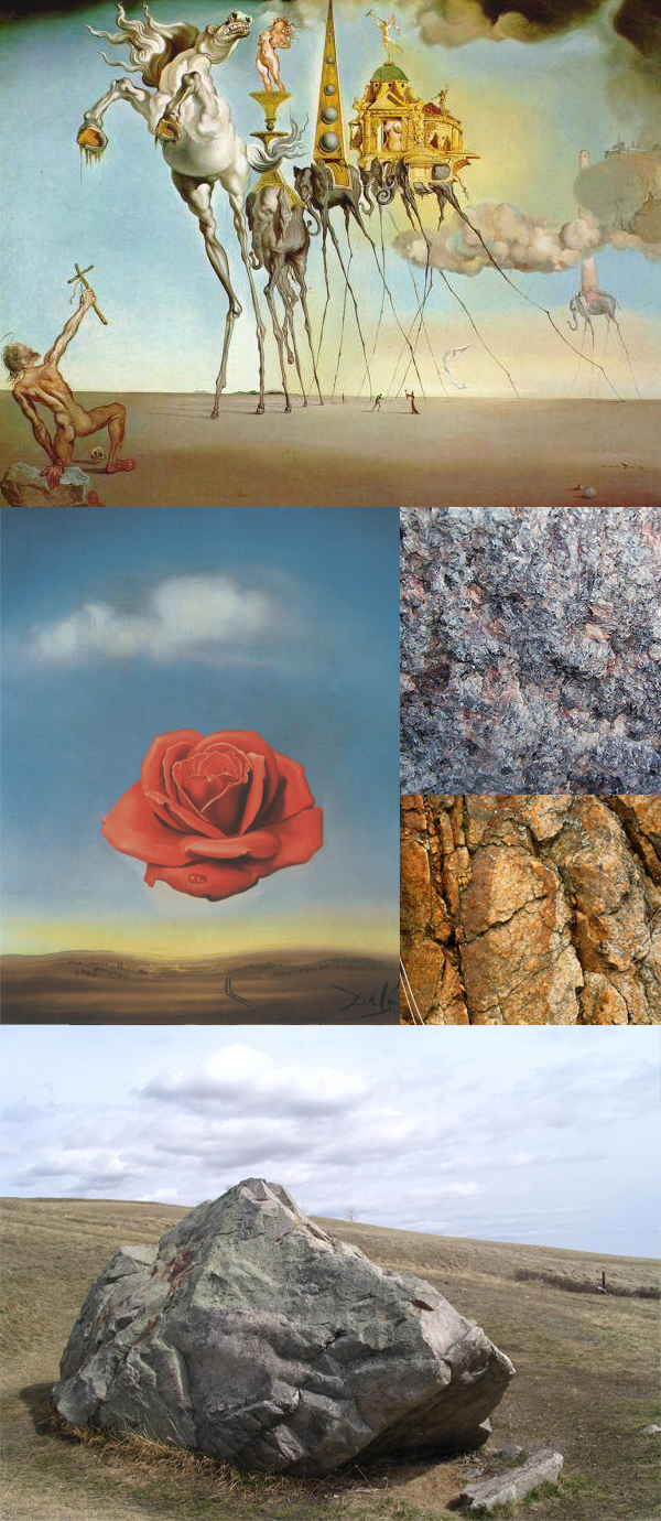
Below is a sketch of a potential upcoming piece and a few reference images that I possess. I imagine the structures floating to be rocky structures, thus I found references of strong rock textures, as well as relevant inspirational surrealist work.
Sketch of mine for a potential upcoming piece.
Reference images of rock textures and Surrealist work. Mindset During CreationNow that you are ready to start the piece, let’s go over some things you may come across during the creation process.
Below is an example of how something could be convincing but not hyper-realistic.
“Meditative Rose,” by Salvador Dali Realism Versus SurrealismThis goes back to the earlier question of, “Does this look real?” If you want to create a Surreal piece of art, I believe it’s important to know the difference between Realism and Surrealism. I will try to define what these two terms mean to me personally, not as written by the Dictionary. Remember, this is what the two terms mean to me, and I have no intension to start a mass debate on what they truly mean.
The point that I’m trying to make is that one can be free when creating Surrealist work. This goes back to unleashing the mind as mentioned earlier in the article. This is what I love about Surrealism and it is the reason why my artwork often exhibits a Surreal atmosphere. I don’t need my work to be hyper-realistic, nor am I aiming to be in the future. I just love playing between the lines of the Real and Unreal. As an artist, I feel rather powerful to have the ability to control and deliver such notions to the audience based on my will. To me, Surrealism is the perfect movement for artists who enjoy letting their imagination go wild, which allows them to delivering their wild visual ideas in a believable atmosphere. Tips and RecommendationsHere are some tips and recommendations that I have that may help you with your creative process and artistic vision:
A piece from my sketchbook, created 2007. ConclusionSo there you have it, a peek into my mindset, a look into how I incorporate Surrealist concepts into my digital artwork. Surrealism is perfect for artists whom enjoy playing the fine lines of the real and unreal. Digital artists – remember that the software is just your canvas and basic tools. Your main tool is your imagination. A lot of people ask what sort of software an artist uses to create their artwork because they believe it is the software that does the work…but this is totally wrong. Many people could use Photoshop, but it is how you use it in conjunction with your mind, your attention to detail, and overall aesthetics that makes you stand out above all. Resources and Inspiration
This Post is Day 8 of our Digital Illustration Session. Creative Sessions |
| Create a Textured Female Robot in Photoshop Posted: 21 Jun 2010 06:00 AM PDT
Photoshop is great for creating resizable, realistic, characters. Thanks to its basic support of vector shapes, its amazing layer styles and the endless possibilities offered by textures we can create compelling vector characters with complex shading while keeping file size to a minimum and performance to a snappy level. In this tutorial we will create a female robot made of simple vector shapes, we will use layer styles to lay down convincing metal shades and a few textures to add a final layer of realism.
ResourcesThe following resources were used during the production of this tutorial: Step 1Create a new blank document, using the size you want. Activate Snap from the View menu with Shift + Command + ; and hit Command + ‘ to turn on the grid. Using the Pen Tool (P) in Shape Layer mode draw the head (1a). Make sure all points snap to the grid and all lines lie on the pixels, not across them. This way we’ll avoid anti-aliasing. Using Color Overlay (1b) make the head light pink (1c). 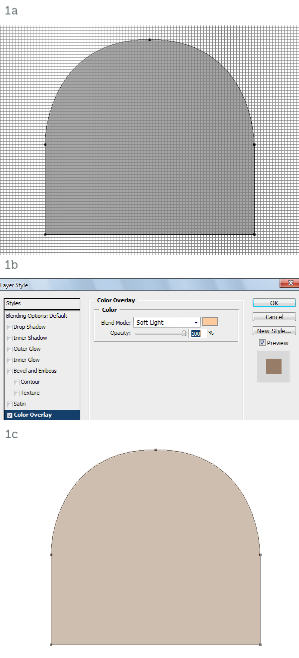 Step 2Add a Gradient Overlay style (2a, 2b) to simulate metallic reflections (2c). 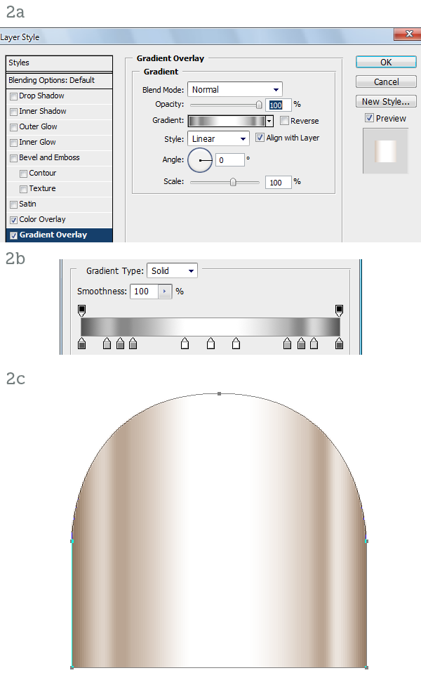 Step 3Add some Inner Glow (3a) to simulate ambient reflections and Inner Shadow (3b) to enhance the roundness of the surface. The character is mainly lit from above and ahead so the inner shadow around the top of the head effectively pushes back the outline (3c). 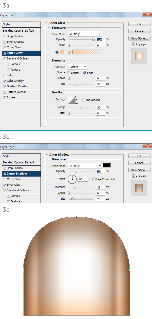 Step 4Create the neck with a simple, gold rectangle. Again make sure you snap to the grid for perfectly crisp edges (4a). With a Gradient Overlay (4b, 4c) we add reflective highlights. An Inner Shadow (4d) simulates the shadow cast by the head (4e). 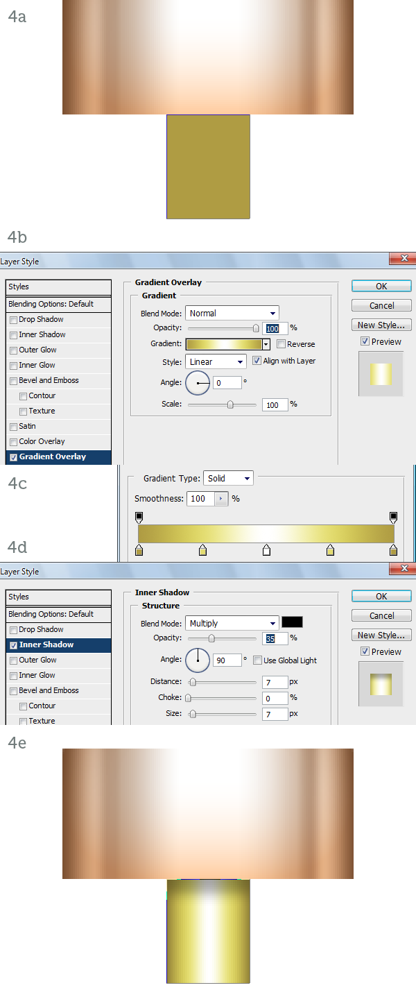 Step 5On to the eyes. Draw a gold circle (5a). Add an Angle Gradient Overlay (5b, 5c) to create a different type of metallic reflection (5d). 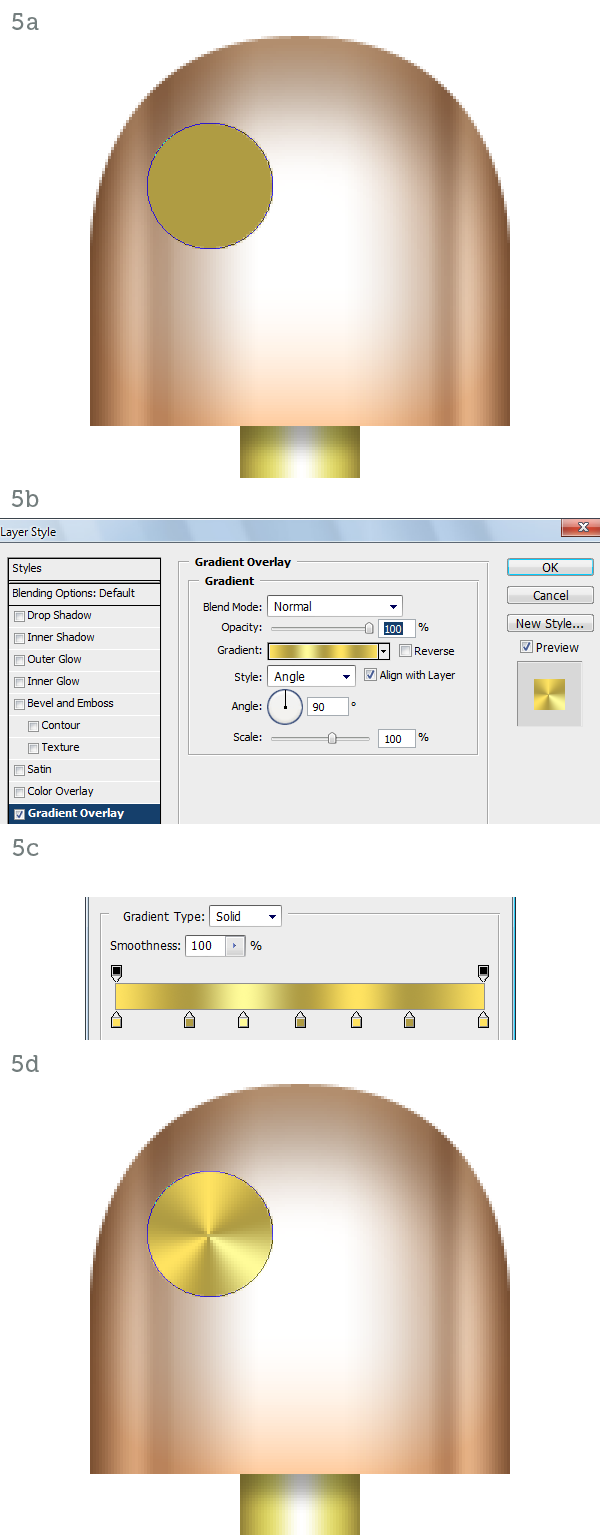 Step 6Using a Stroke set to Inside create the raised border (6a). With an Inner Shadow (6b) and a Drop Shadow (6c) we make the eye protrude from the head (6d). 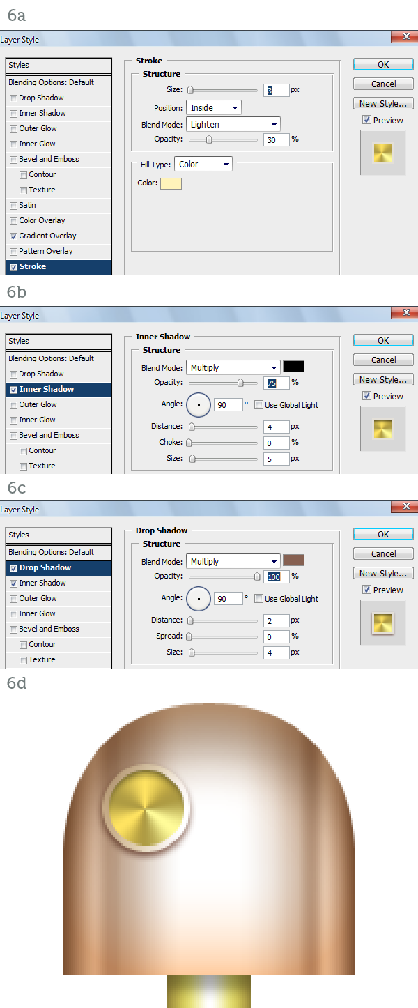 Step 7The pupil is a simple orange circle (7a). A Bevel and Emboss set to Down (7b) will make the pupil inset (7c). The Inner Glow set to Center (7d) will turn the eye on (7e).  Step 8To finish off the pupil we have to add an Inner Shadow (8a) and a purple Outer Glow (8b). The eye is complete so we can duplicate it (8c). Here are the layers so far. It’s important to keep an organized layer structure. Use folders and colors, if you like (8d). 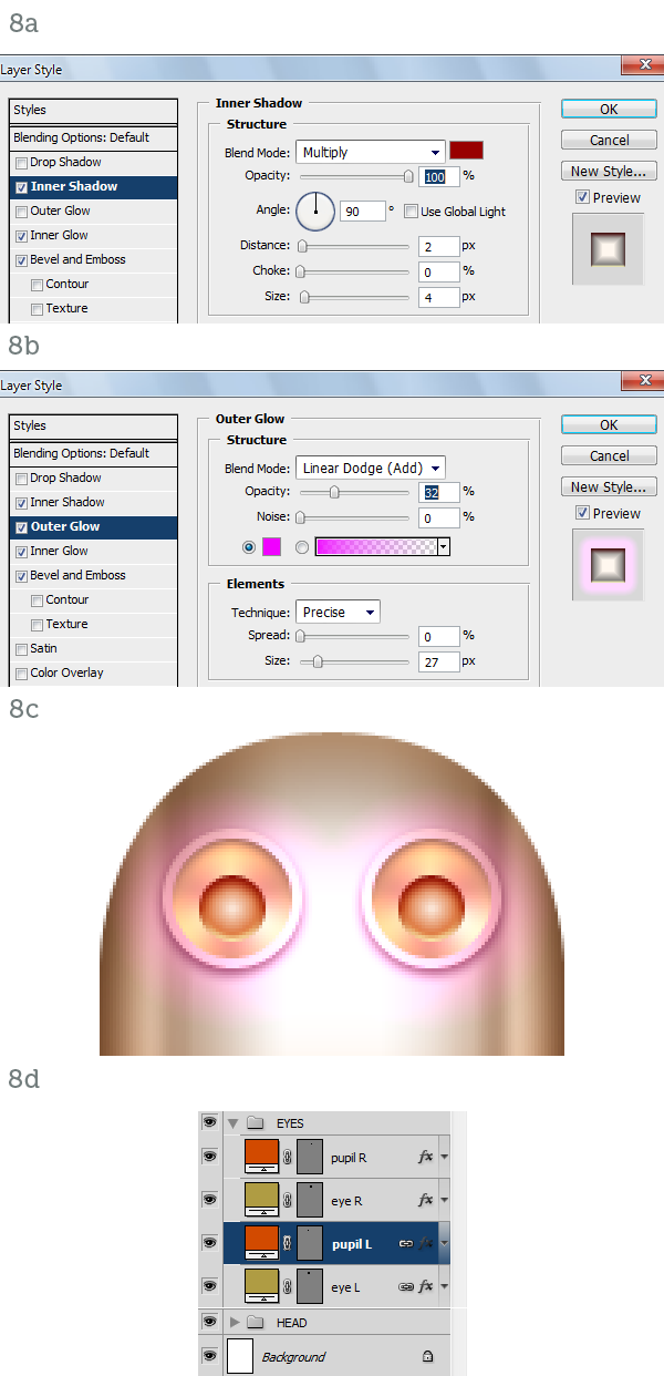 Step 9Draw the shape for the lips (9a). Using a yellow-to-transparent Gradient Overlay (9b) we highlight the upper lip (9c). Add a Stroke, an Inner Shadow and a Drop Shadow or better yet copy them from the eye to complete the lips (9d). 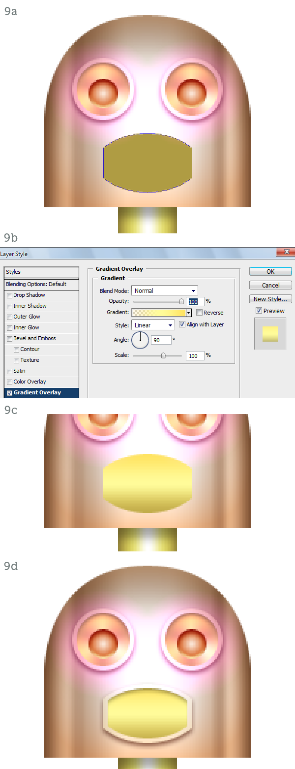 Step 10Create the center tooth as a dark brown rectangle (10a). Use Bevel and Emboss (10b) and Inner Shadow (10c) to inset the tooth. It is in fact a slit in the lips (10d). The rest of the teeth are created with copies of the center tooth, shortened vertically with the help of the grid (10e).  Step 11The torso is a trapezoid (11a). The shading technique is the same as before. Gradient Overlay (11b, 11c), Inner Glow (11d), Inner Shadow (11e). The result is a metallic cone (11f). 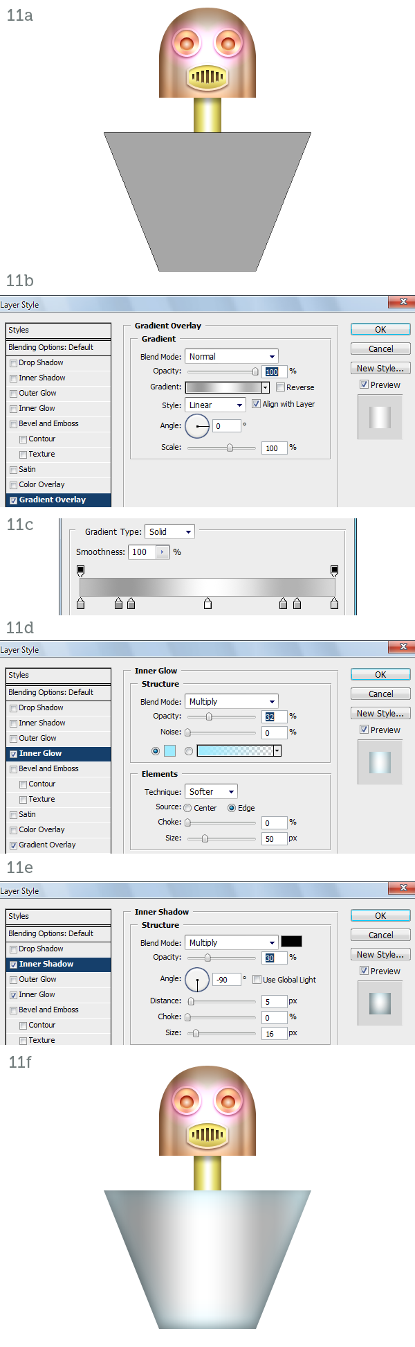 Step 12The skirt has a bell-like profile (12a). Yet another time use Gradient Overlay (12b, 12c), Inner Glow (12d) and Inner Shadow (12e) to shade it (12f).  Step 13Draw the left arm as a thin metal rod that initially curves out and down from the shoulder and then ends in a straight line (13a). Using a dark Inner Glow (13b) we simulate a rounded surface (13c). With the same method create the hand (13d). As you can see similar materials are created with the same layer styles. Of course you have to use your judgment and make minor adjustments to the settings to adapt the styles to different shapes and/or dimensions.  Step 14The hand is attached to the arm via a round joint similar to the eye (14a). Apply a similar Angle Gradient Overlay (14b, 14c) and a slight dark stroke to enhance the edge (14d). The hand is finished (14e). 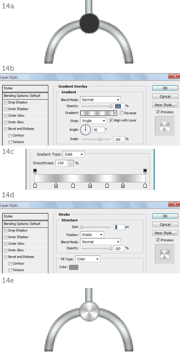 Step 15To complete the arm we need to draw a wire that winds around the metal rod. Create a new layer. Draw the spiral with the Pen Tool (P) in Paths mode (15a). Hit B to activate the Brush Tool and then F5 to open the Brushes palette. Pick a hard-edged, round preset and set the Diameter to 2px (15b). Now in the Paths palette right-click on the spiral path and choose Stroke Path. The path will be stroked on the new layer (15c). Mask the spiral where it curves behind the arm (15d). 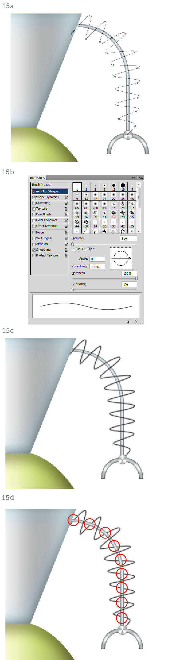 Step 16Activate the Dodge Tool (O) and set it to Shadow mode. Paint on the spiral where it faces the view directly. These parts catch highlights and should be almost white (16a). The arm is finished so you can group all its layers. Duplicate the group and flip it horizontally to the other side of the body to create the second arm (16b).  Step 17It’s time to add some detail to the body parts. The head, the neck, the torso and the skirt are made of metal plates soldered and riveted together. Create a thin vertical rectangle down the middle of the torso, make it medium gray (17a). Now open the Brushes window (F5) and increase the spacing to about 600%. In the preview you will see the brush stroke change to a trail of dots (17b). Holding down Shift paint a vertical line of rivets along the rectangle (17c). Add a white Drop Shadow (17d) to make the rivets look inset. Duplicate the layer to create a second row of rivets (17e).  Step 18Add a few more rows of rivets to the torso (18a), place one on the head and on the neck too (18b). The skirt has no rivets, just horizontal lines carved in it. They have the same white drop shadow as the rivets (18c). Crop the lines with the vector mask from the skirt itself (18d, 18e).  Step 19The torso is not complete without a big reflective highlight. Draw a white ellipse on top of it (19a) set it to Screen, 35% Opacity and crop it with the torso’s vector mask (19b).  Step 20In lieu of ears the fembot has small antennas. First create the base of the left ear with a gold rectangle (20a) filled with a Gradient Overlay (20b, 20c). That’s shiny enough (20d).  Step 21Use an Inner Shadow coming from the left (21a) to simulate the shadow cast by the head (21b). Add a thin rectangle filled with a single two-tone vertical gradient for the antenna to wrap around (21c). 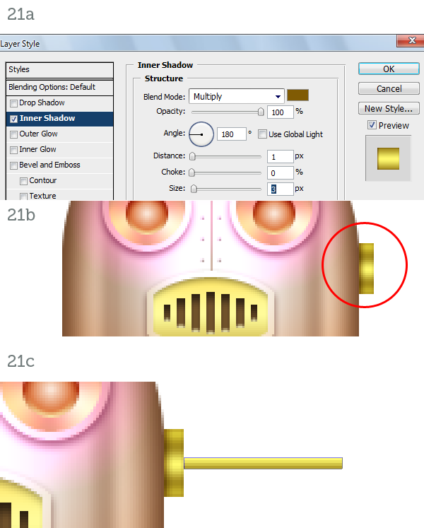 Step 22Draw a yellow circle at the end of the stick (22a) and use an Inner Glow to make it round (22b. 22c). Create two squashed ellipses, one dark brown and one bright yellow, to complete the ball (22d). 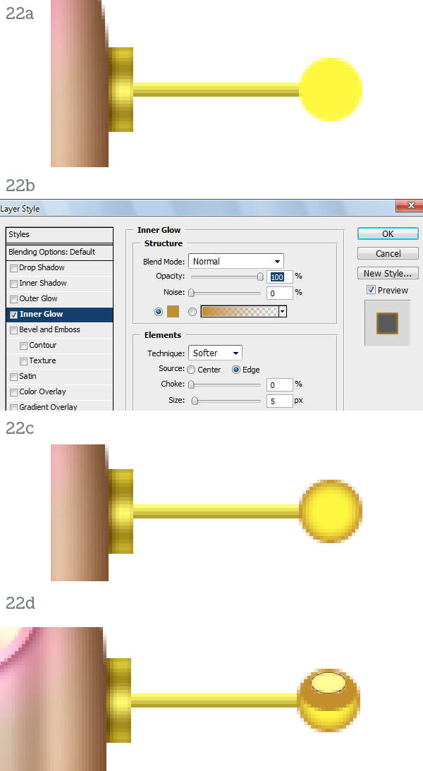 Step 23Create the small antenna the same way you created the arm. Draw a path (23a), stroke it in white and mask it (23b). Apply an Outer Glow style set to Linear Dodge (23c) to create a very bright glow (23d). The left “ear” is finished so simply mirror the right one (23e). 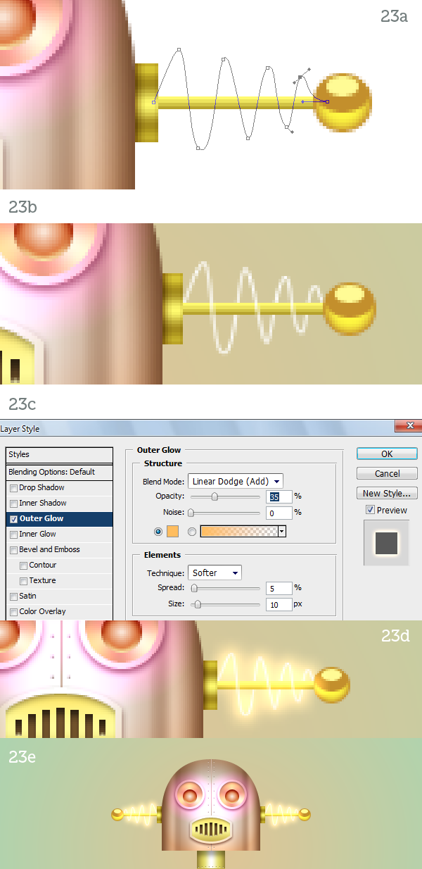 Step 24For the leg draw a small rectangle with rounded corners (24a). Fill it with a copper Gradient Overlay (24b, 24c), an Inner Glow (24d) and an Inner Shadow (24e). Duplicate this module several times to complete the leg (24f).  Step 25The foot joins the leg by way of a small steel ring. You know how to create it by now (25a). Create the foot as a Shape Layer path (25b) and copy and paste the layer style from the leg module. Just modify the Contour of the Inner Shadow (25c) to alter the color variation (25d). The leg is finished so group everything and create the other one. 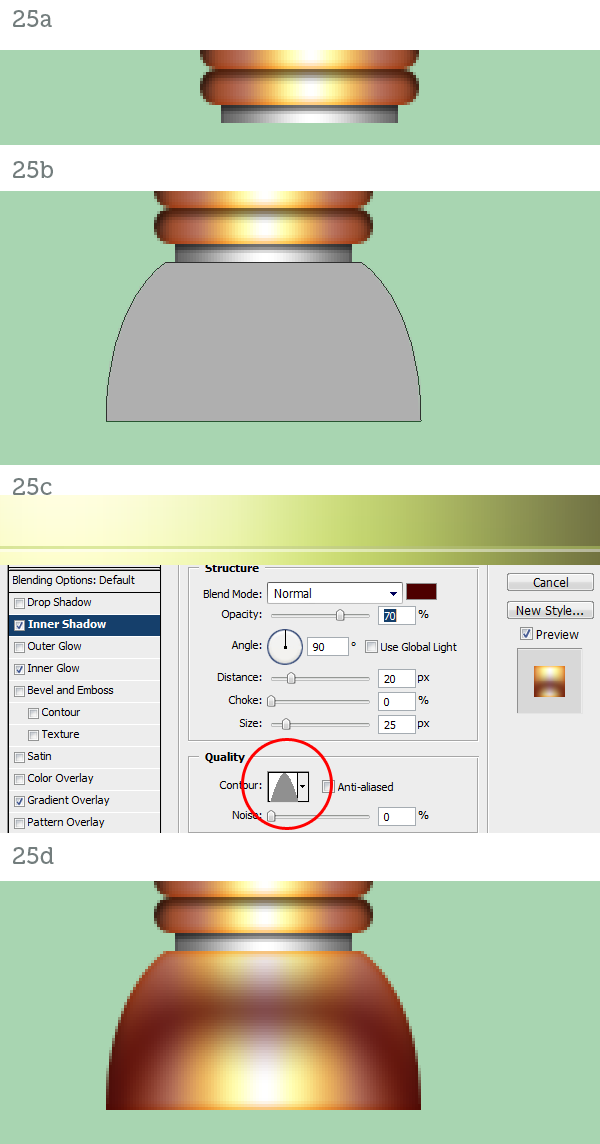 Step 26The fembot is finished but it looks too polished. She needs some realistic textures to be really complete. Place the Rust #1 texture in the document and resize it to fit the head (26a). Set its blending mode to Soft Light and crop it with the head’s vector mask (26b). For the neck use Rust #2 (26c) set to Overlay mode (26d). 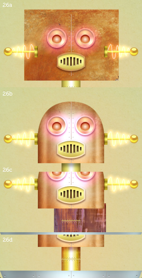 Step 27Place the Rust torso texture on the torso, of course. Set it to Soft Light (27a). The skirt gets both Skirt #1 and Skirt #2 placed on top of each other while the legs and feet get the same rust applied to the head (27b). The fembot looks much better now. 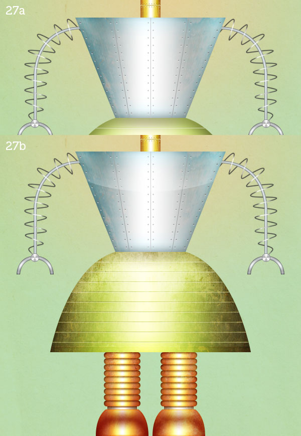 Step 28No respectable robot has a bare chest, especially a female one. Let’s give her a control panel. Draw an ellipse (28a) and apply an Angle Gradient Overlay to it (28b). Also add the usual Inner Glow (28c), Inner Shadow (28d) and Drop Shadow (28e). 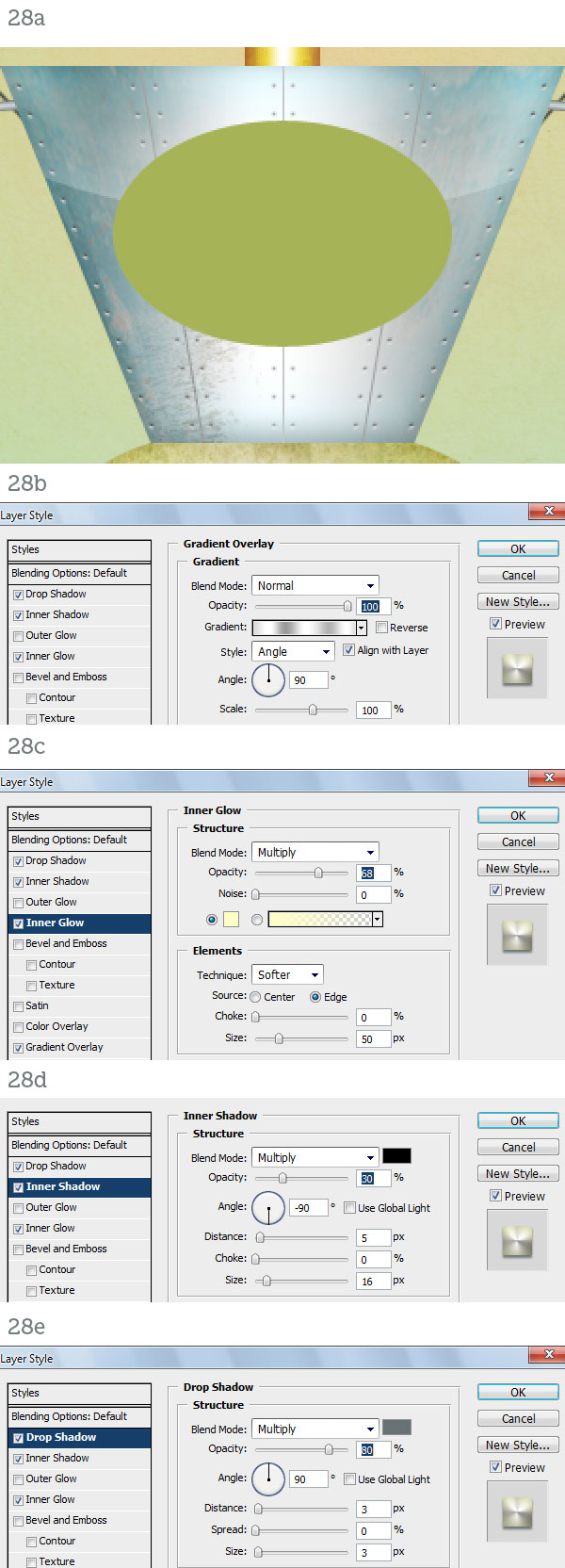 Step 29Complete the oval plate by texturing it with Copper (29a). The display is a smaller ellipse (29b) with a bunch of layer styles applied to it (29c).  Step 30The blank screen (30a) can be filled with a warm “hello” and a couple of status icons (30b). Also add a reflection on the glass by drawing a white crescent set to Screen, 35% Opacity (30c).  Step 31This step is optional. Open the Broken glass #1 image and go to Select > Color Range. Select Highlights (31a). Hit Command + J to create a new layer from the selection and drag this layer over the fembot’s glass screen. You can add a white Inner Shadow (31b) and a dark Drop Shadow (31c) to simulate depth and of course use Broken glass #2 the same way (31d). 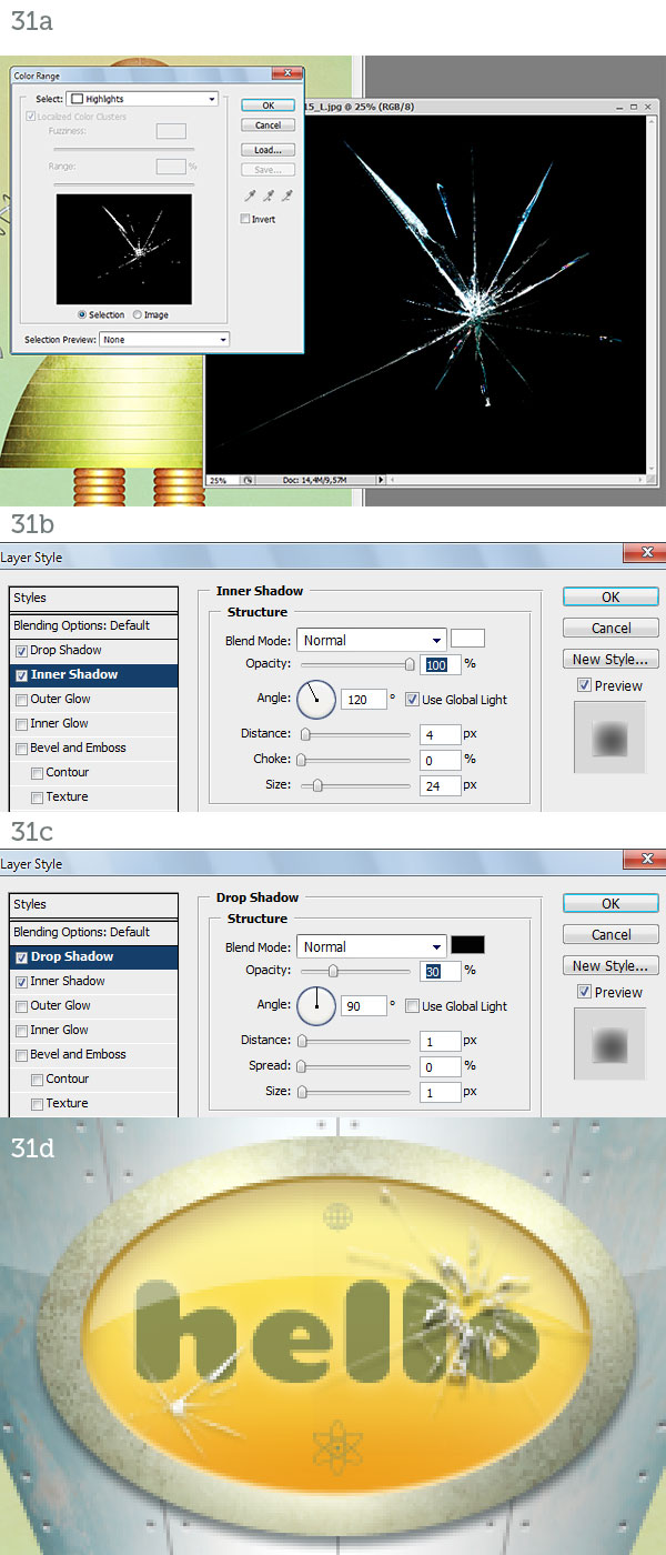 Step 32Just add a background and a floor of your liking and the fembot will finally be complete. 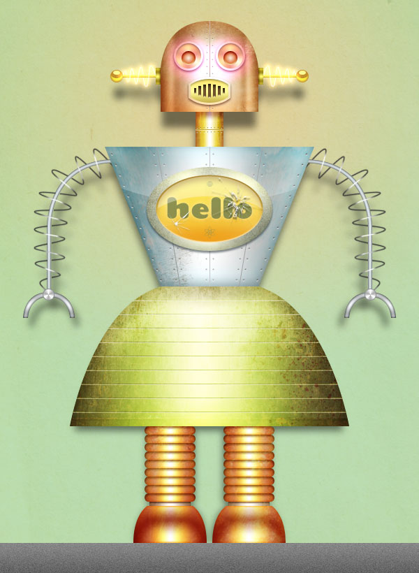 ConclusionIn this tutorial we used very simple vector shapes and well-thought layer style combinations to create a fun female robot made of metal parts. Since the result was too polished and plastic-looking we added a layer of realism by simply juxtaposing rusty, corroded and dirty textures. Not only do they add life to the materials, they also heighten the realism by providing subtle color changes, realistic surfaces and ambient reflections. The beauty of this workflow is that the entire character is made of infinitely scalable vectors. For the most part the layer styles will scale with the body parts and the few elements that don’t, the textures, can be obtained in high resolution and require little effort to be applied again should you change the size of the document. I hope you had fun creating the robot but especially I hope you learned a useful method for creating scalable characters in a raster-based application like Photoshop. |


| You are subscribed to email updates from Psdtuts+ To stop receiving these emails, you may unsubscribe now. | Email delivery powered by Google |
| Google Inc., 20 West Kinzie, Chicago IL USA 60610 | |
0 comments:
Post a Comment